Art Direction by Emma Story
Product Photography by Patrick Morano
Objective: Bring craft thinking to a category that's been coasting on function.
Audience: Home cooks who care about ingredients and already shop the craft lane in other categories.
Strategy & Concept
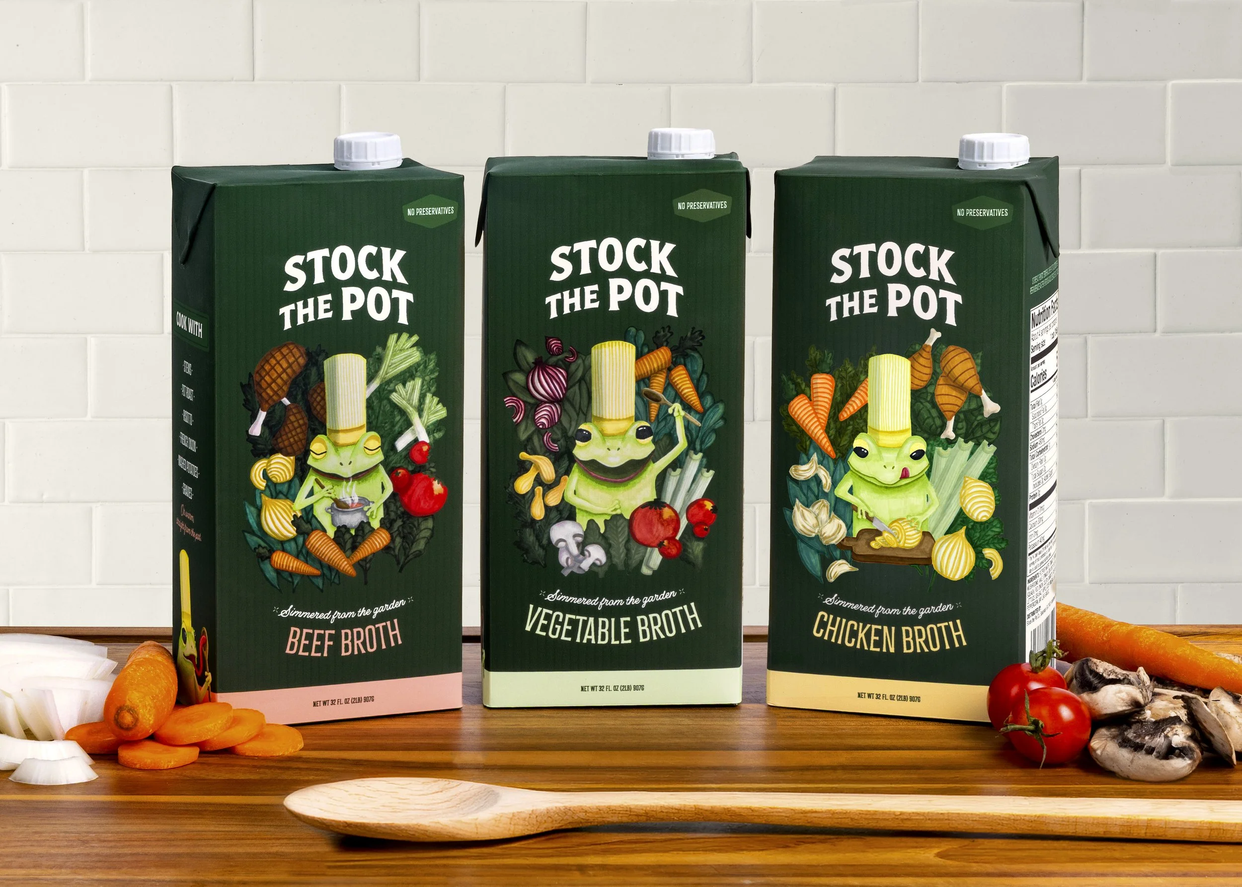
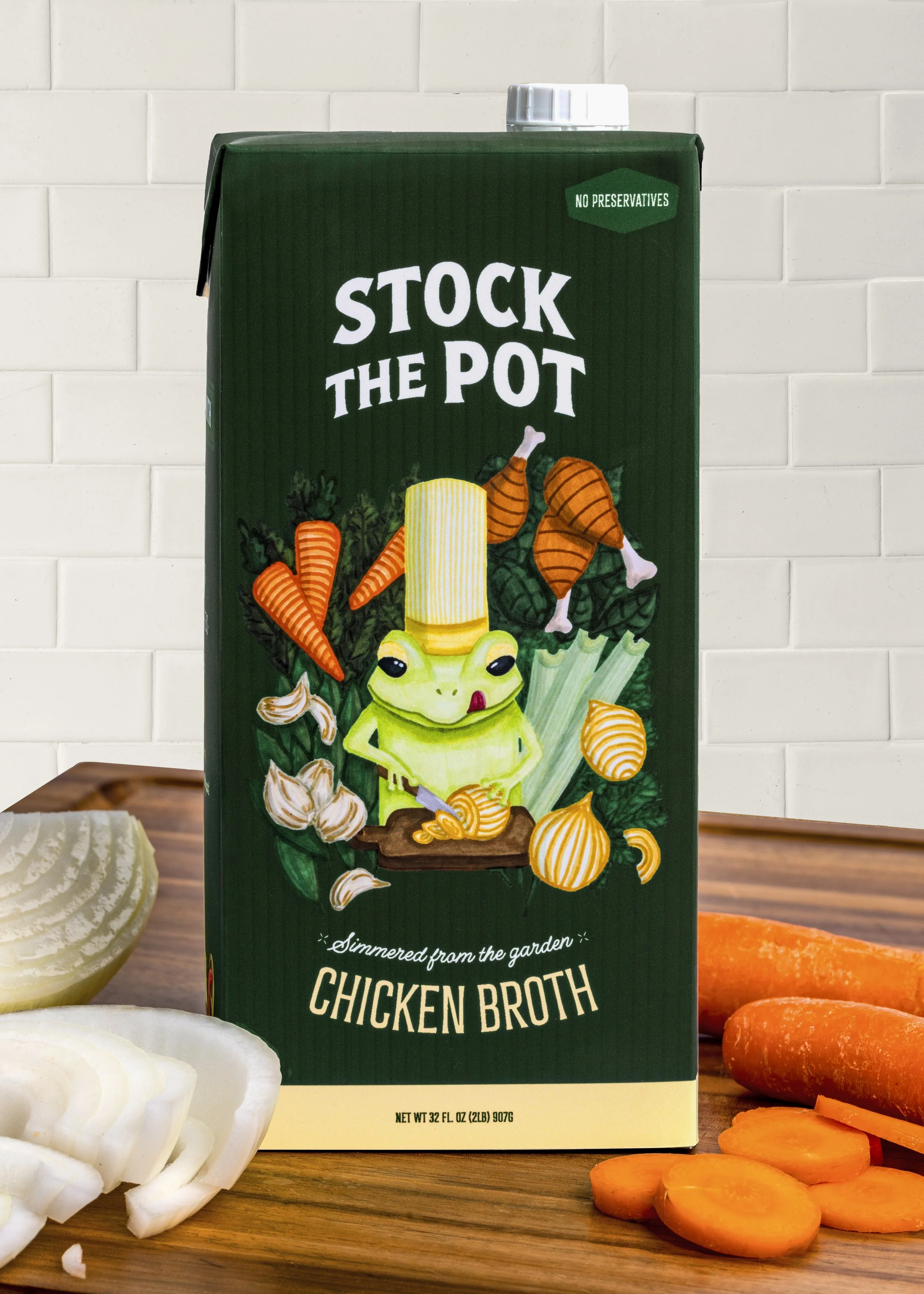
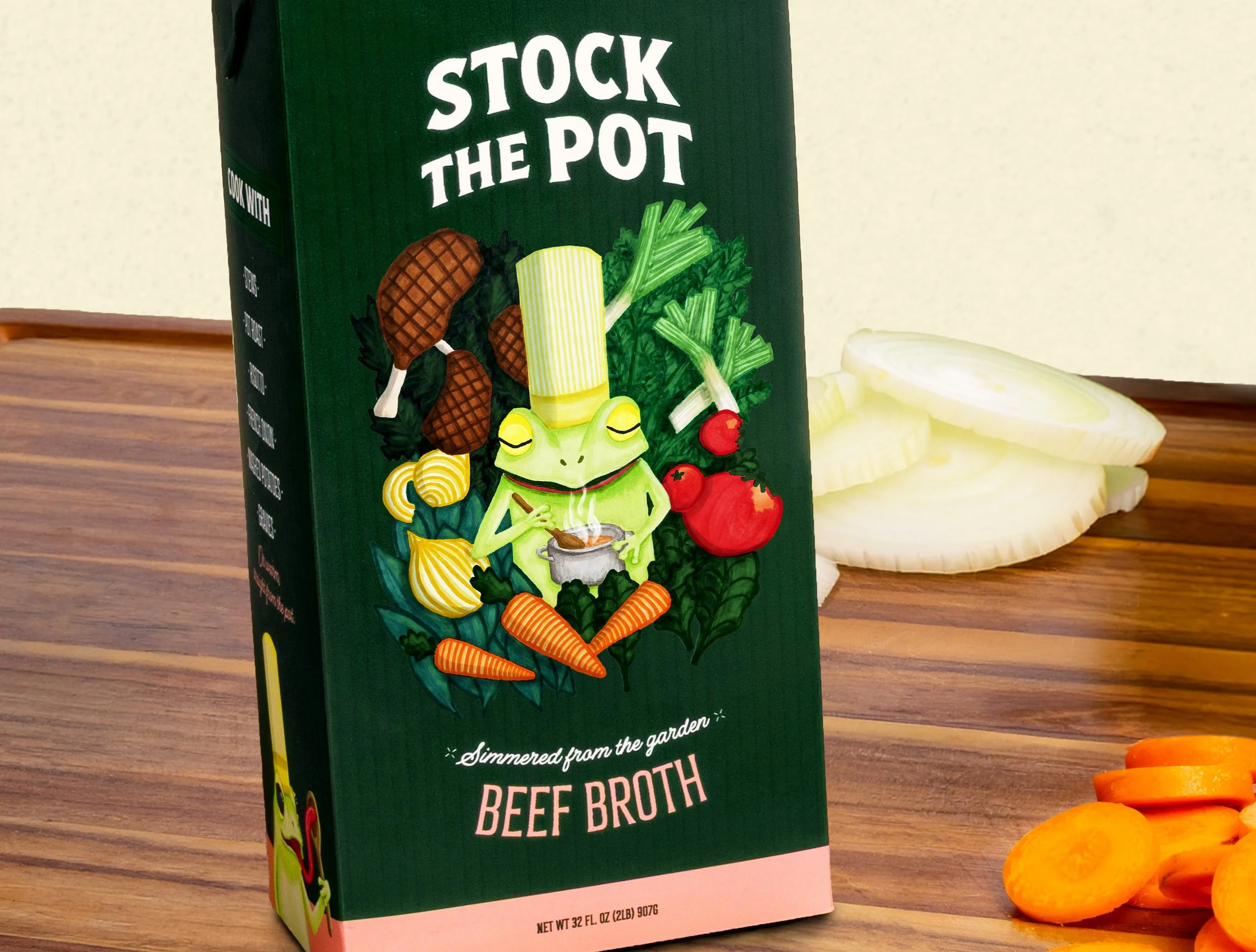
Stock the Pot was developed in response to a category that has coasted on function for decades. Broth sells on utility, and the aisle looks the part, leaving the craft lane wide open. I explored how a broth brand could treat the carton with the same care a home cook puts into what they are making, building an identity around warmth and craft rather than convenience cues.
The concept is anchored by a hand-illustrated chef frog, pulled from a childhood memory of Froggies Cafe, an elementary school tradition where older students played server for a day. That small detail of earned delight became the tonal north star. A confident wordmark, a hand-lettered tagline, and a deep forest green carry it across three broth flavors and into point of purchase, printed recipes, and merch, giving the system shelf presence without losing the handmade feel.
Product Photography by Patrick Morano
Product Photography by Patrick Morano
Product Photography by Rebecca Burney
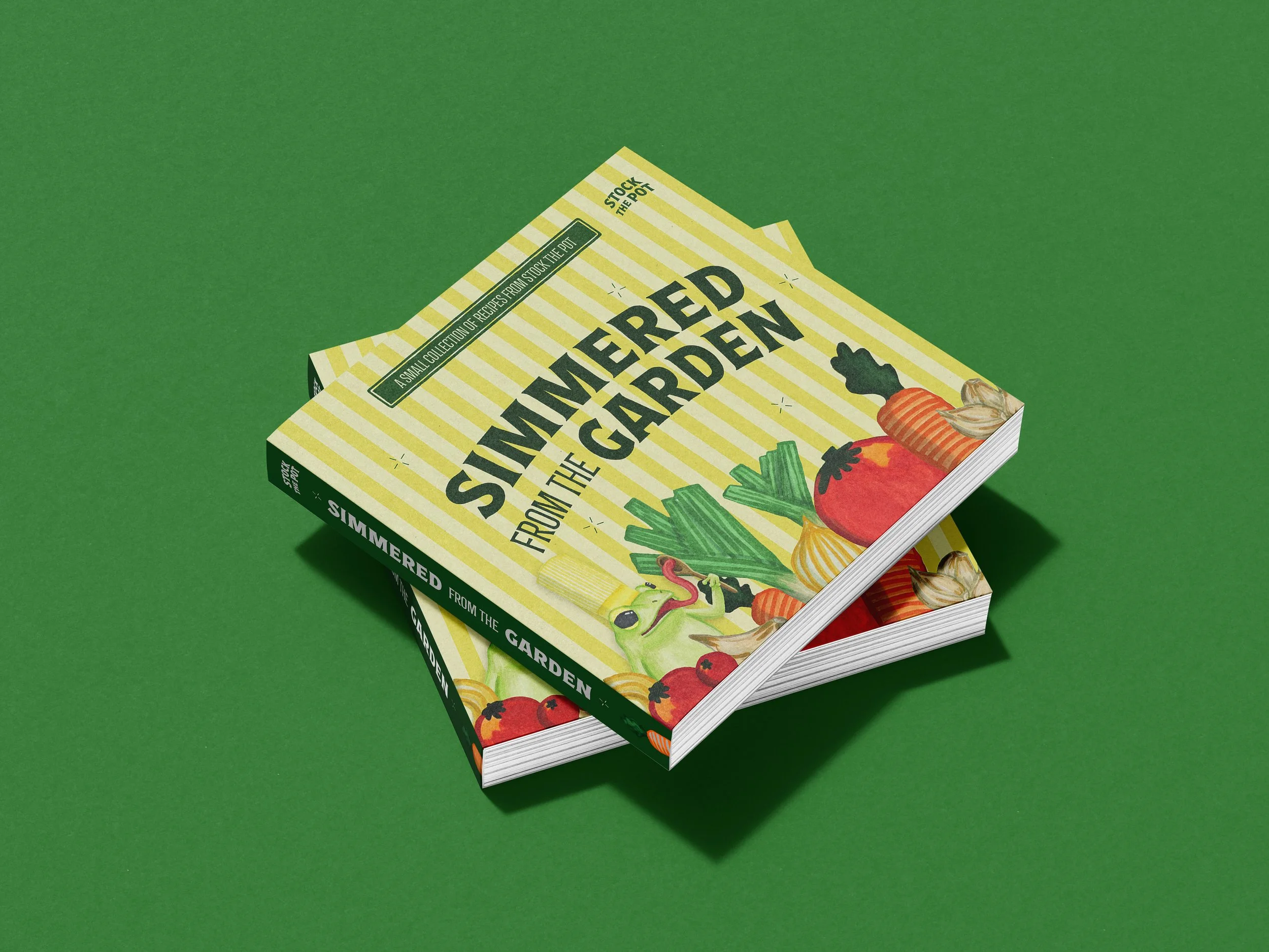
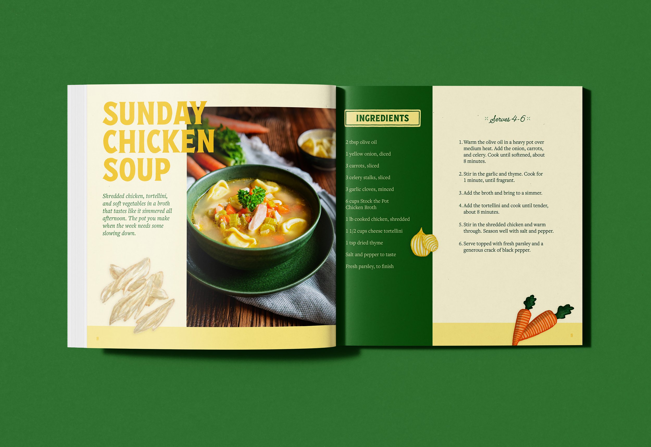
Recipe Book
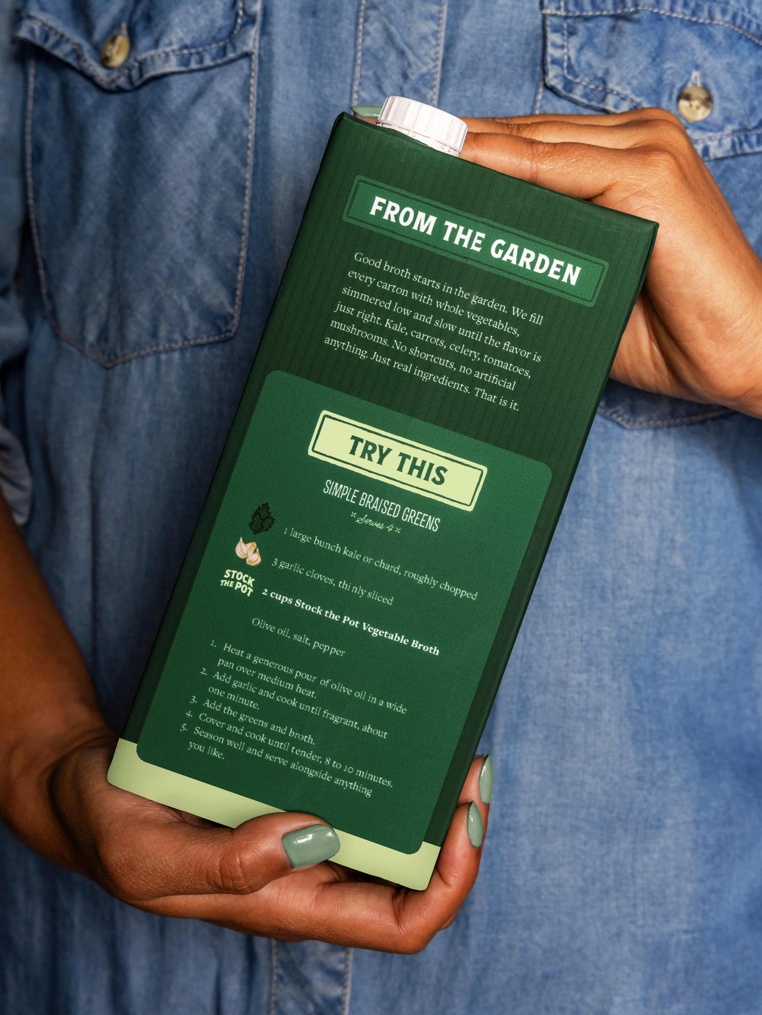
An extension of the brand into the kitchen, the recipe book pairs dishes built around each of the three broths with kitchen notes from Art, turning the carton's back-panel voice into a book a home cook keeps.