Meza
BRAND IDENTITY, PRINT, EDITORIAL
SCAD, Candidacy Review Passion Project
Objective: Give people whose identities are layered or in-between a sense of belonging. A home that exists culturally rather than geographically.
Audience: Anyone living between cultures, identities, or places.
Strategy & Concept
Meza grew out of my experience as an Asian American adoptee. The name comes from Mesa, meaning table or common ground in Spanish, but I did not want it anchored to a single heritage. Changing the spelling created just enough distance. A word that feels familiar and belongs to no single place, much like the people it was designed for.
Instead of a traditional brand, I looked to official nation symbols as a visual language of legitimacy, recognition, and place. The system centers on a symbolic passport, a logo built from smaller forms joining into a unified whole, a flag, stationery, and a narrative book of interviewee stories.
If Meza is a nation, it needed a way to be lived in. Tables are how Meza shows up locally, standing invitations in each city where members gather in person. Each Table is shaped by the city it sits in, its own typeface, its own voice, under the parent Meza system. The nation holds. The city speaks.
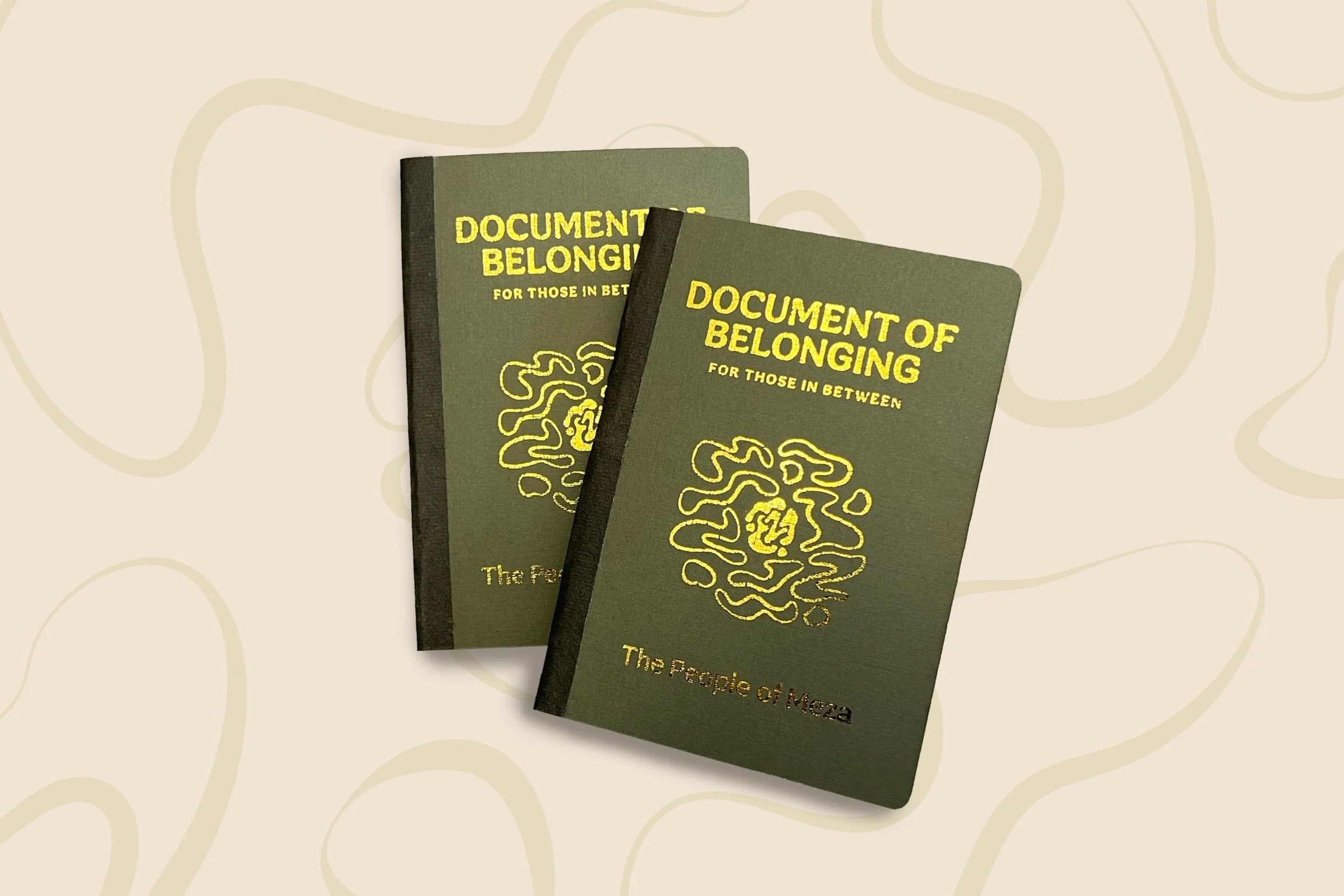
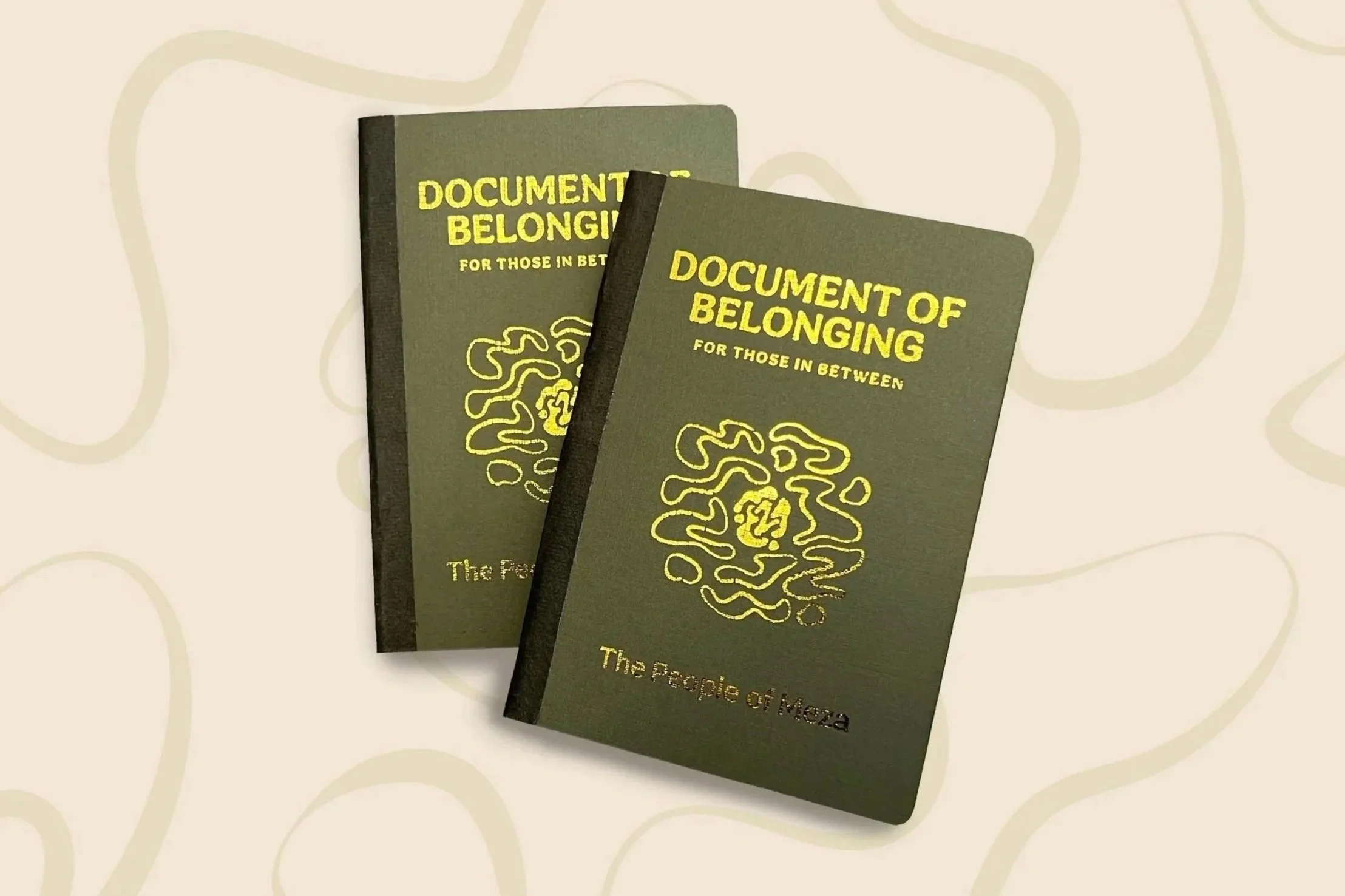
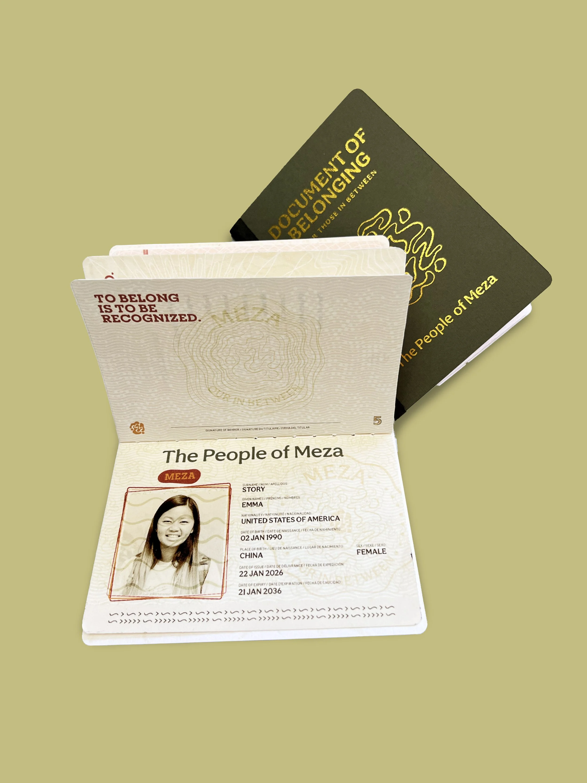
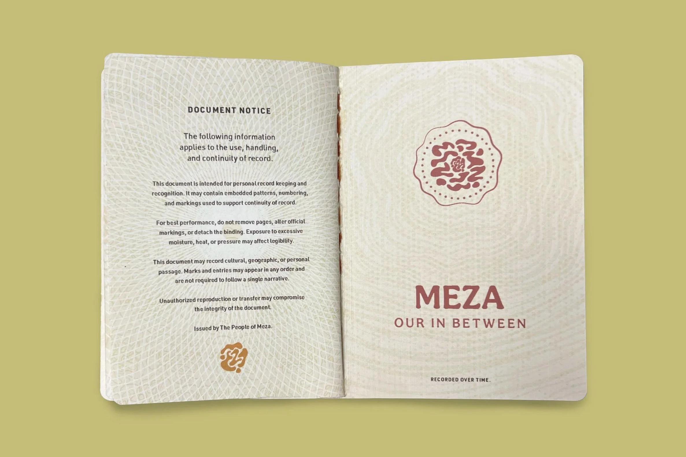
Document of Belonging
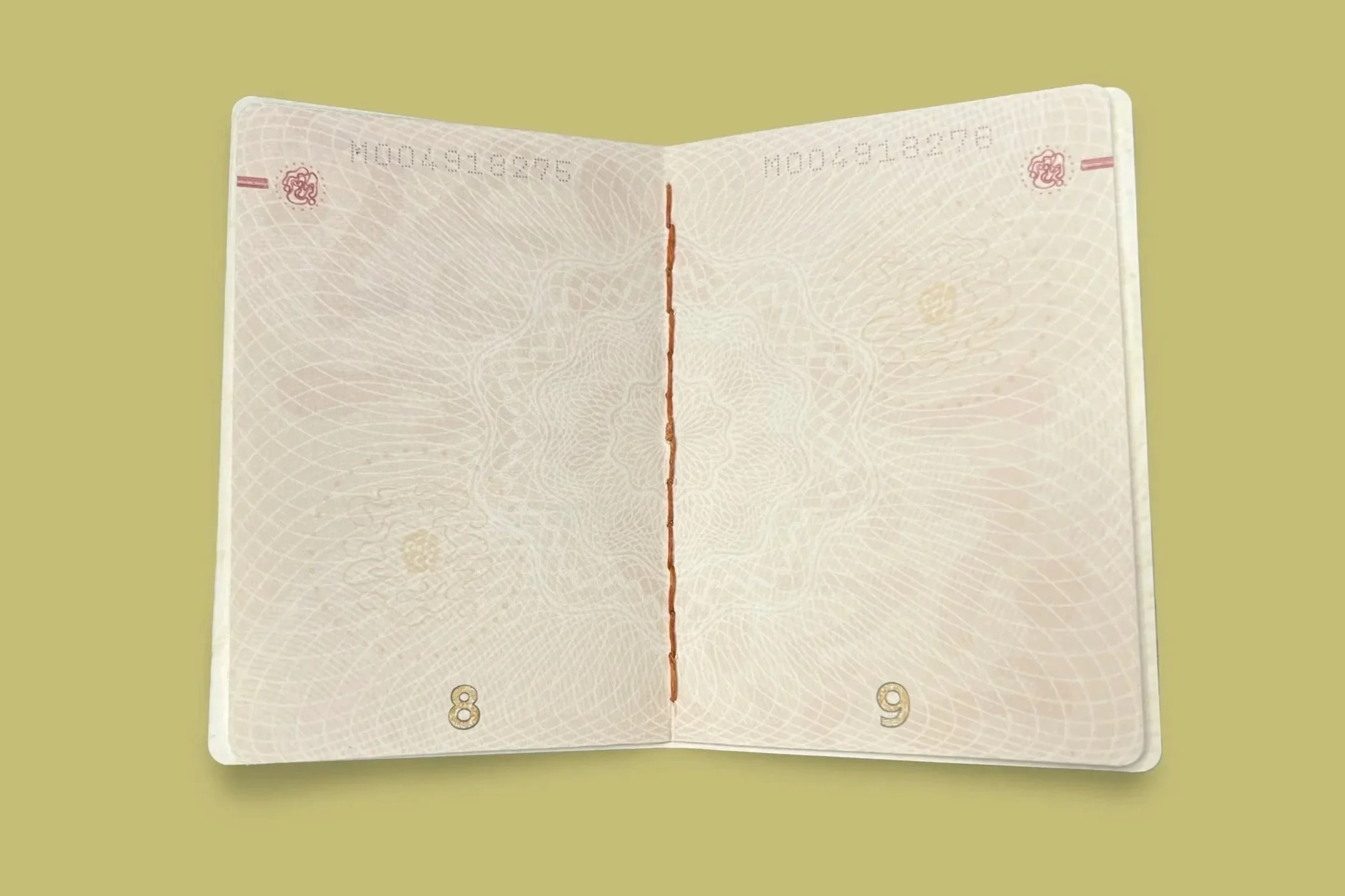
Using the structure of official passport documentation, this piece frames Meza as a place that recognizes identity and connection, using the document to acknowledge belonging rather than define it.
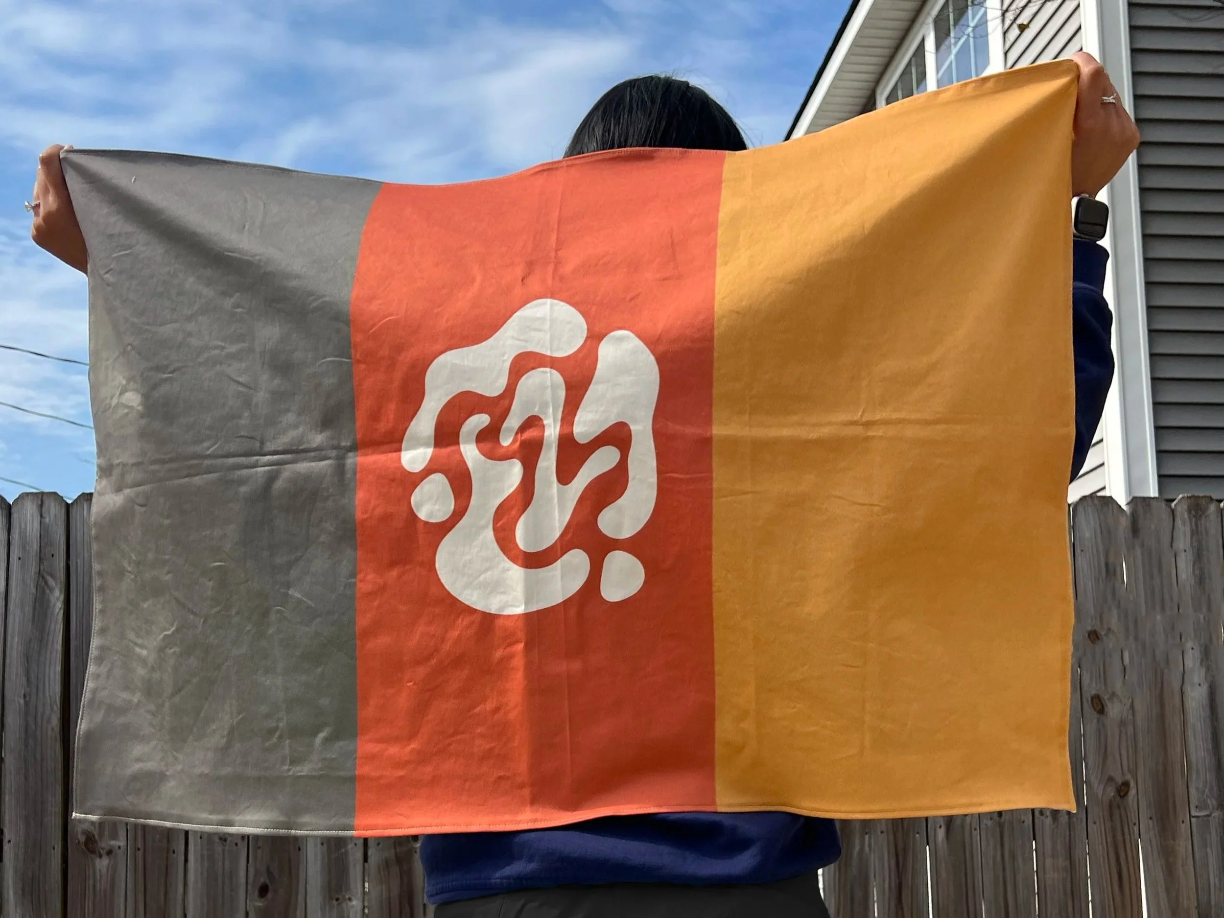
Flag
Serving as a unifying symbol, the flag represents collective identity and shared belonging through a form typically tied to nationhood and recognition.
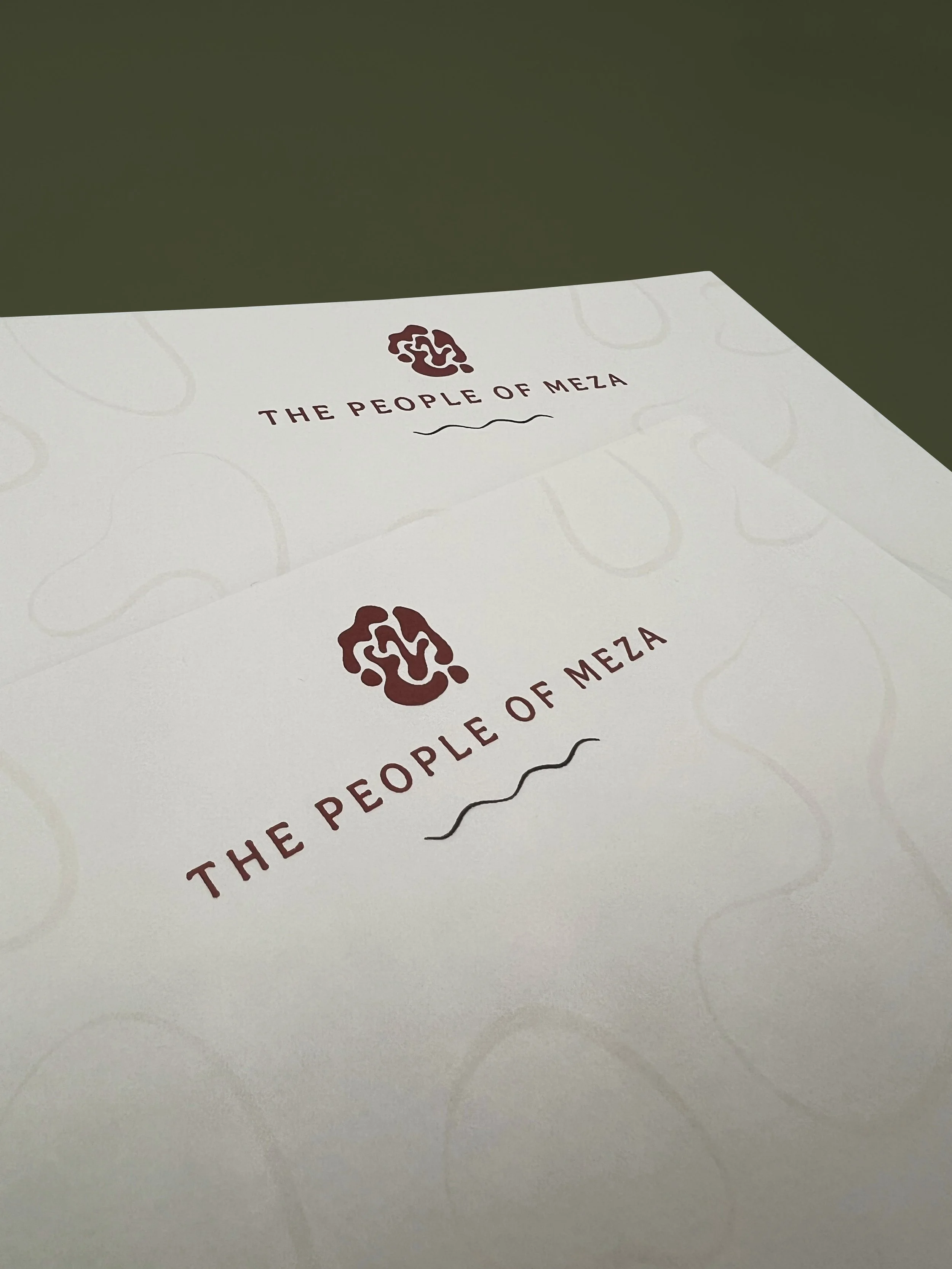
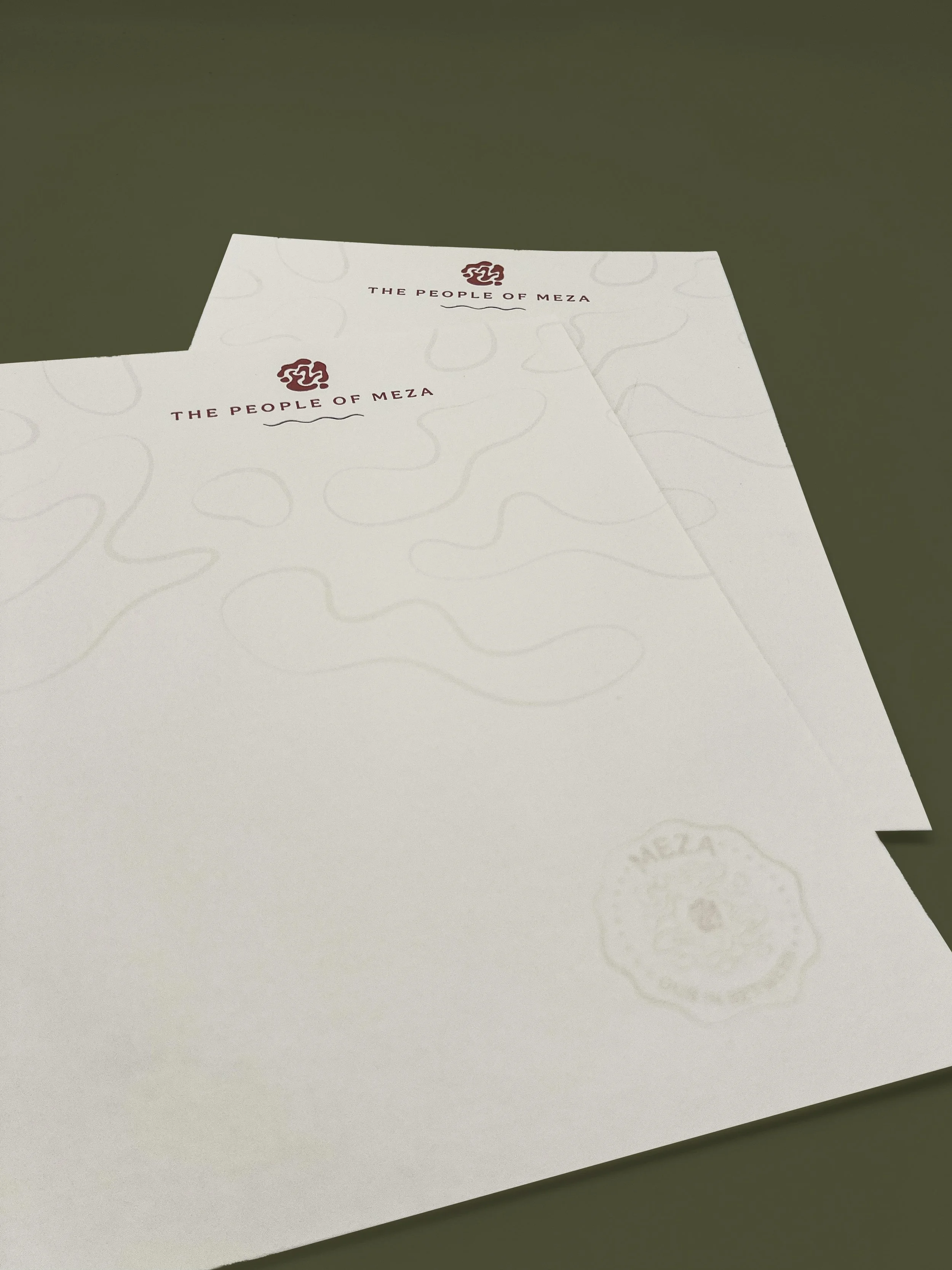
Stationery
Extending the system into everyday communication, the stationery reinforces Meza as an organized, functioning place rather than a purely symbolic idea.
Narrative Book
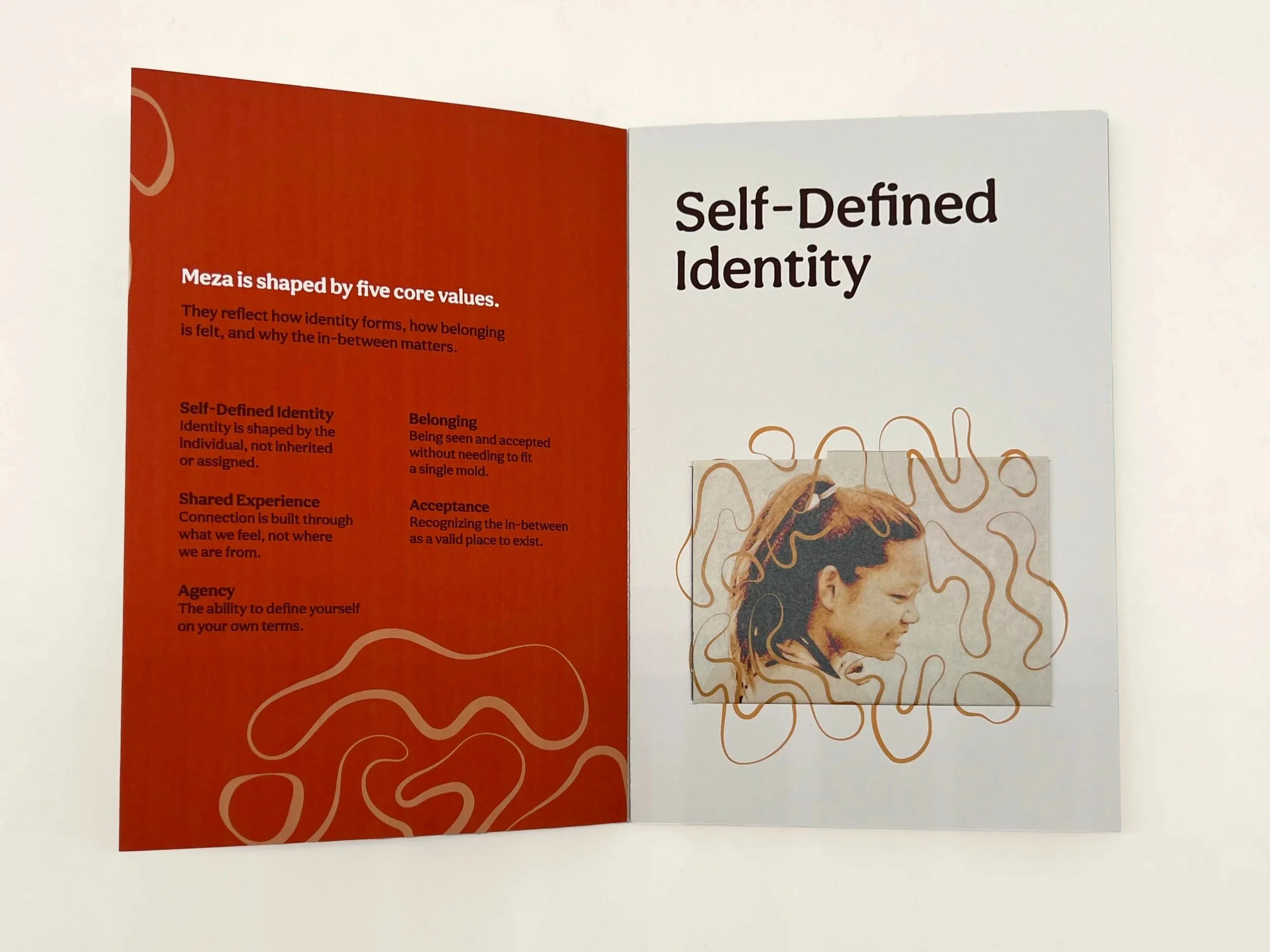
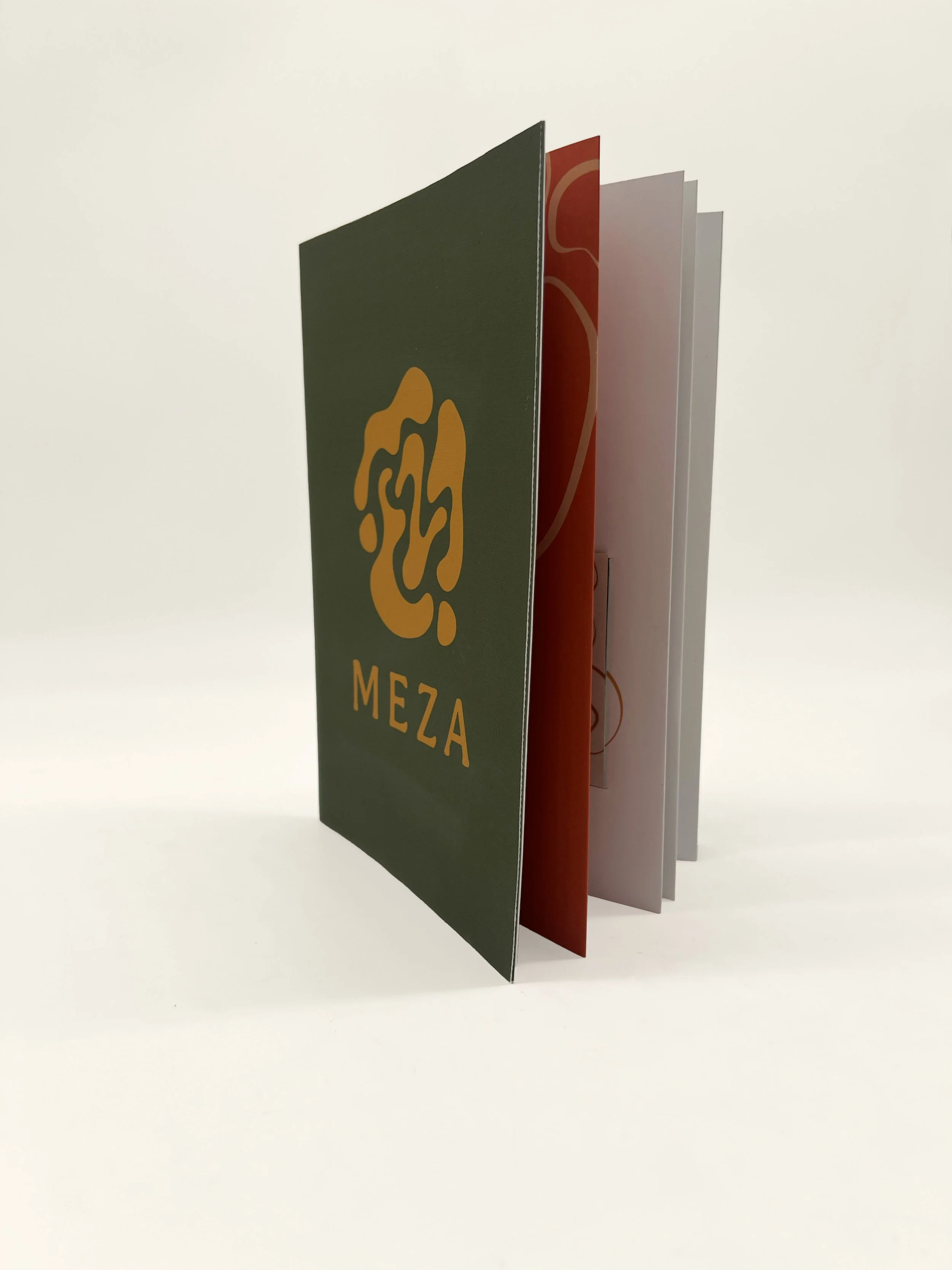
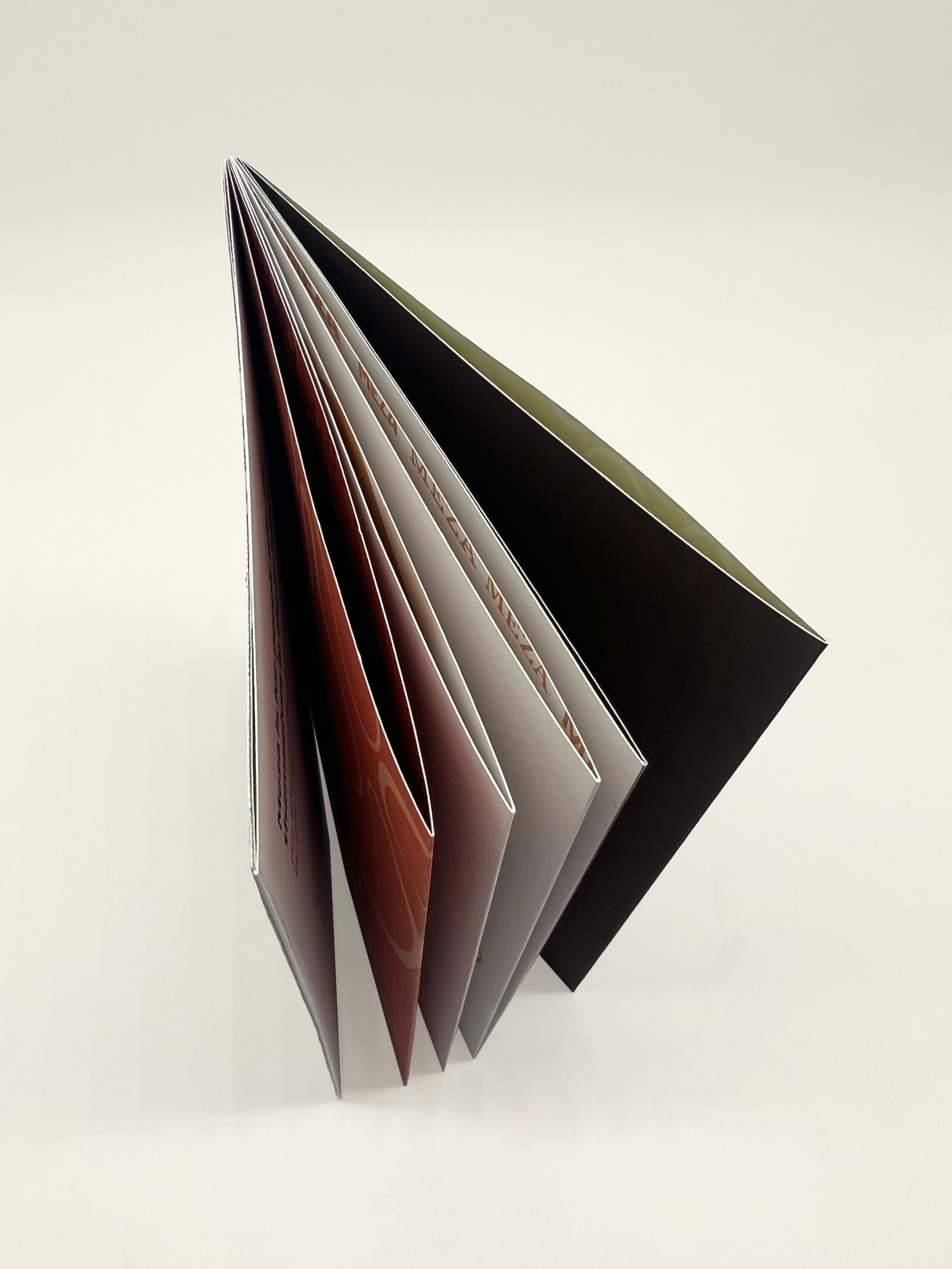
Grounded in lived experience, the book defines what Meza is and why it exists, outlining its values before introducing interviewee stories that give the project human depth and cultural context.