
After
BRAND IDENTITY, PACKAGING, COPYWRITING
SCAD Project
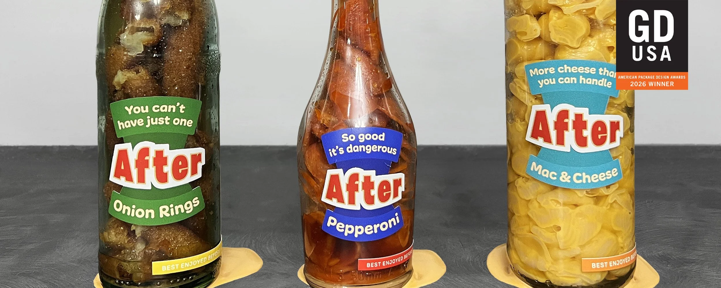
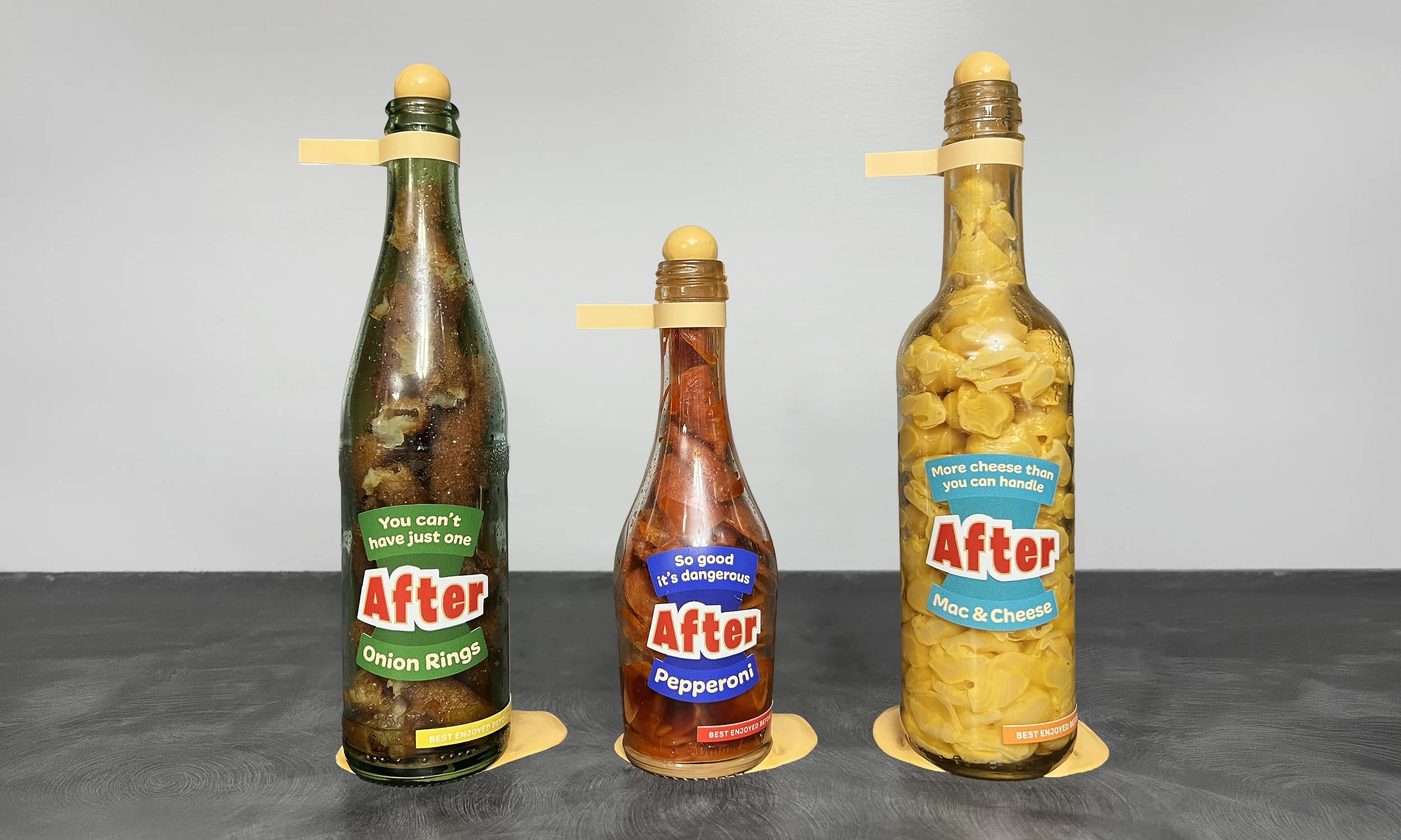
Objective: Design a label system across three glass bottles holding unexpected contents, where the labels either reinforce or subvert what the viewer expects. I chose junk food.
Audience: Anyone who buys junk food already knowing exactly what it is. After assumes a person who doesn't need protecting from the truth, only one who has never been handed it on the package.
Strategy & Concept
Food marketing has one job: carry you to the moment of purchase and not one step past it. After was built around the part that never gets designed.
The front of each bottle behaves like any junk food package, using sensory language and real food pressed against the glass to sell the craving without asking you to think about it. The three foods were chosen for how they behave in glass. Pepperoni, onion rings, and mac and cheese all read instantly through the front, and all of them are close to impossible to get back out, so grease is the only thing that ever escapes.
The back is where the brand stops performing. A sentence that starts on the front only finishes when you turn the bottle, one word changed so the meaning inverts. The wax pool escalates as you turn, and the back is dipped in the color of a grease stain. A Contains list borrows the structure of an ingredient panel to name behavioral truths rather than nutritional ones. The tone stays deadpan instead of satirical, because the concept only holds if the brand is being honest with you and not lecturing you.
Every material decision argues the same point. The wordmark is raised in resin so the name swells off the glass, the cork ball sits in the neck without ever fully sealing what's inside, and the painted back pools at the base the way grease spreads once it's out of the container.
Best enjoyed before you think about it too long. The line wraps the base and only finishes when you turn the bottle.