Art Direction by Emma Story
Product Photography by Rebecca Burney
Jaybird Juice
BRAND IDENTITY, PACKAGING, PRINT, HAND LETTERING
SCAD Project
Objective: Build a juice brand with personality that fits everyday moments, not just breakfast or the kids' aisle.
Strategy & Concept
The juice category signals quality through restraint. Natural cues, minimal type, muted color. Everyone is quiet in the same way.
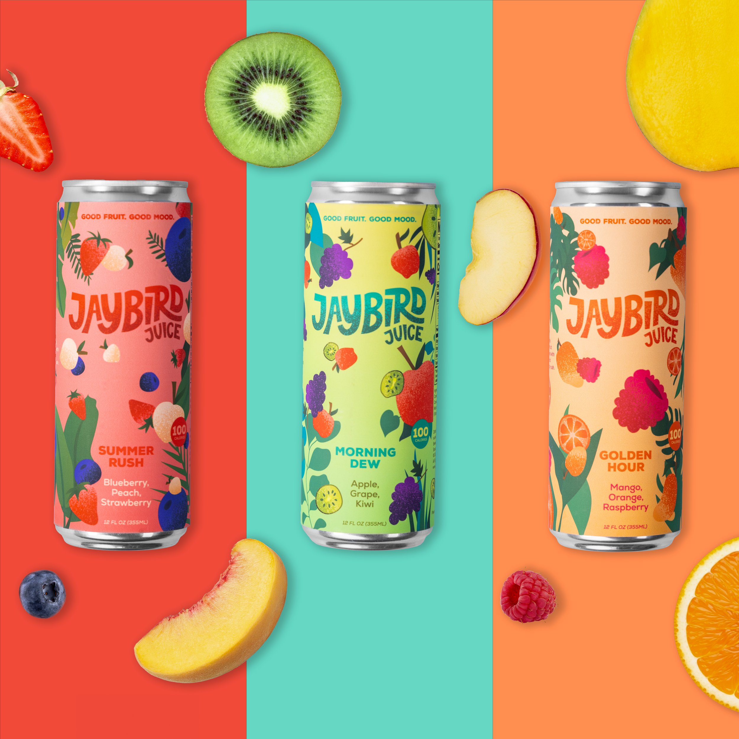
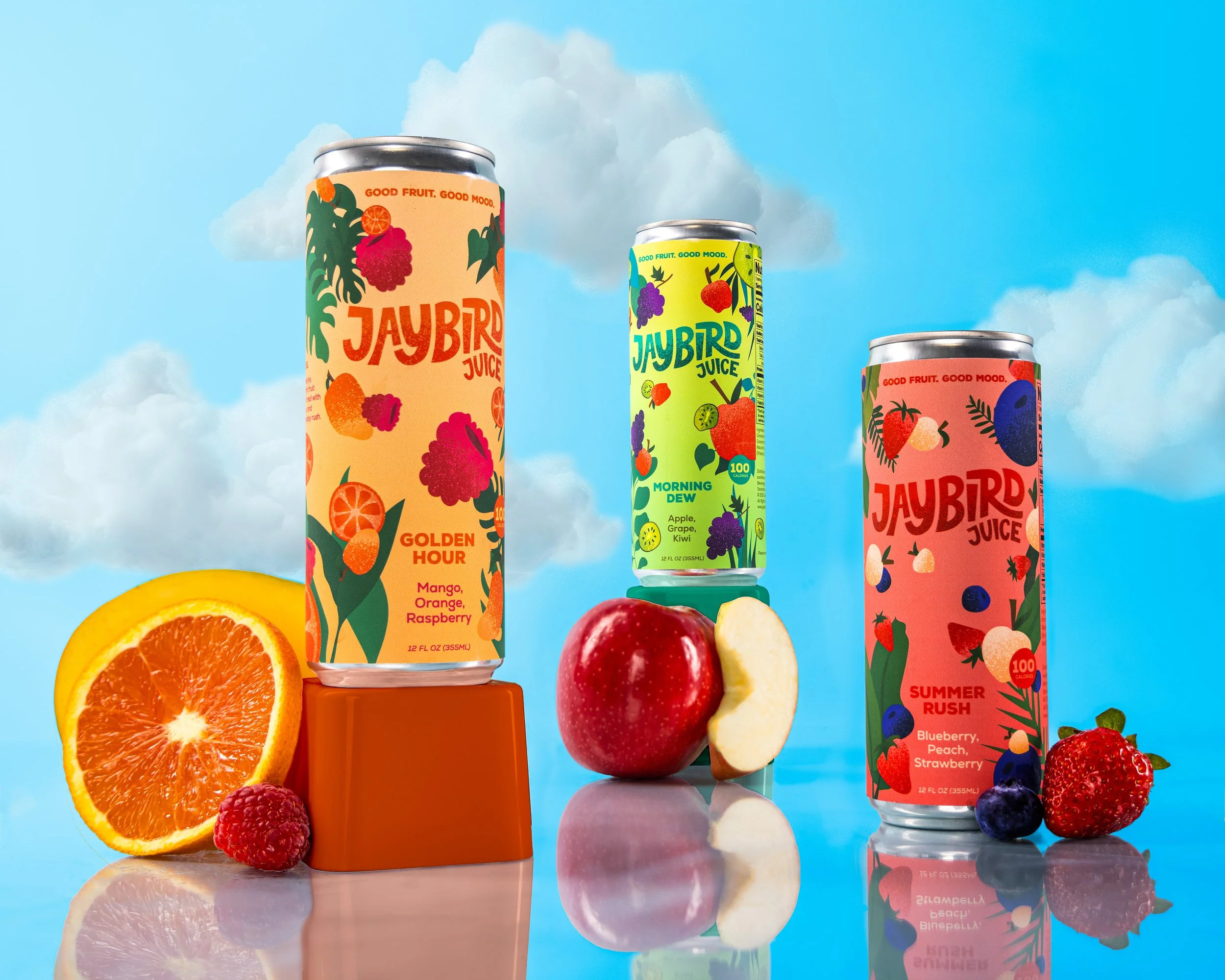
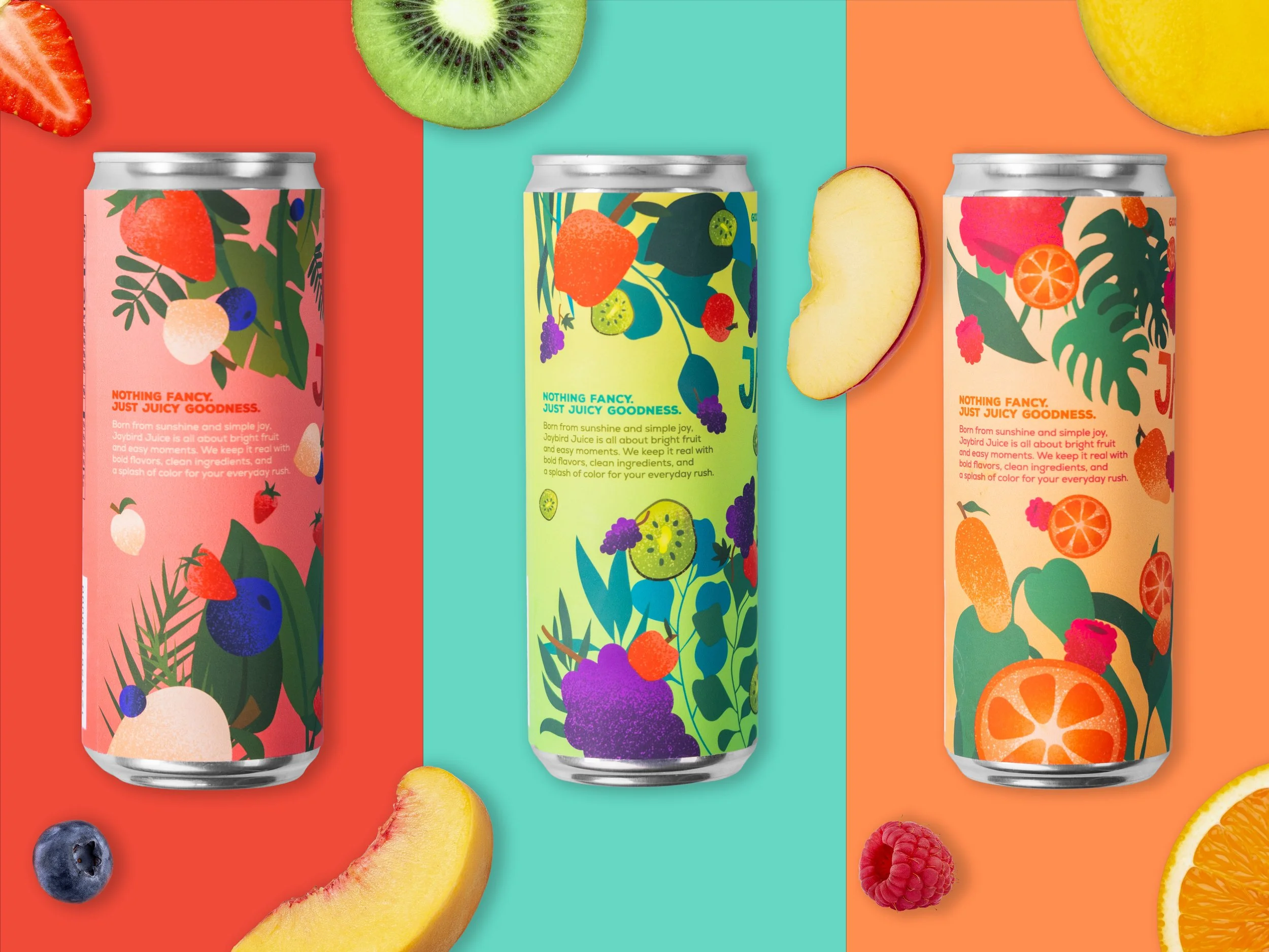
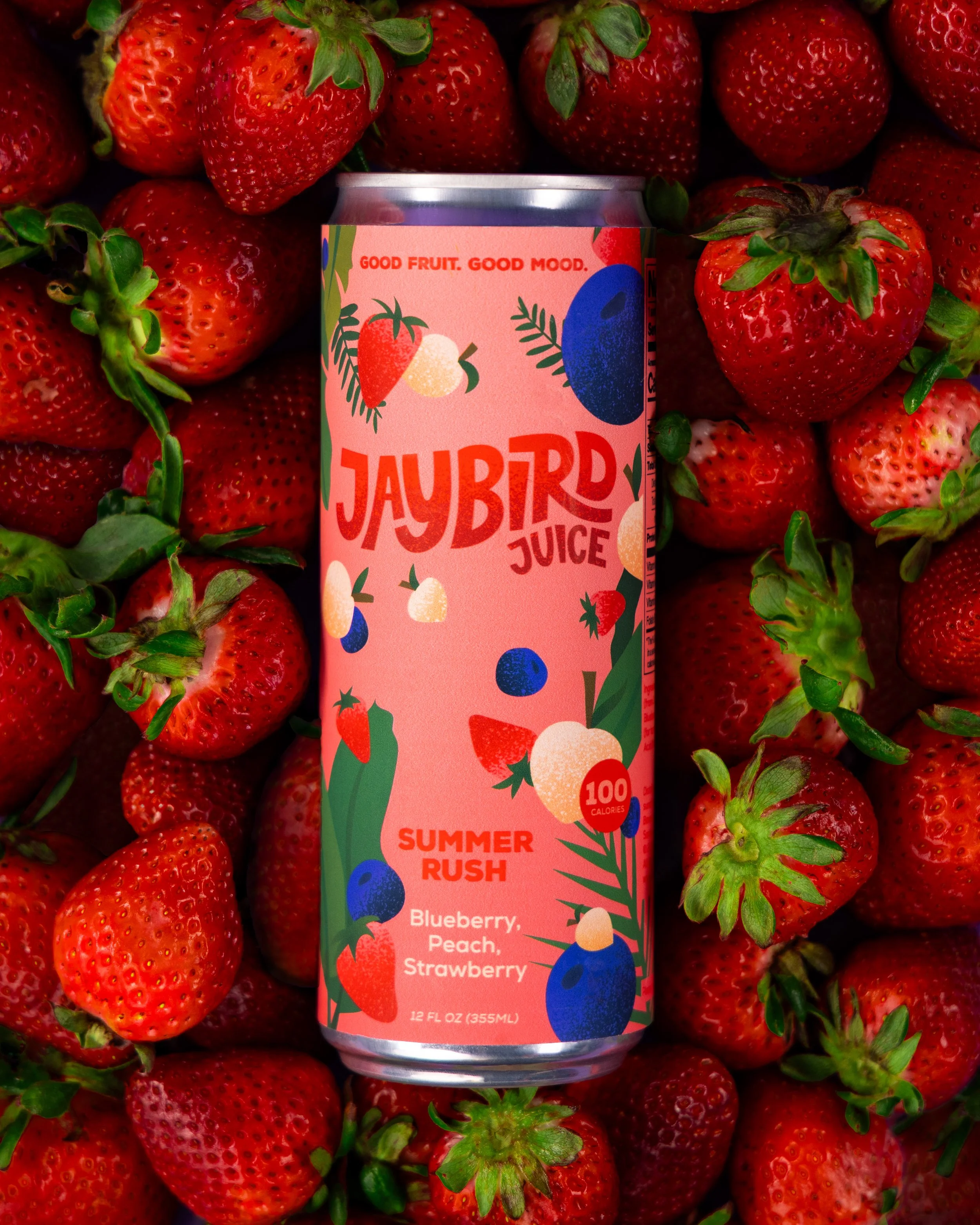
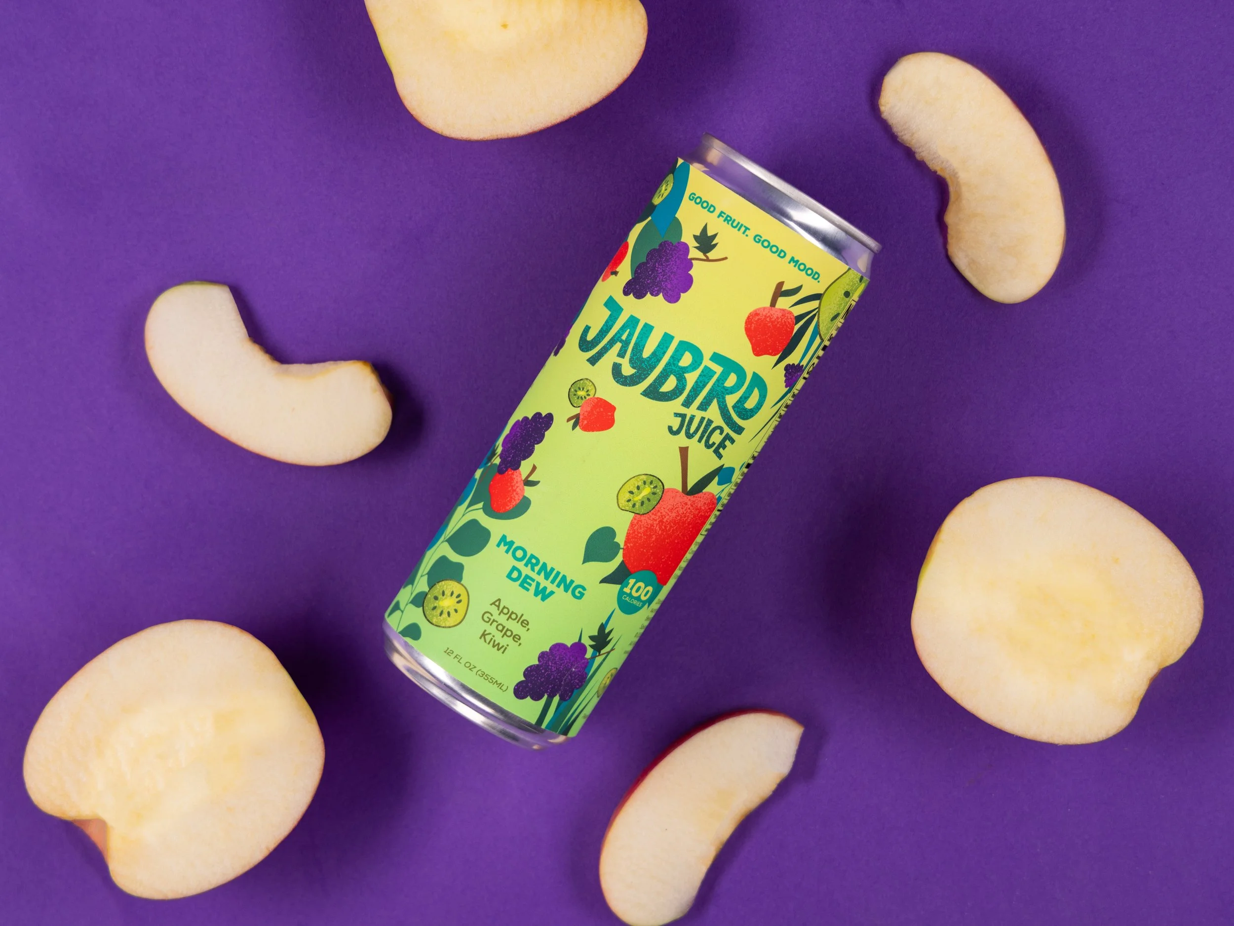
Jaybird gets loud. The name takes from jungle juice, the improvised party drink, and reframes it as something intentional. Each flavor is built around a distinct feeling, with naming, color, and illustration working as identity rather than decoration. It runs across packaging, an endcap display, a juice truck, a social campaign, and illustrated advertising poster.
Brand Marks
Advertising Illustration
This piece extends Jaybird’s playful tone beyond packaging, pairing the tagline “Good fruit. Good mood.” with the headline “Let the good vibes fly easy” to translate the brand’s mood-driven identity into a narrative scene.
End Cap Aisle Design
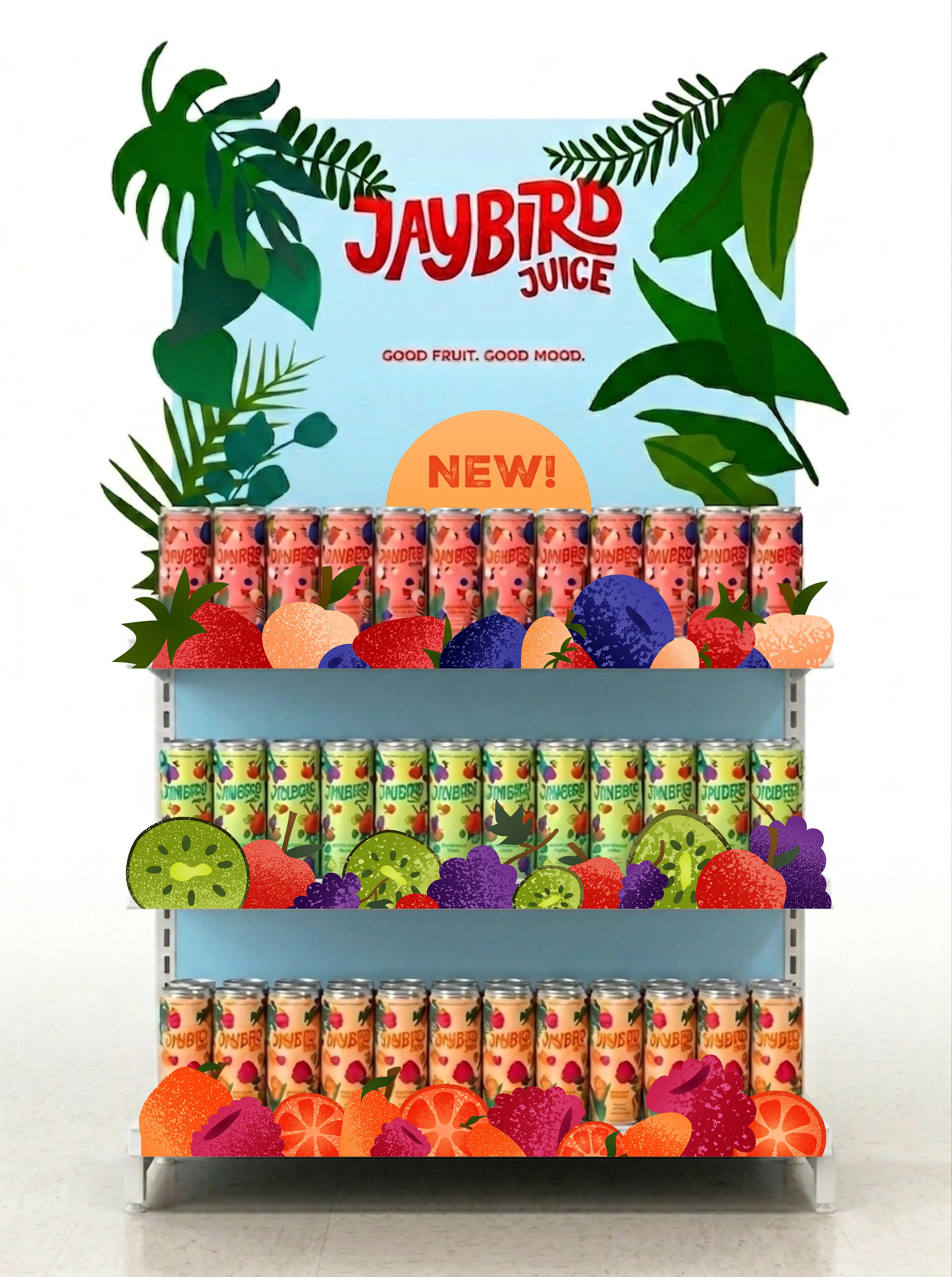
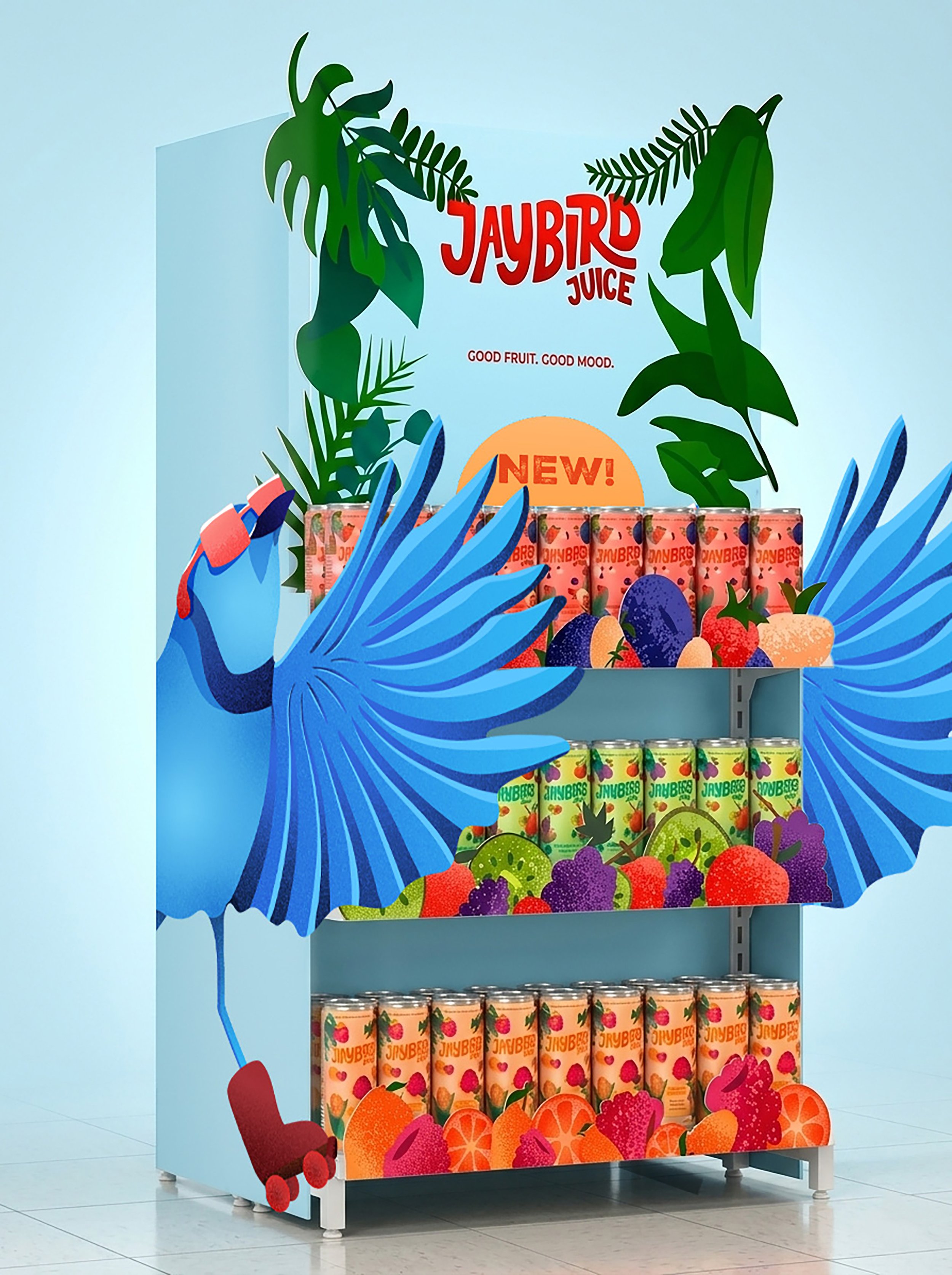
Translating Jaybird's illustrated world into retail, the end cap turns a standard grocery fixture into a branded moment, pulling the packaging's color blocking and foliage motifs into the shopper's eye line before they reach the shelf.
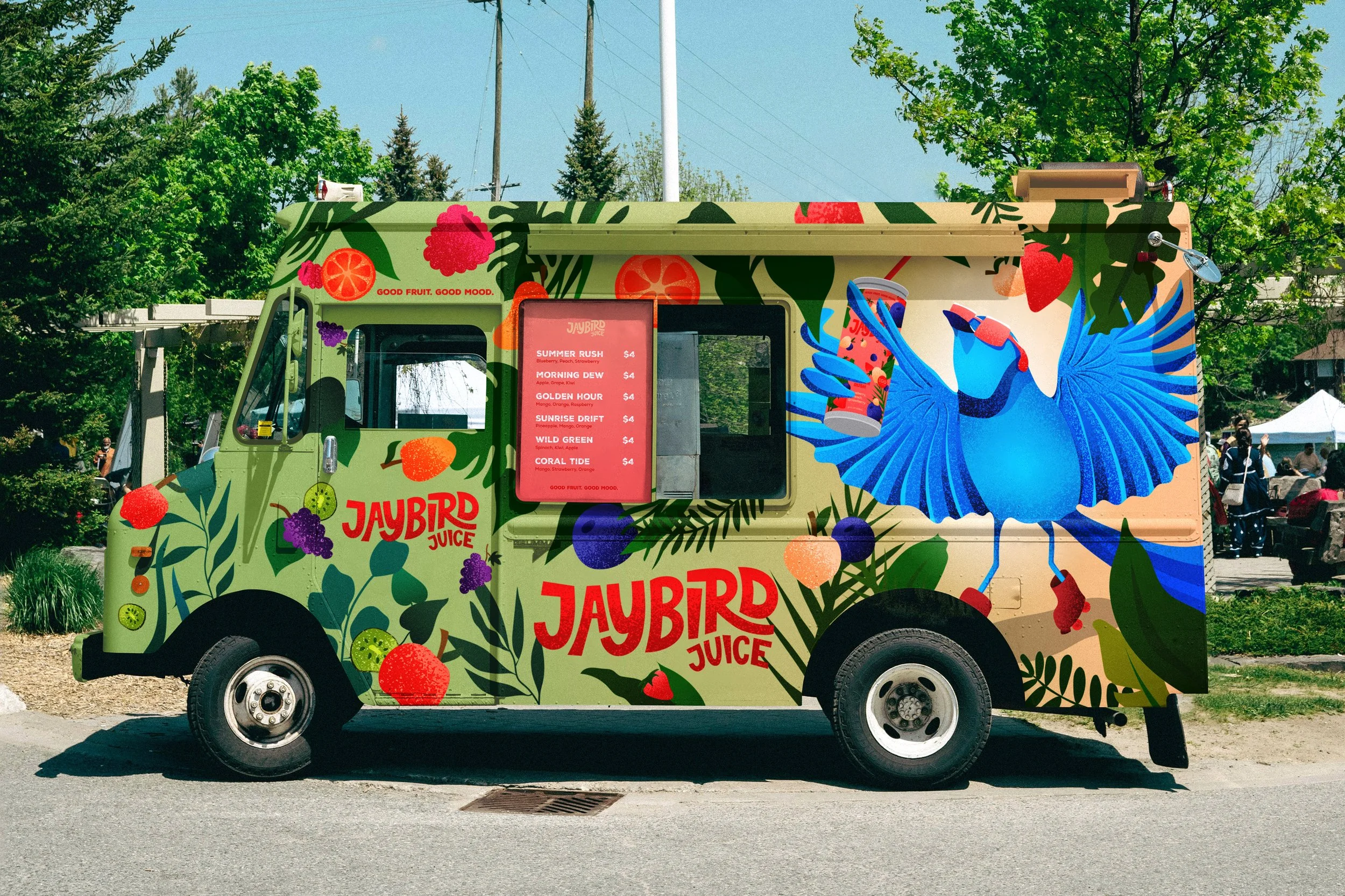
Juice Truck
A mobile pop-up built to bring Jaybird into summer events and neighborhoods. The truck treats the vehicle itself as packaging, extending the brand's tactile illustration style onto a dimensional, drivable surface.
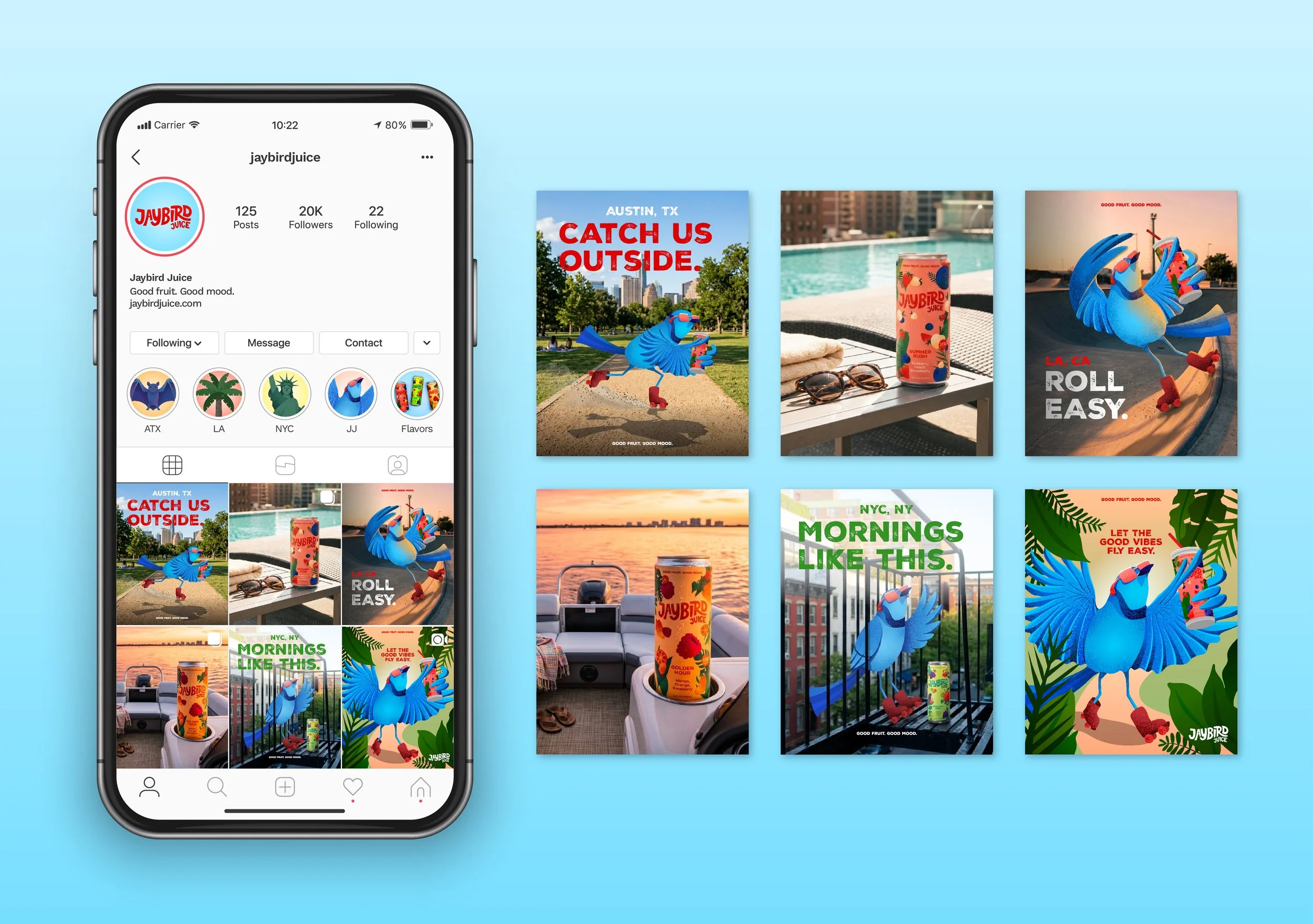
Social Campaign
Documenting the juice truck in the wild, the social campaign captures Jaybird as a lived experience, emphasizing the brand's "good mood" promise through real moments, real people, and the energy of the pop-up in motion.