Looking for Alaska (2018)
Type + Image Design, taught by Franz Werner at Rhode Island School of Design – Summer Institute of Graphic Design Studies. 2 week course. Project was 2 days.
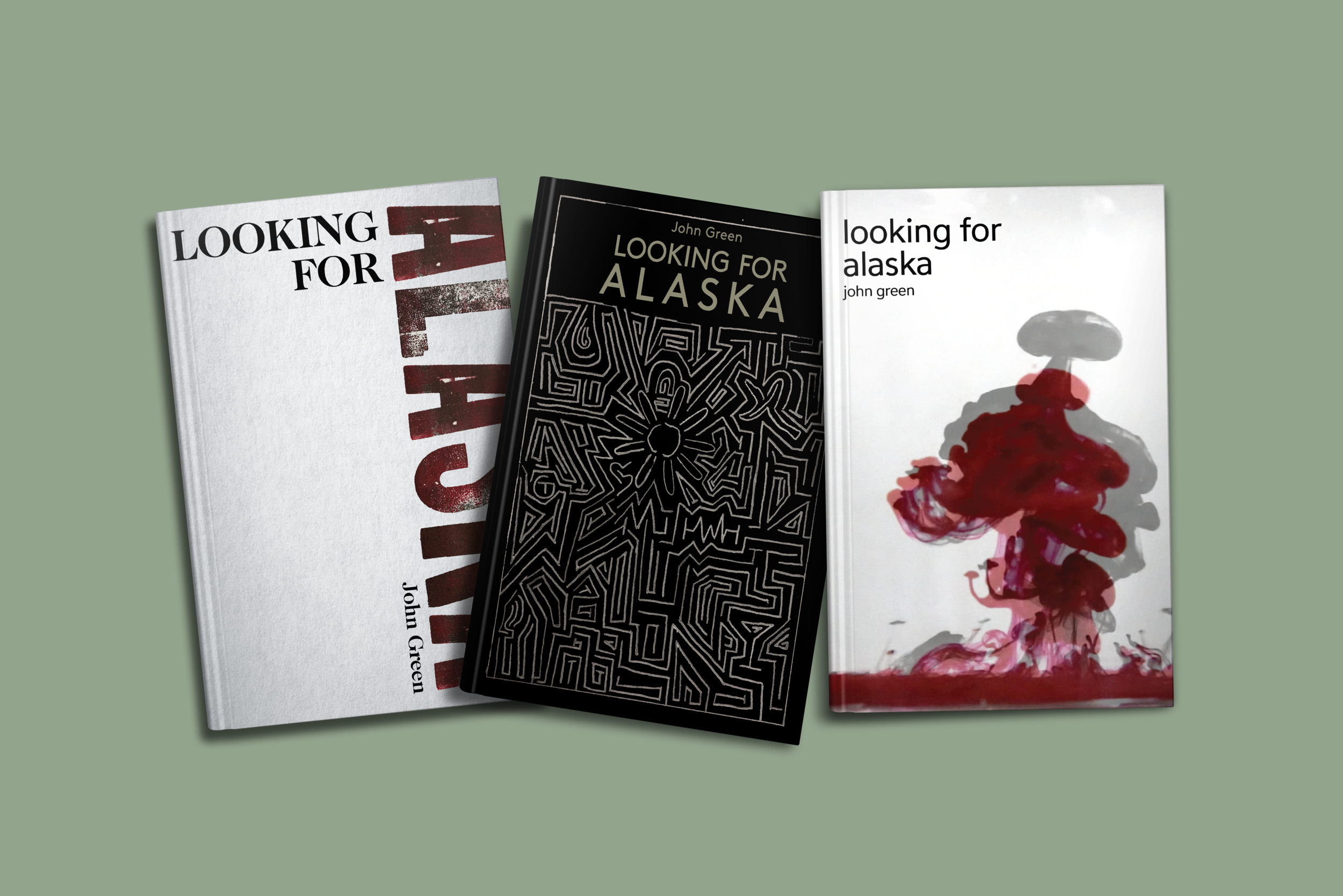
We were asked to design 3 book covers, (same book, different books, or same authors – did not matter), using 3 different methods: letterpress, drawing/illustration, and photography. I chose to do all 3 book covers on Looking for Alaska by John Green.
For the letterpress cover, I wanted big thick condensed type. I had a few different trials of type before settling on the one used below. I chose to have part of "Alaska" off the page to play off of the title. I used the color red to evoke seriousness and mystery.
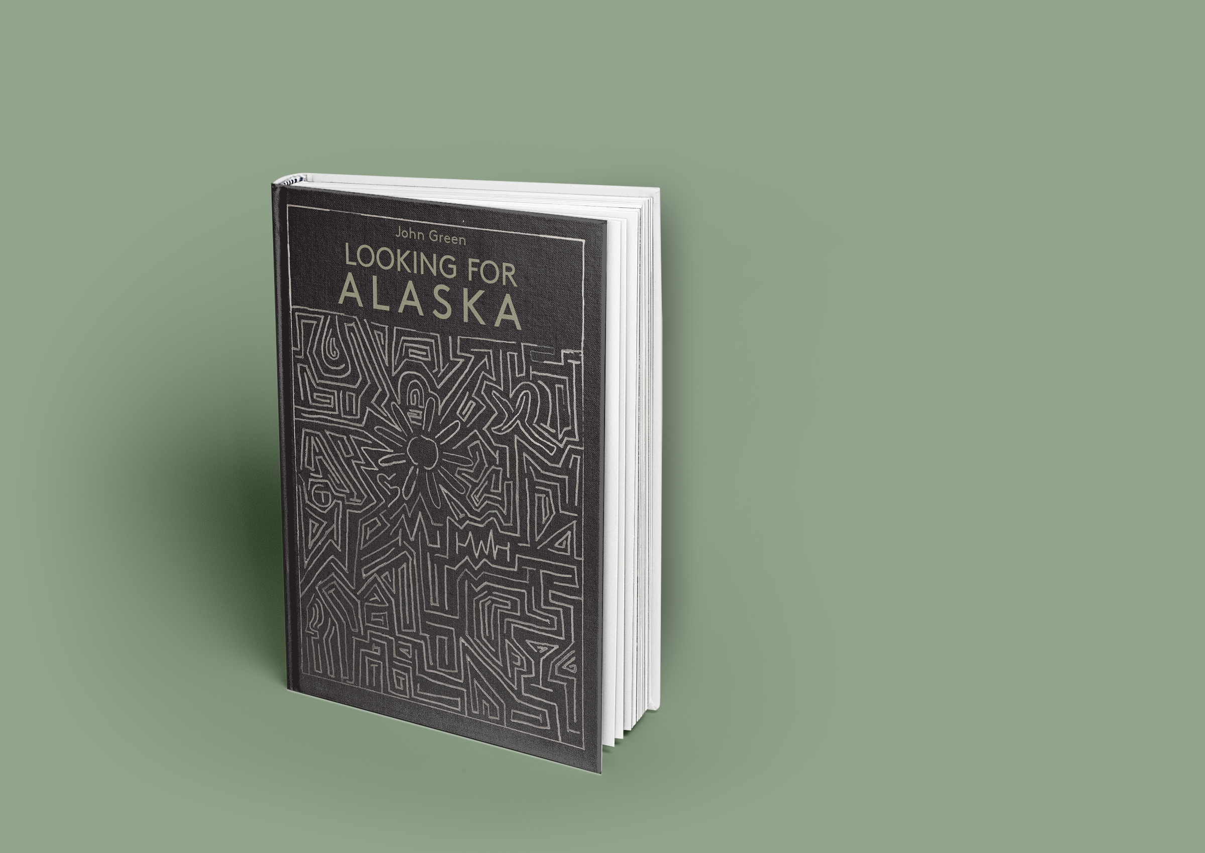
For the illustration cover, I wanted to illustrate a maze with small icons that relate to the book. A maze is an important symbol in the book. I hid a peeled banana, martini glass, water drop, flower, torch, and steering wheel in the maze. These represent themes or things that happened in the book.
For the photograph cover, I wanted to use ink in water to create an exploding image. I had two photos overlap to add dimension. This explosion relates to the main character as she can be impulsive and reckless. I used the color red to evoke seriousness and mystery.
Book Covers


Letterpress Illustration Photography