
Type + Image Design: 3 Book Covers
Taught by Franz Werner at Rhode Island School of Design -- Summer Institute of Graphic Design Studies. 2 week course. Project was 2 days.
We were asked to design 3 book covers, (same book, different books, or same authors -- did not matter), using 3 different methods: letterpress, drawing/illustration, and photography. I chose to do all 3 book covers on Looking for Alaska by John Green.
For the letterpress book, I was going for a darker, sinister feeling by using paint rolls and red type.
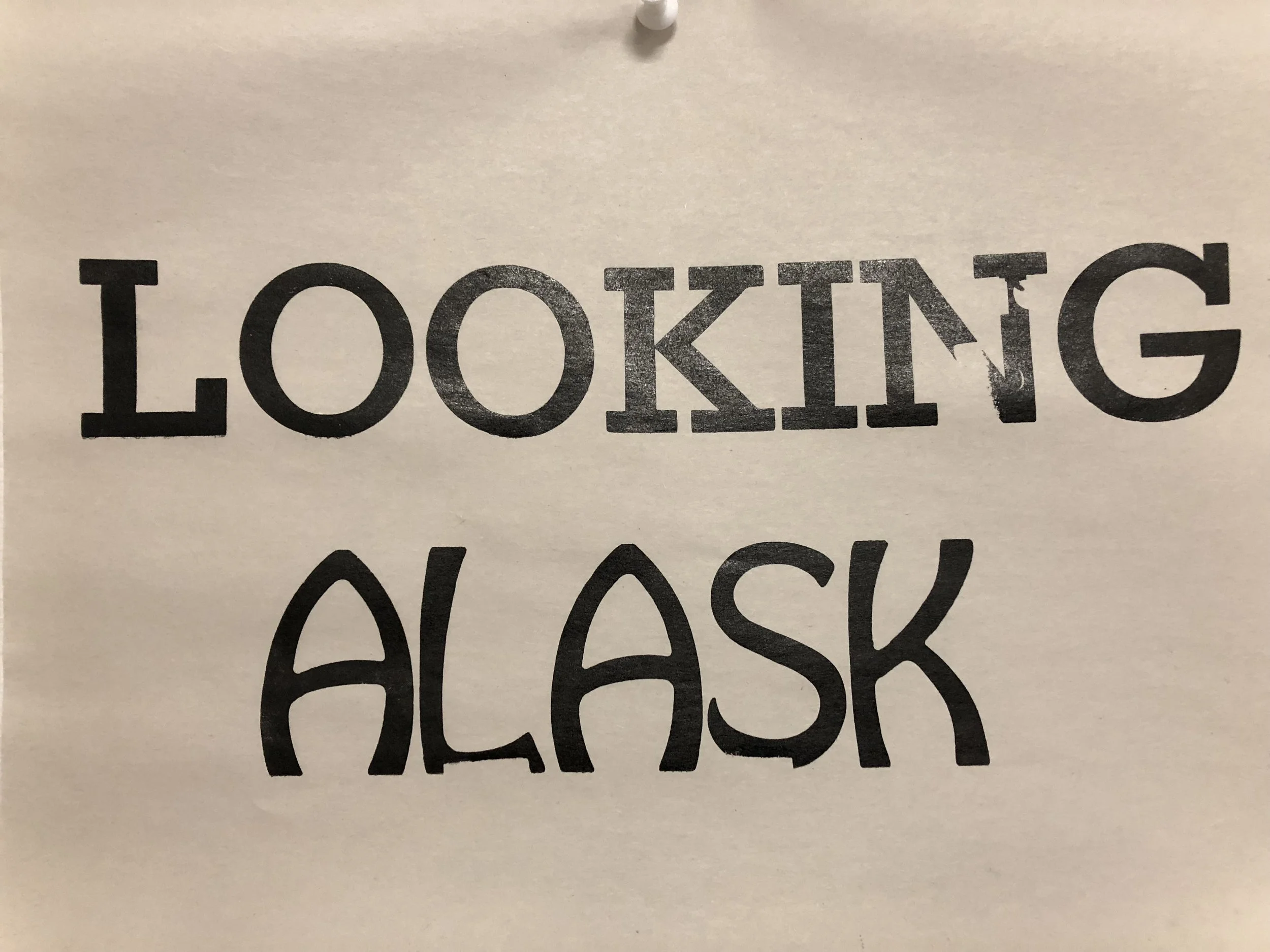
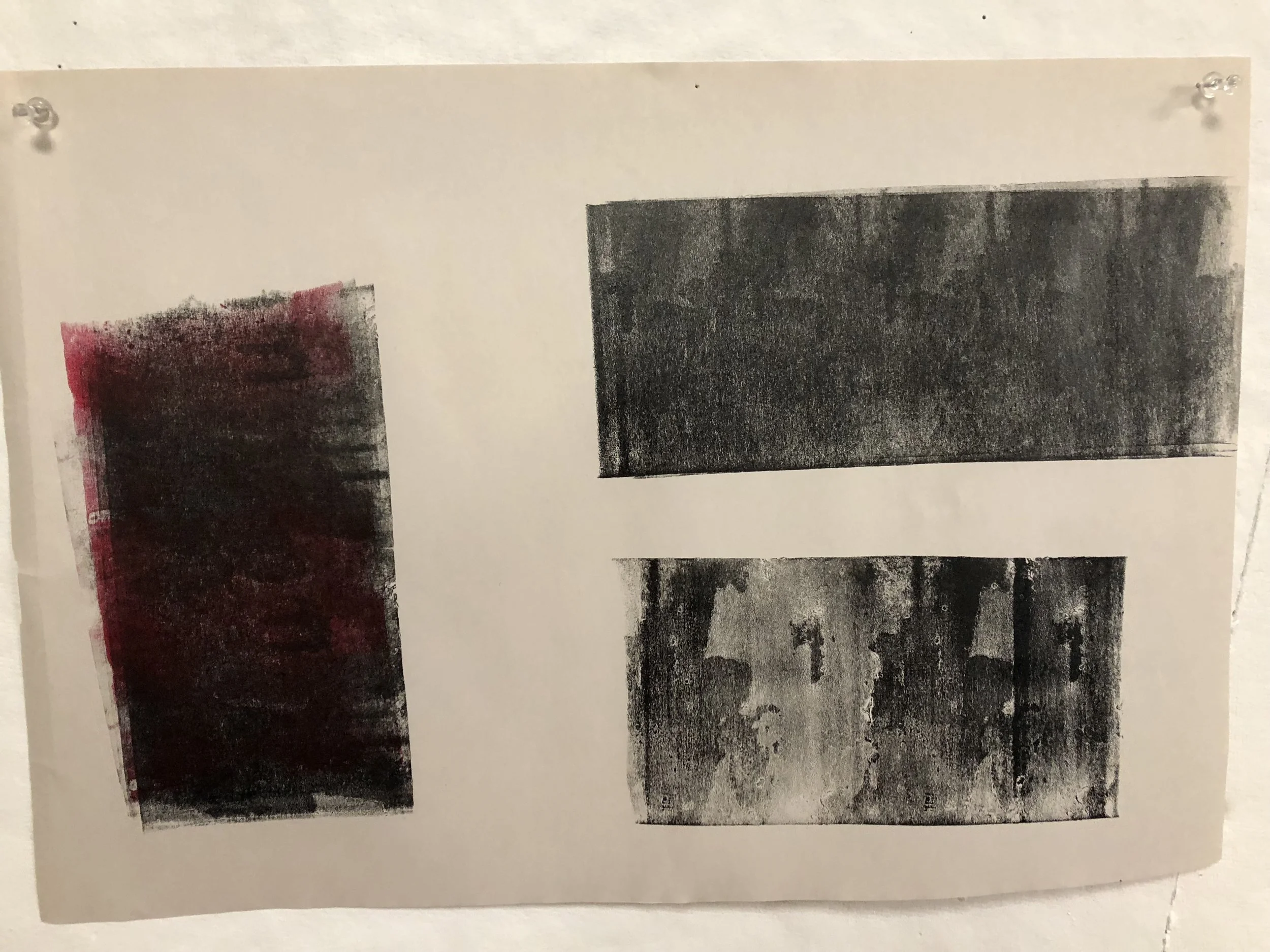
These were some of my letterpress prints. Below was my first concept idea.


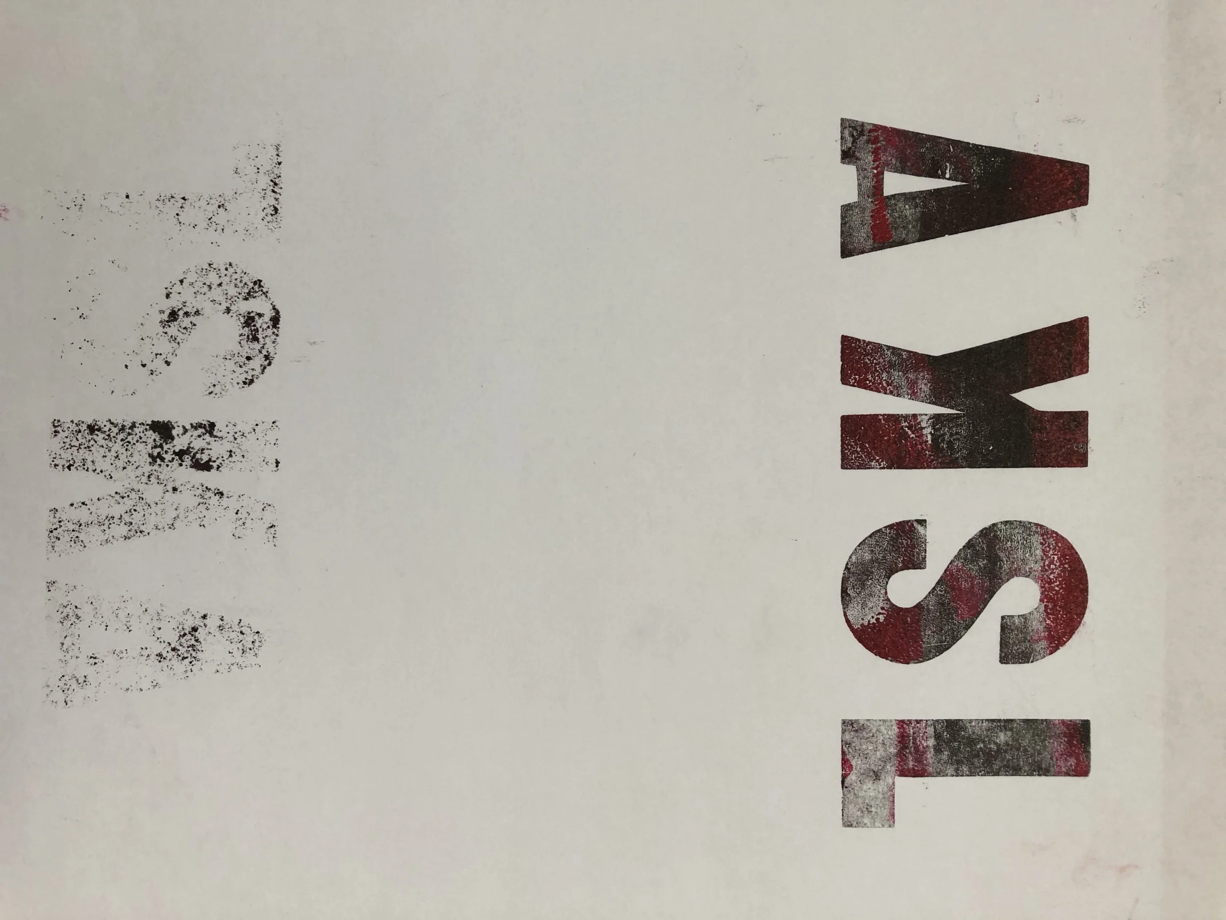
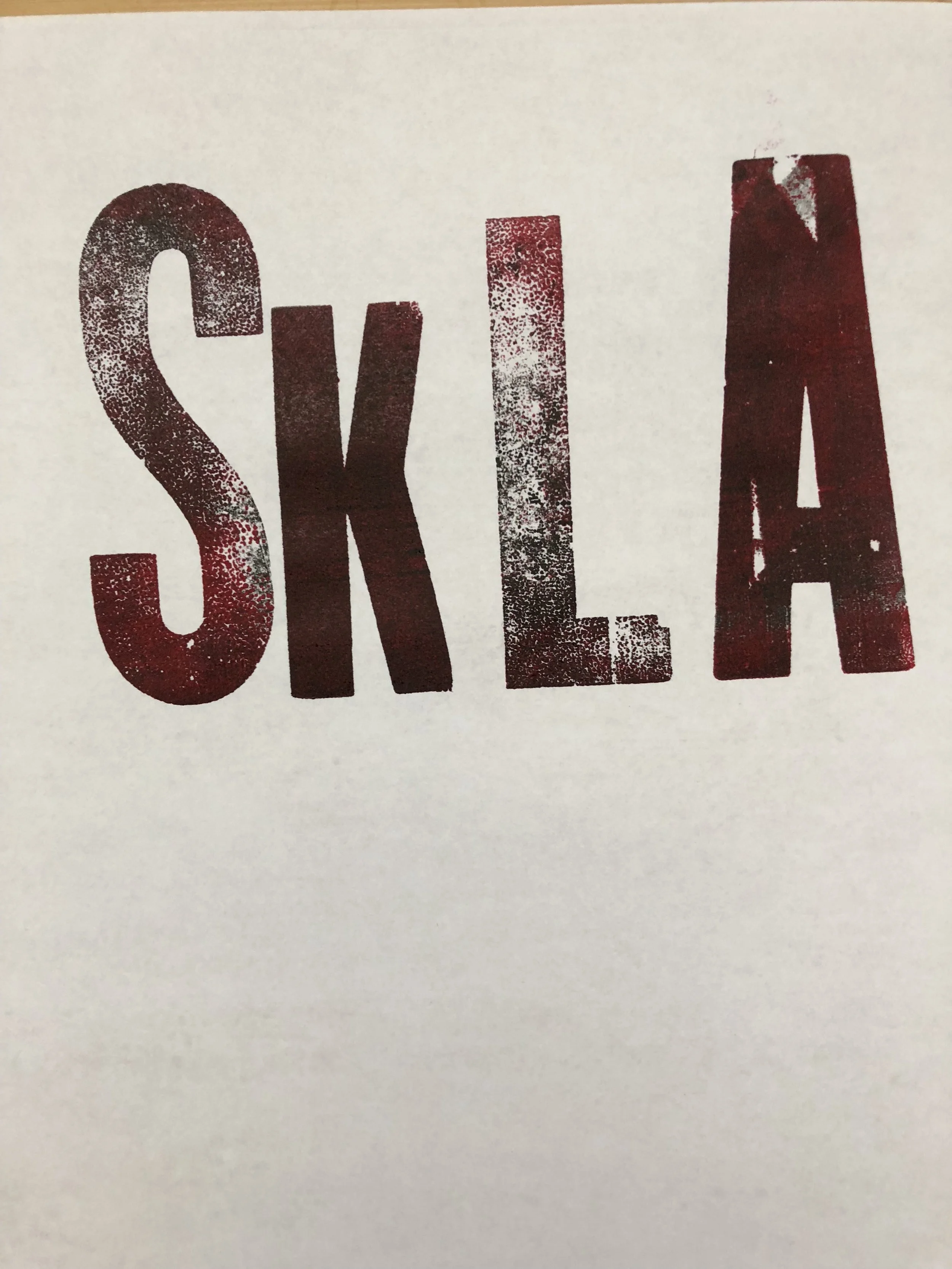
However, the concept was not working very well, so I went back to the letterpress to make some more prints with different type. Here is my final book cover for the letterpress book.
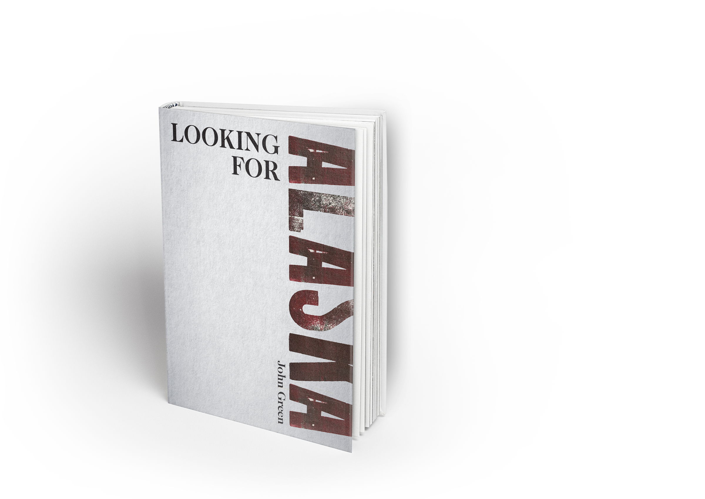
The idea to place part of Alaska off the page was a play on looking for Alaska, the other half of the text.
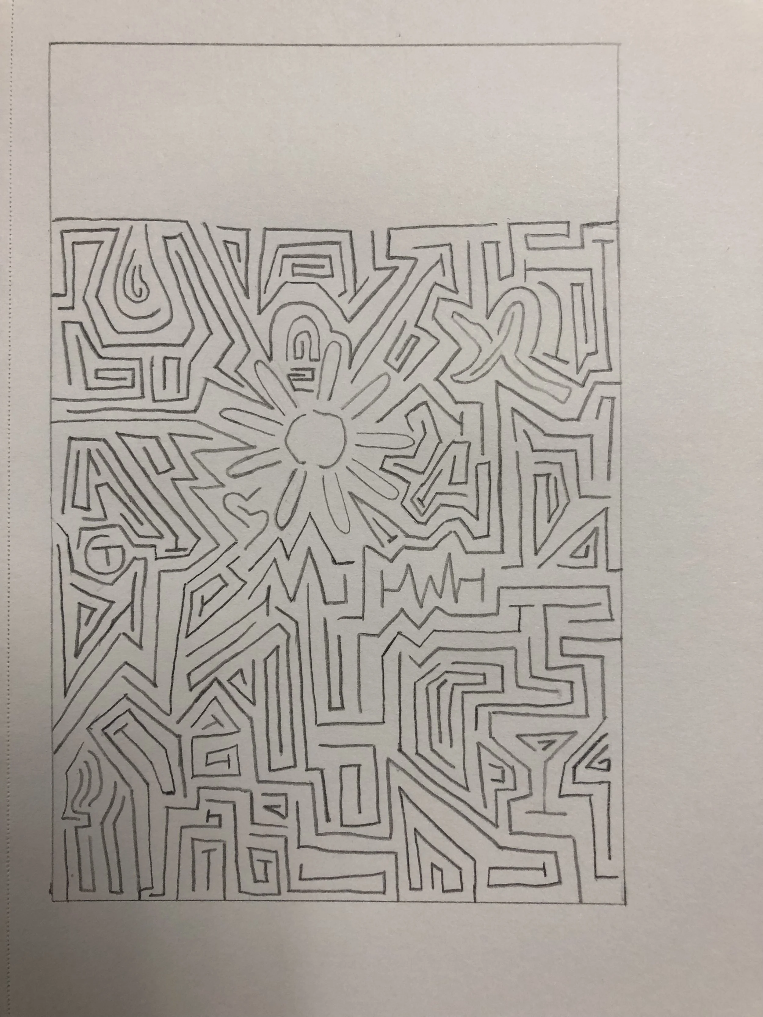
For the drawing/illustration design, I choose to focus on the theme in the book of a labyrinth of suffering. I drew the labyrinth and made an iteration with icons that were important in the book.
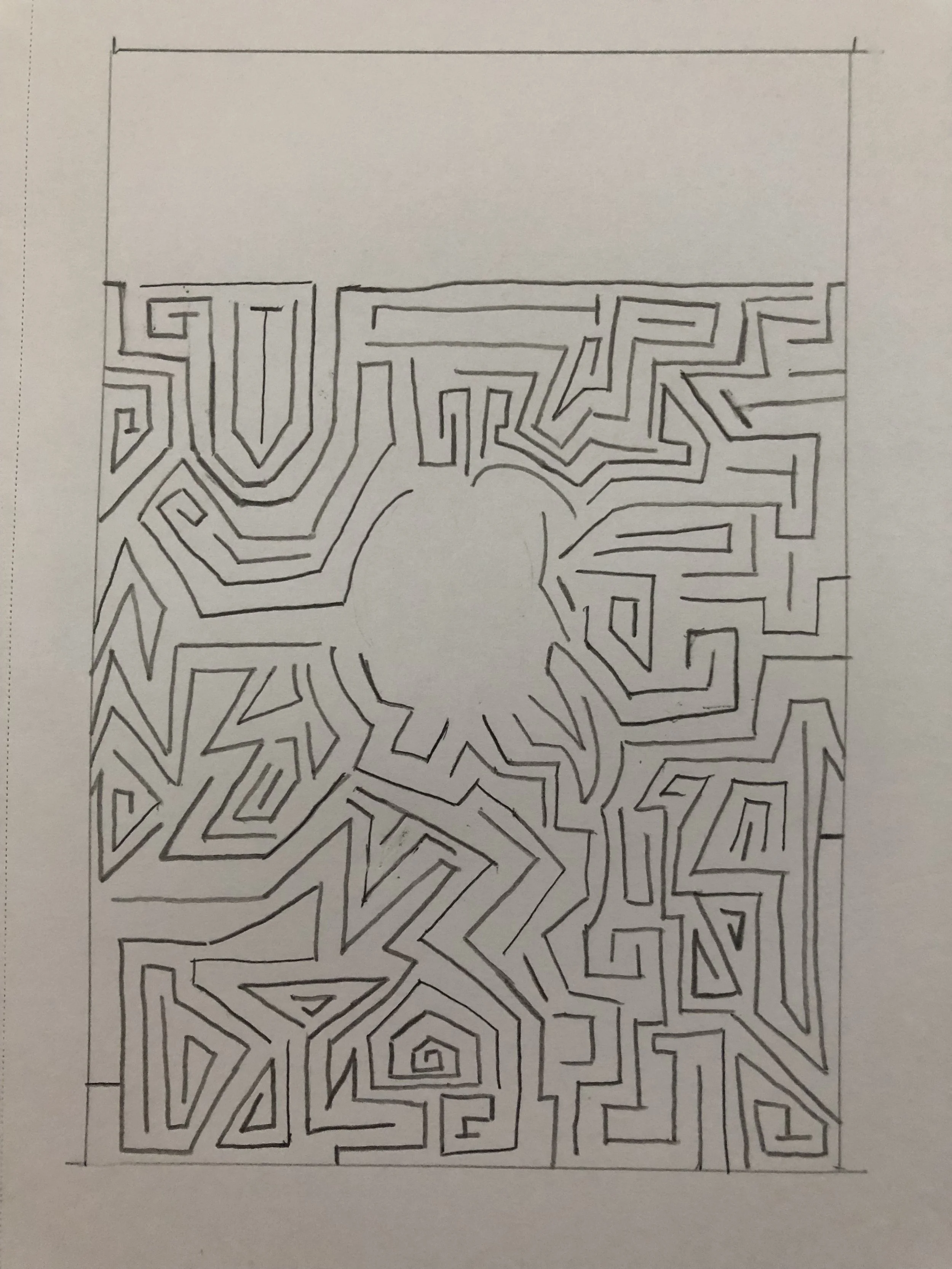
Then I played with the placement of the title and the typefaces.
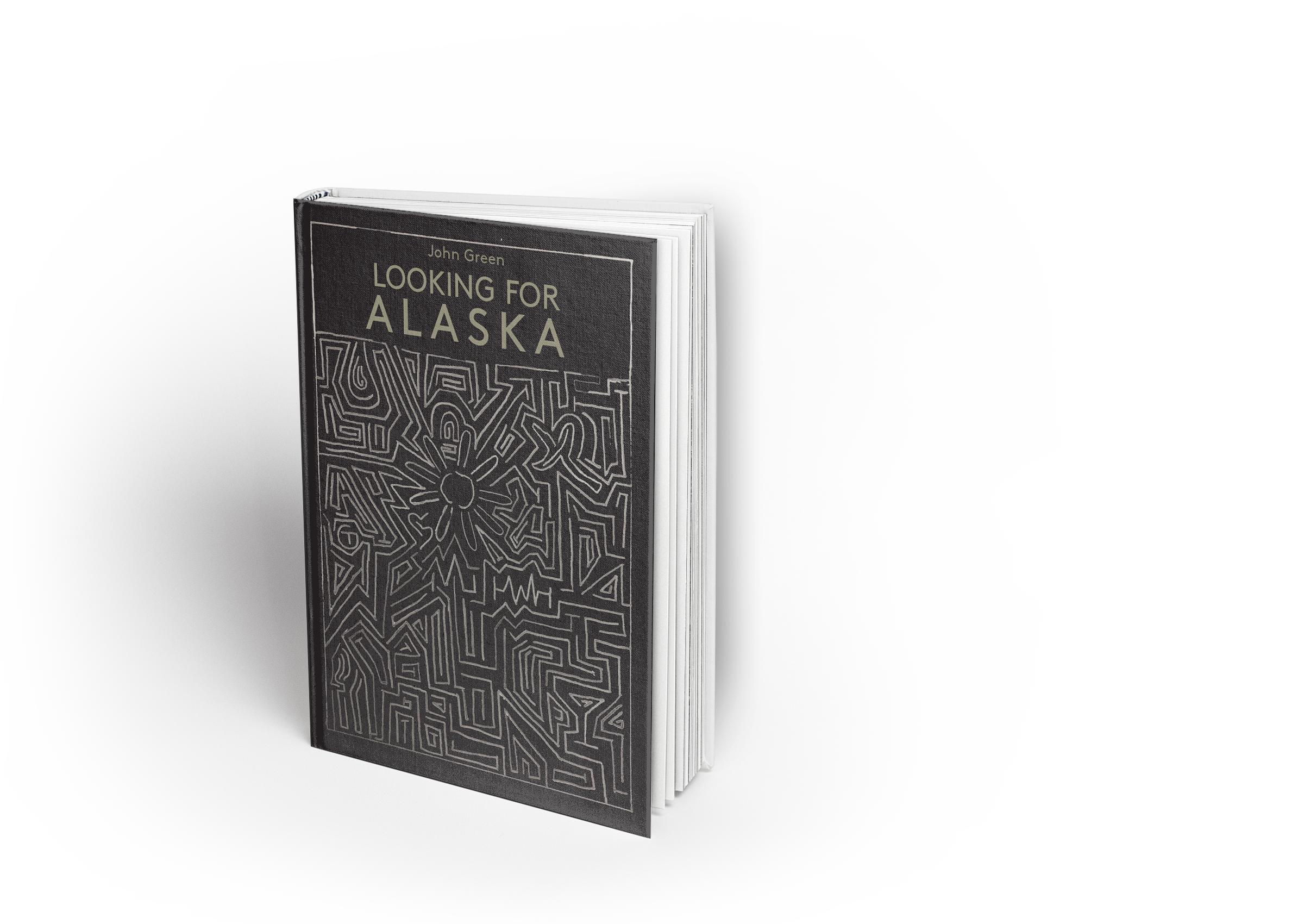
This is my final design. I went with the icon labyrinth to have a little bit lighter feeling.
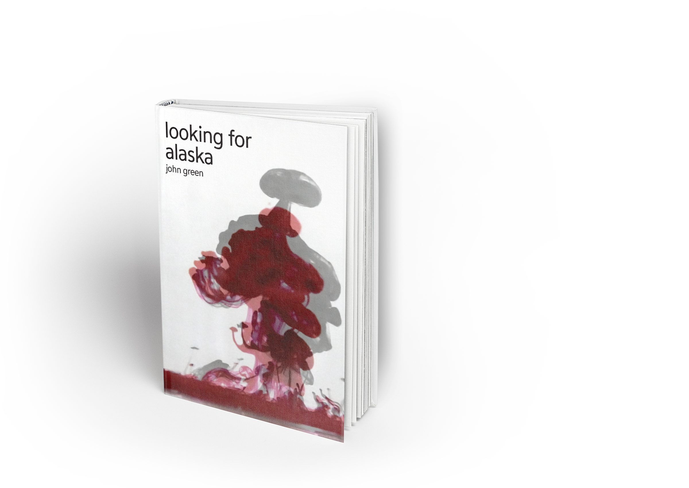
Finally, the photography book cover. Smoke was on the original cover, so I wanted to do something somewhat similar but in a different way. I choose to photograph ink dropping into water as it created a similar smokey effect.


These are some of my iterations.


I choose this one as my final.
Since this project was 2 days long, the focus was more on generating ideas and learning that there are different methods to creating designs (not just doing everything on the computer), rather than making perfect book cover designs.