
Type + Image Design: Promotional Typeface Postcard
Taught by Franz Werner at Rhode Island School of Design -- Summer Institute of Graphic Design Studies. 2 week course. Project was 3 days.
For this project, we had to choose a typeface and research all about it. Then we were asked to create a promotional postcard that showcases something about the typeface, designer, history, etc. I chose Avenir.
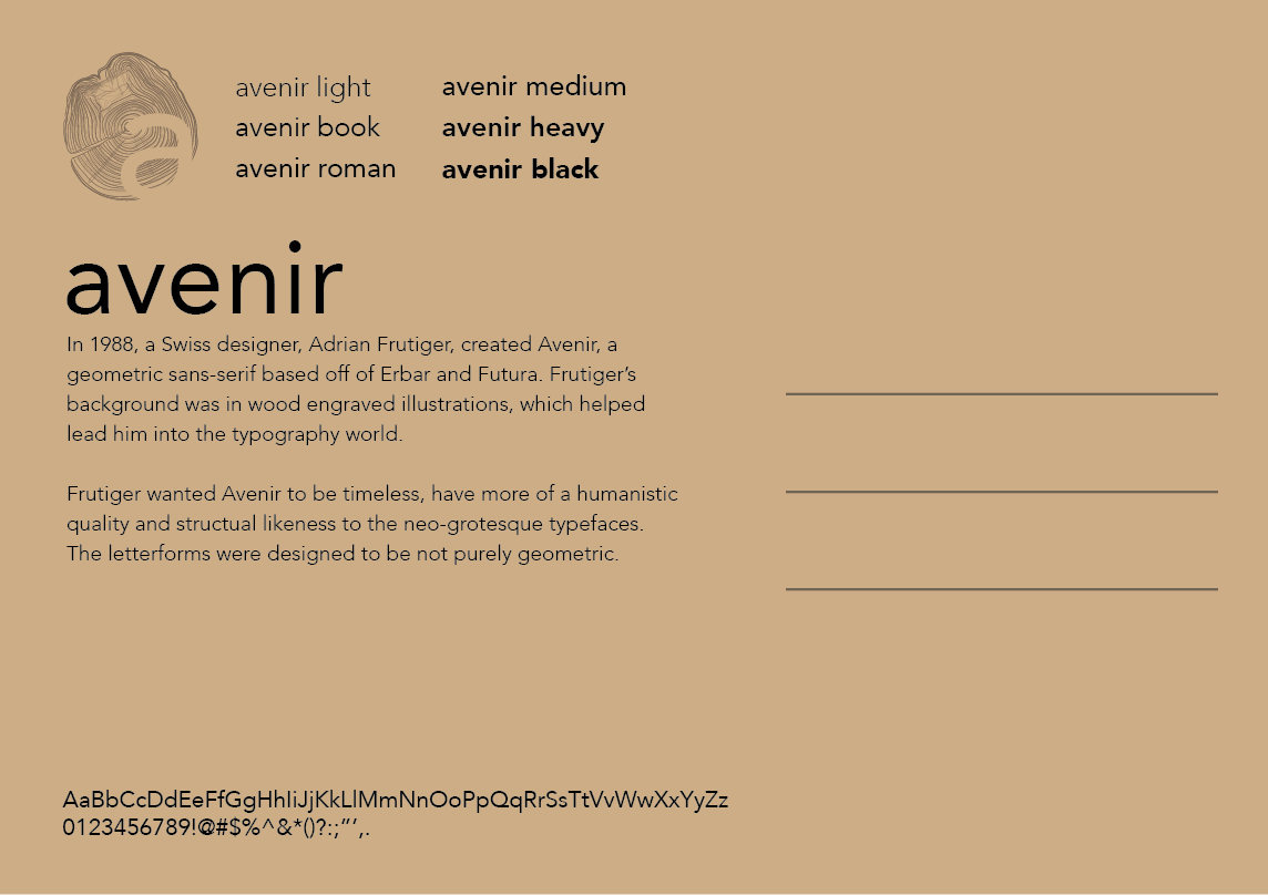
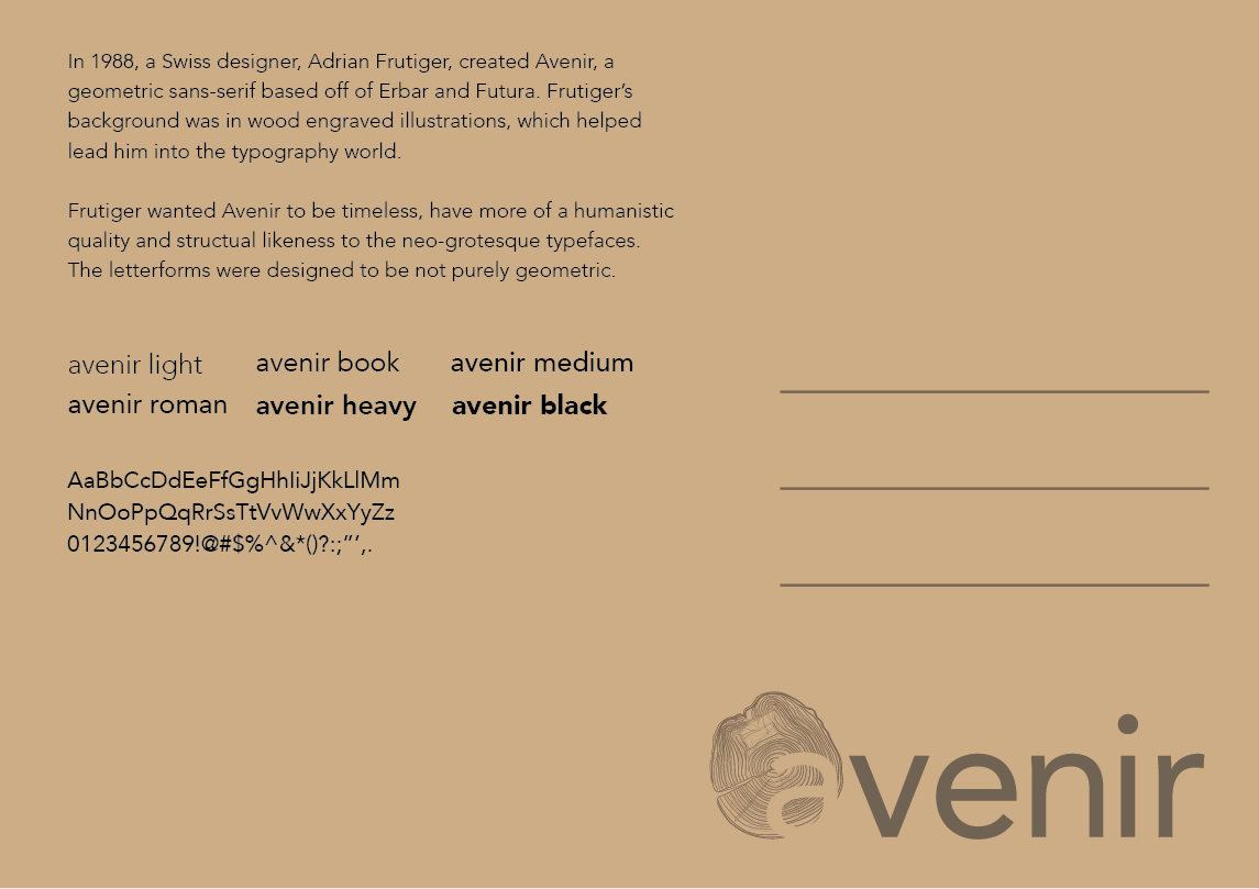
This was my research on Avenir.
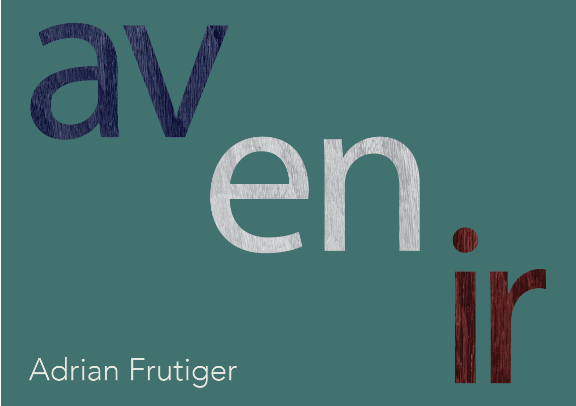


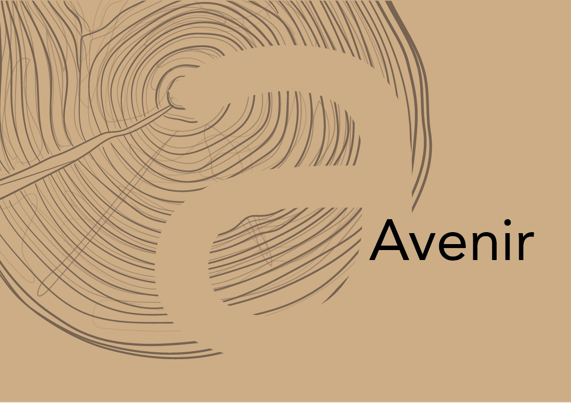
At first I was bouncing around too much with several different concepts I was trying to represent, so I decided to only focus on the fact that the type designer, Adrian Frutiger, was a wood illustration engraver.


I decided to go with a grid of different colors and weights of Avenir because it is used widely for many different things (advertising, corporate identity, signage, etc). The wood ring is suppose to represent Frutiger's background in wood engraving.