Identity Design + Branding: art2connect
Taught by Donald Tarallo at Rhode Island School of Design -- Summer Institute of Graphic Design Studies. 2 week course.
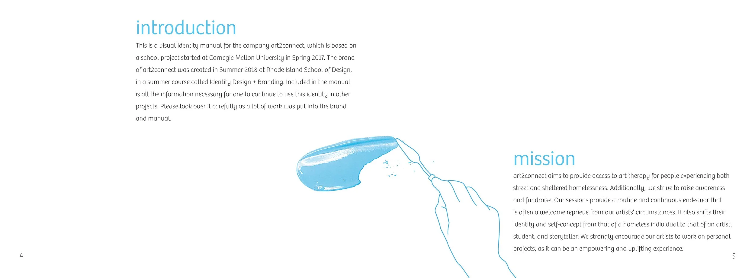
After the monogram exercise, we were asked to make up a company to design an identity for them. I decided to choose use a project that I am working on now as my company, but tweak what they do a little bit. My company was called art2connect and they provide the homeless with art therapy sessions that allow them to express themselves through creative means.
First, we were asked come up with some key words that described our company and then create a mood (inspiration) board. My keywords were positive, optimistic, encouraging, fun, connecting, sharing/storytelling, individualism, uplifting, open, expressive, empowering, gender neutral, and respect.


Next, we had to try our company name in 10 different typefaces to see which ones stood out to us.
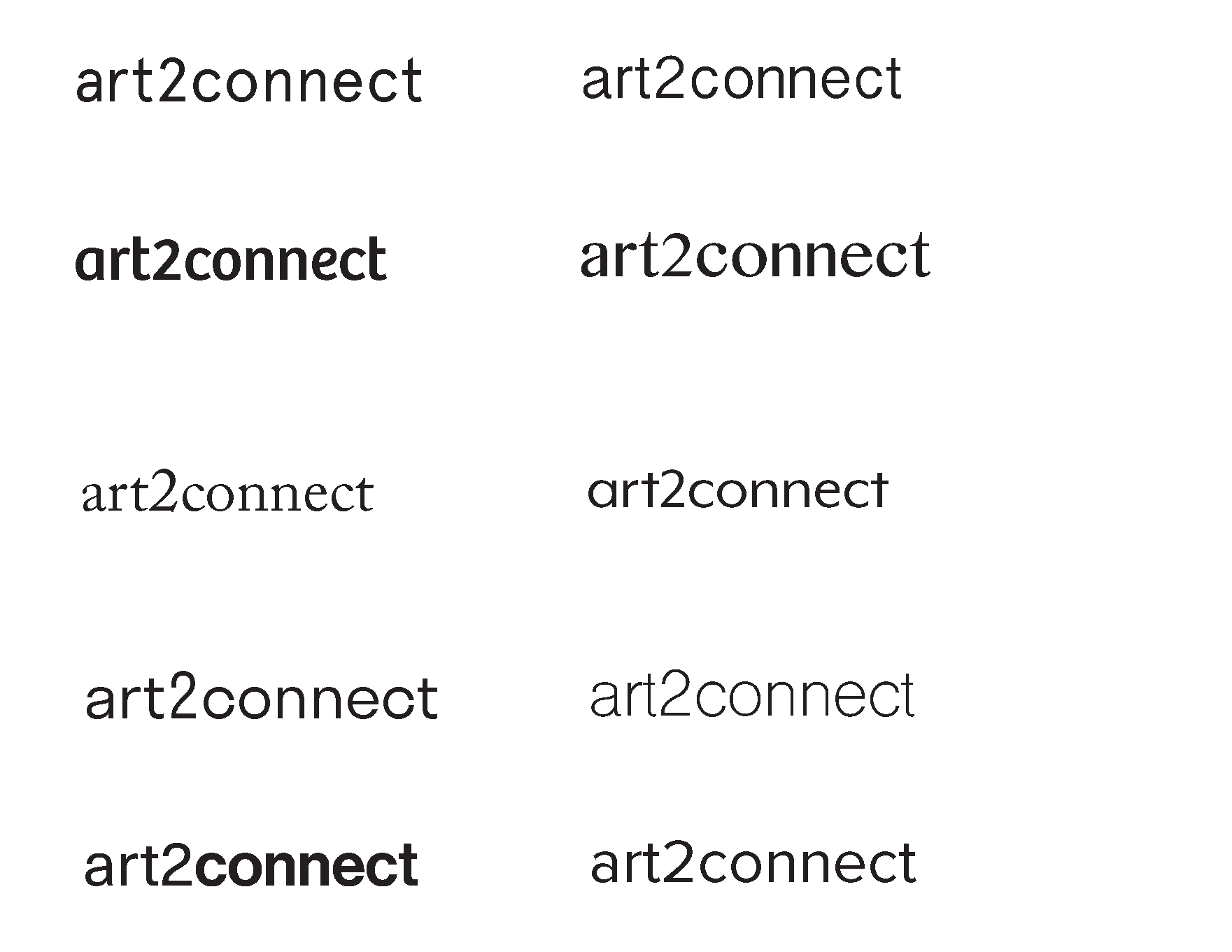
I ended up choosing the typeface Bree regular (2nd down on the left column) because it felt playful, yet had handwritten qualities. From here, I went through lots of iterations of the the logo. Here are a few.
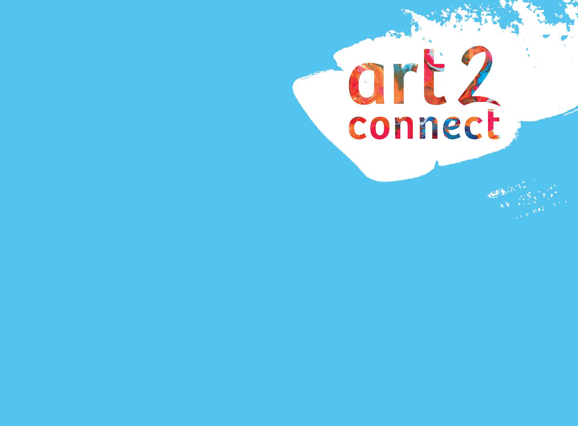
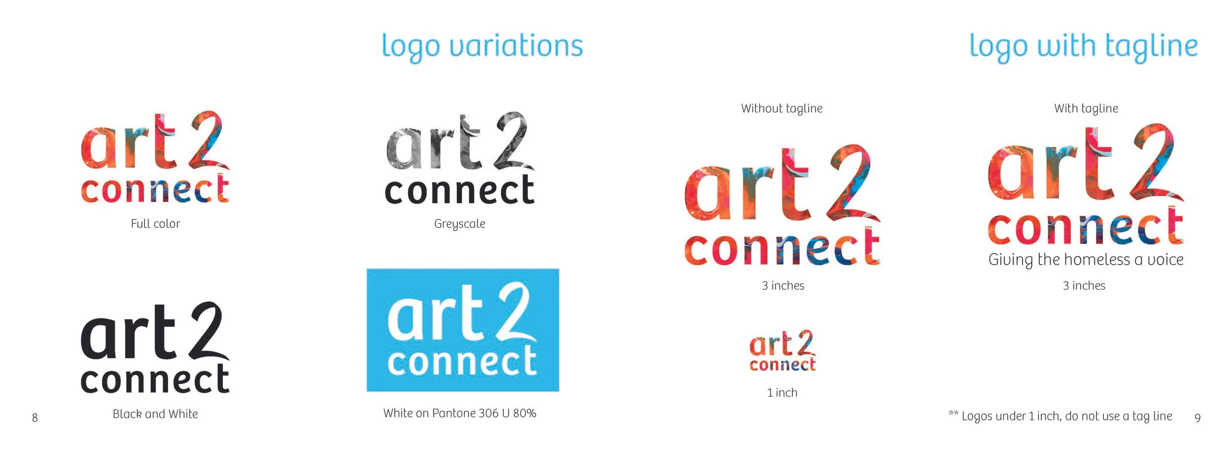
This is the final logo I came up with. It felt fun, inviting, and optimistic.
**Note: This was inspired by the FUN on my mood board.
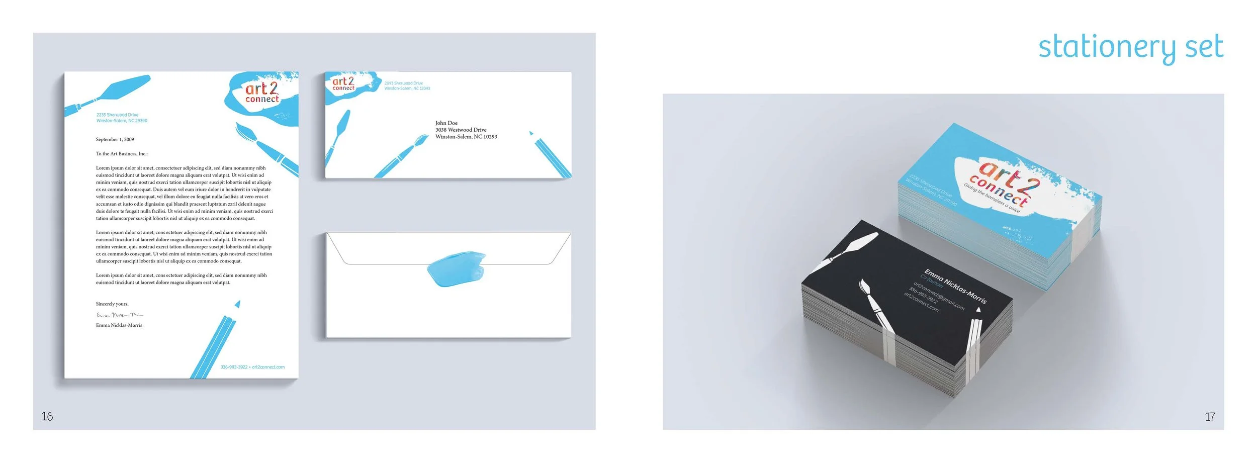
The stationery set came next. We started with the business card, then the letterhead, and finally the envelope. All three had to coexist together and look like they are a set. These are some of my iterations.


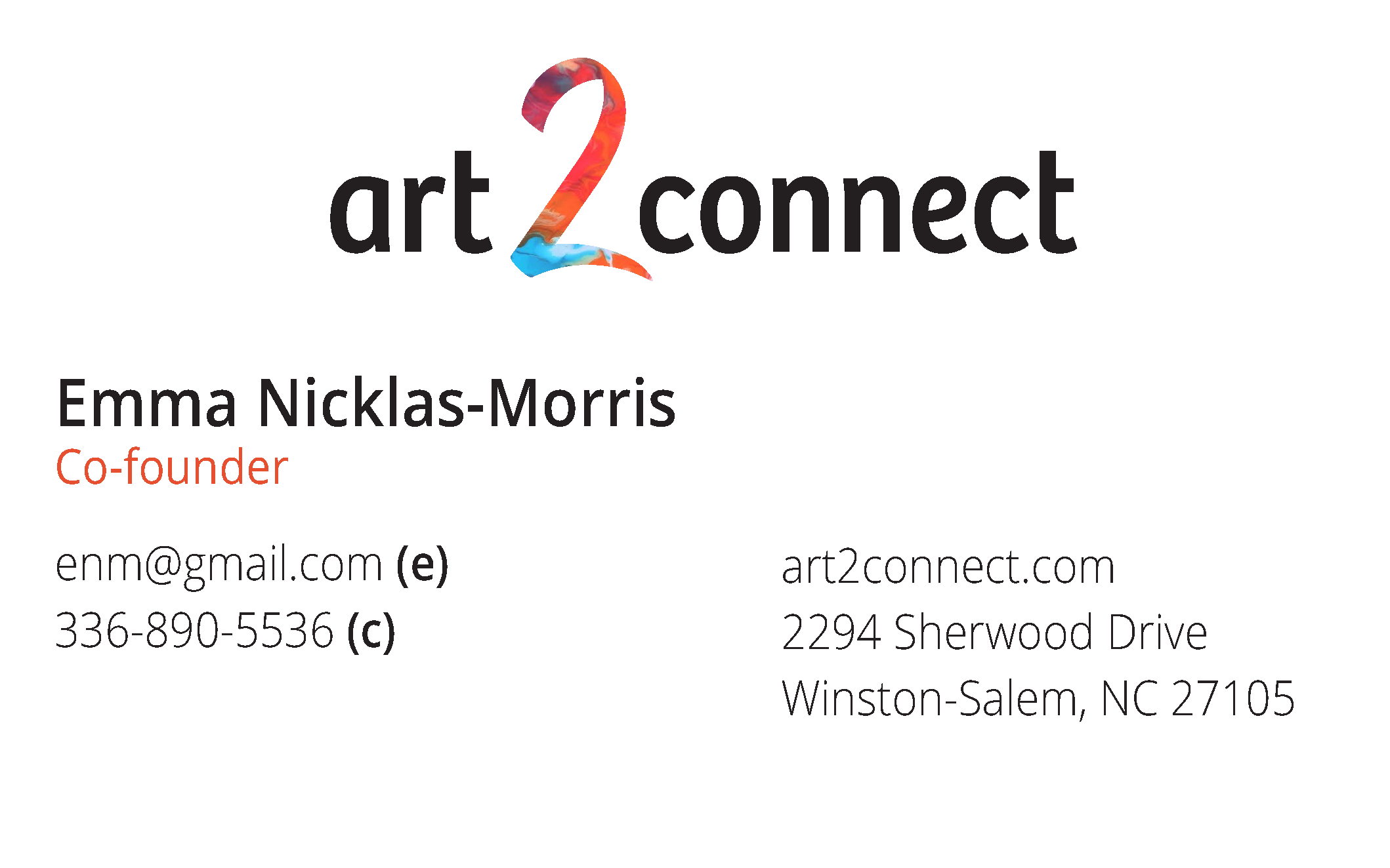

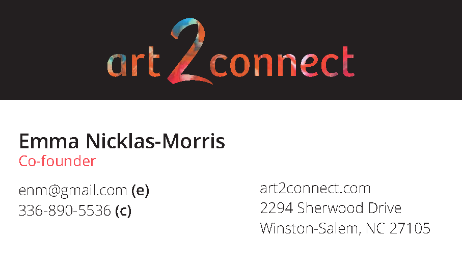


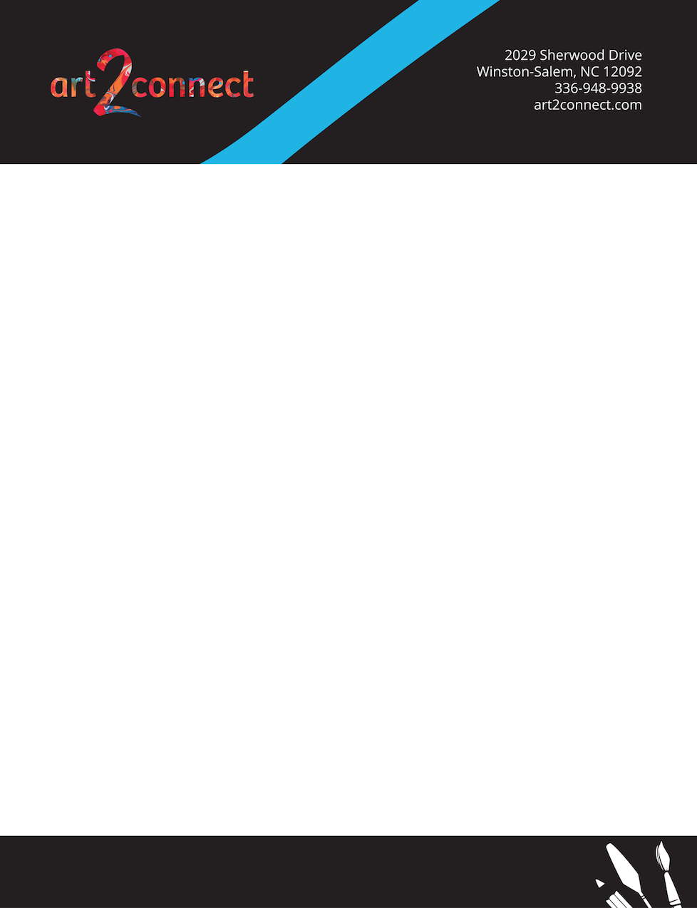

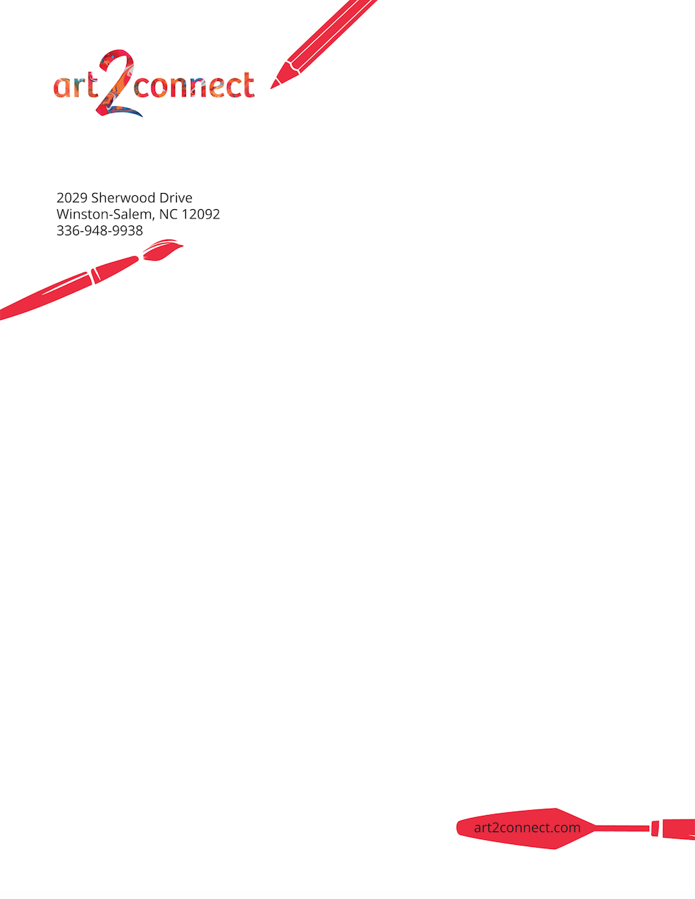
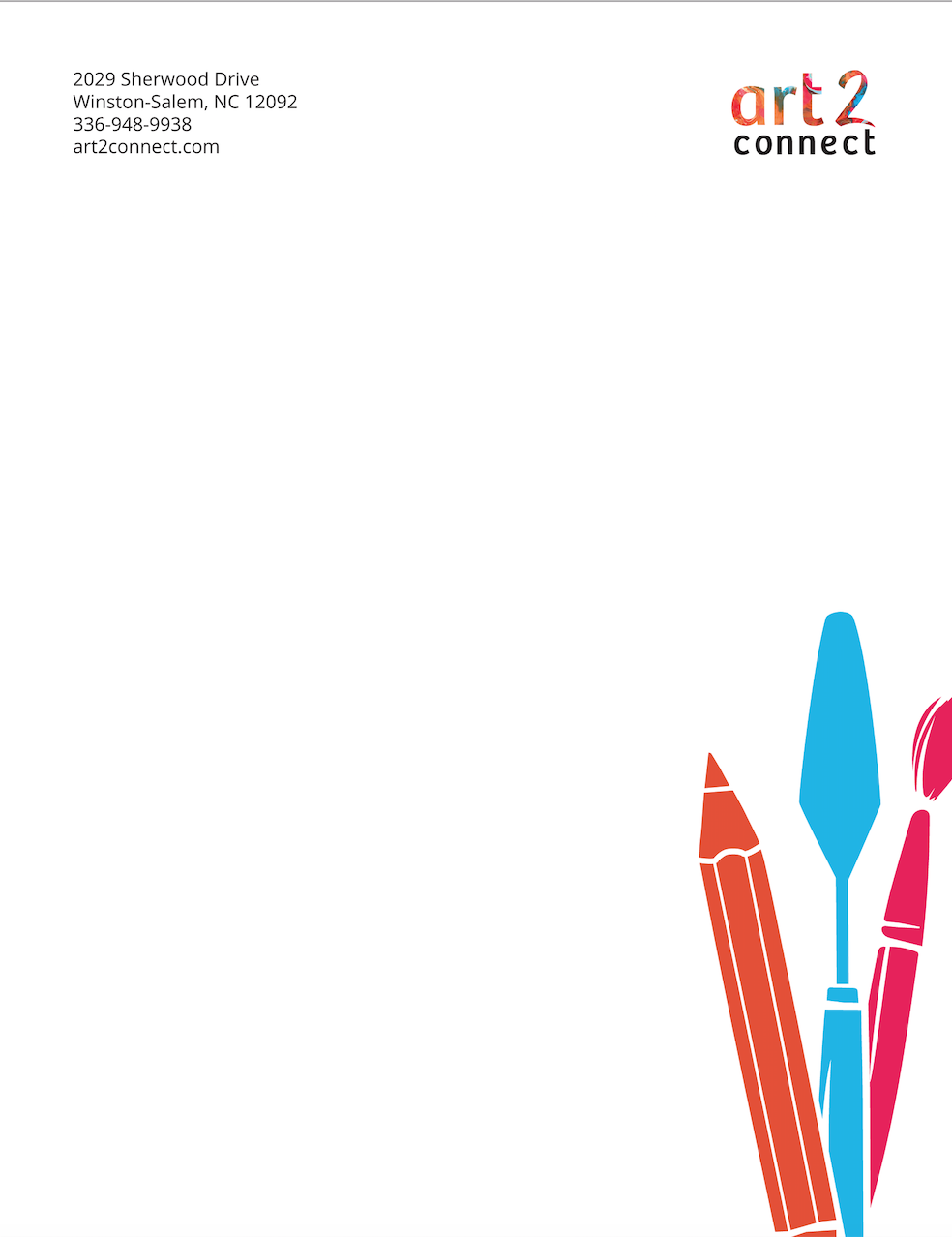
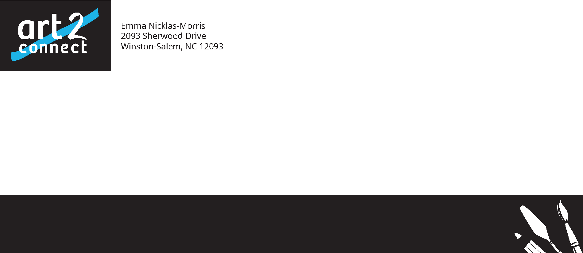
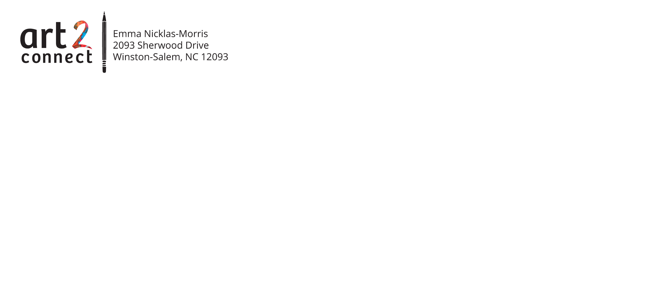
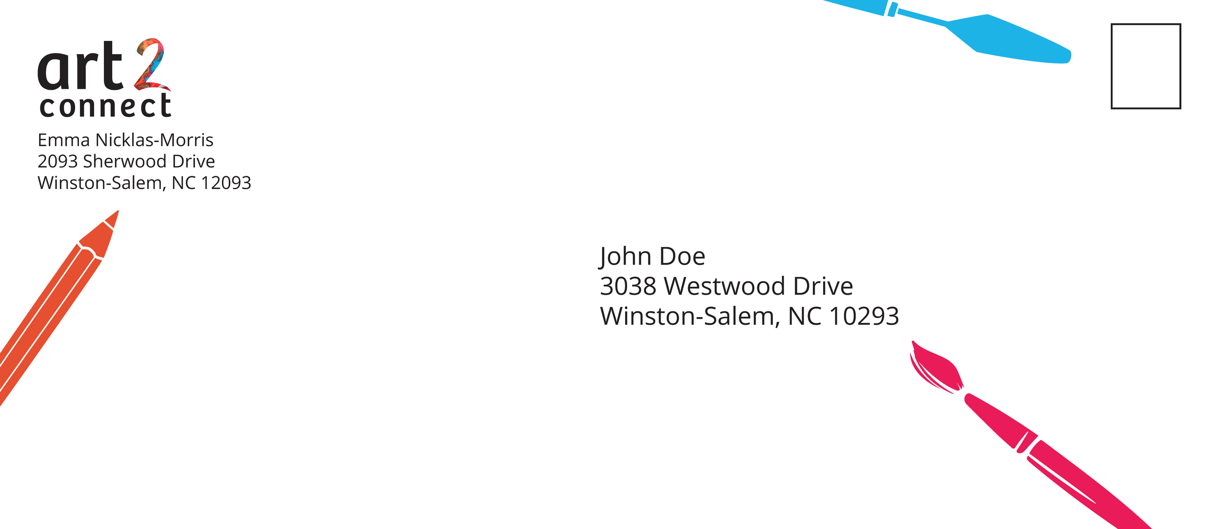
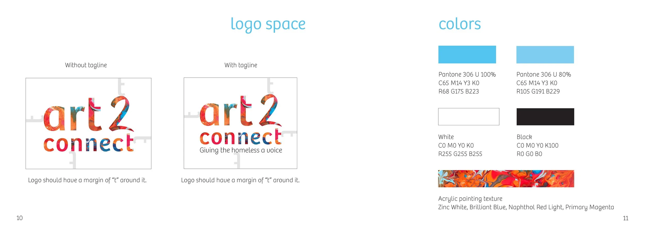
I decided to settle on black background business cards with blue highlights, and blue tools on the letterhead and envelope. Then, I had to fine tune this concept more.
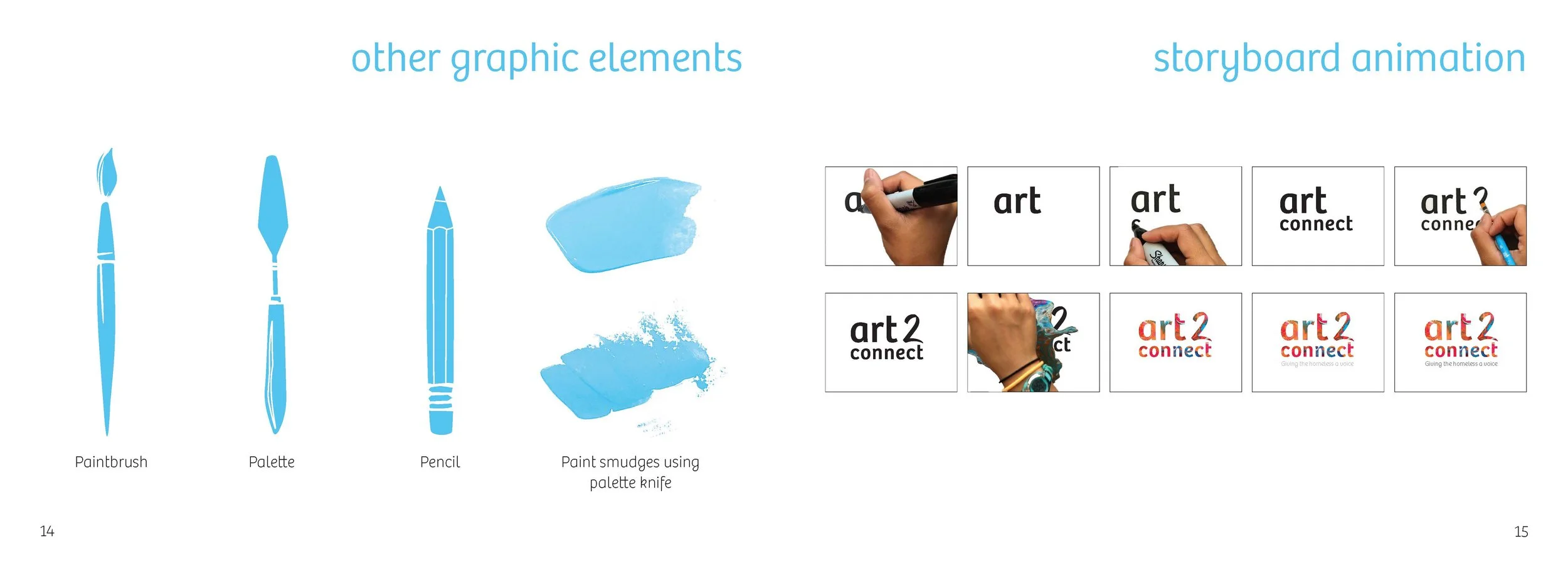
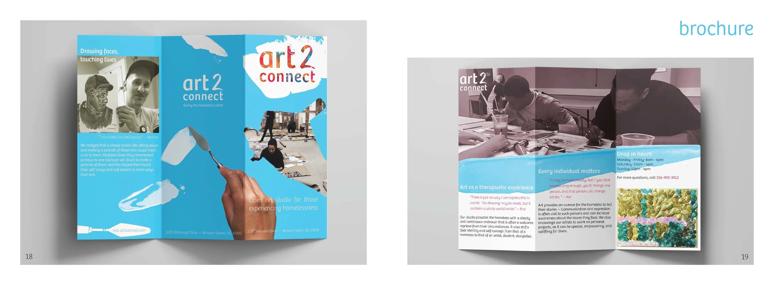
After finishing the stationery set, we had to work on a storyboard animation and an extra element such as a website. I decided to make a brochure, as it was more relevant to my company.
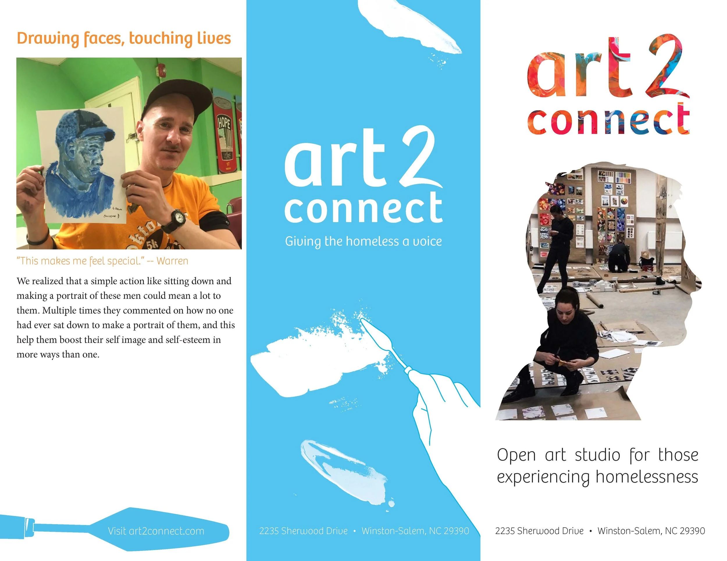
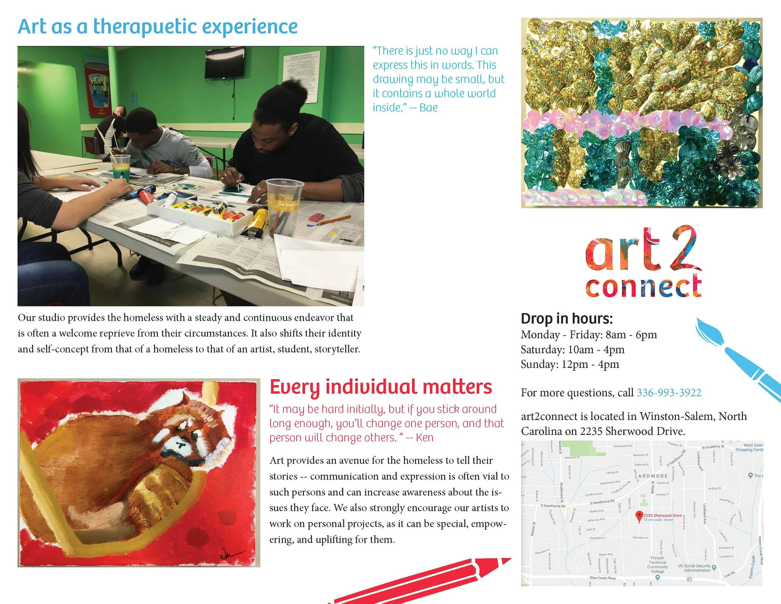
This was my first try at a brochure. I have never designed a brochure before.
Finally, we had to put all of our work into an identity manual, which described the identity and outlined the do's and don't when using the brand. These are a few pages from identity manual.

I learned a lot about identity design and branding, such as the keywords are important when designing because it helps to keep the designs focused.
My final design concept went with a more authentic look by using real paint smudges. It could be pushed further to incorporate more about the homeless or empowerment.