Identity Design + Branding: Monogram
Taught by Donald Tarallo at Rhode Island School of Design -- Summer Institute of Graphic Design Studies. 2 week course.
In this course, we began with a short exercise to design our monogram. We were asked to think about ourselves and try to portray some key words that describe us in our monogram. I am a simple, very calm girl and a reliable person.


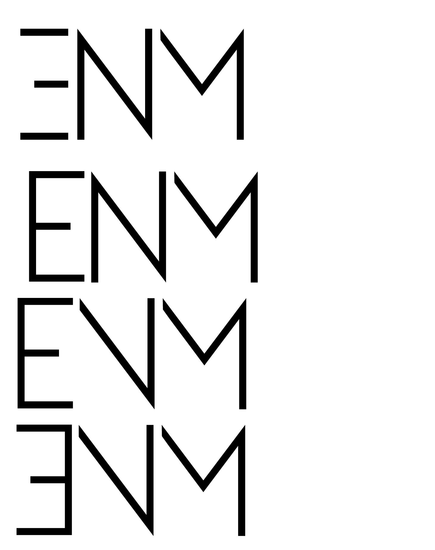

These were my first iterations. We were required to come up with at least 25 different ideas. I choose thin san serif typefaces because they are more simple and soft against the eyes.


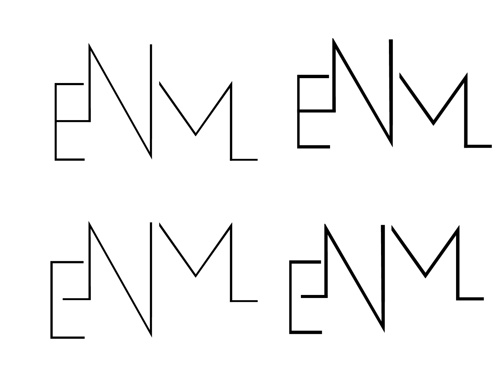


Here, I began to settle on one concept and try different iterations before beginning to finalized my monogram.
This was my final monogram. The idea behind it was it looks like a heart beat monitor pulse which I think of as something that is steady and almost calming. I am an even-keeled person and a person that can be trusted and counted on, so I thought this related to me.