Wildfire Internship (2019)
Worked at an advertising agency in Winston-Salem, NC. These are my exploration and ideas on client projects, including a print design project.
Rpharmy
Client needed a logo for his new business in pharmaceuticals. Because the budget was small, I was asked to only explore wordmarks. Preference on colors was blue or green.
Most of my iteration and exploration was through type studies. I looked into typefaces that felt pharmaceutical and explored the different type families. I was most drawn to san serif types that had varied weights to create contrast.
Some of my exploration of typefaces
After many iterations, my supervisor said he would show three of my best designs to the client. I liked the thick slab serif as it felt bold. The serif type felt delicate and by using color to call out the "r" to help pronunciation of Rpharmy. The san serif type is simple and clean. I used different weights to call the "r" out. All three chosen were very different to give the client a variety of options.
These were the three wordmarks I created shown to the client
This was the final wordmark chosen by the client.
AMS - Retail Solutions
Brief was to create 3 posters for AMS 20th celebration. Each poster had a theme: driving force, own your success, celebrate. I was able to use their shutterstock account for illustrations and images.
Driving Force
I wanted to use images of the employees to show that this company is now powered by their people. I chose to use overlays to incorporate brand colors and allow the people to still shine through.
Own Your Success
I took inspiration from Swiss design to make the poster simple and open. I chose to have the heading big to draw people in and used their brand colors to tie it to the company.
Celebrate
I used shutterstock's pre-created templates and images to make a celebratory poster. With full shutterstock access, and this being my first time with full access, I wanted to explore the route of using pre-created graphics. I chose templates that elicited excitement and celebration.
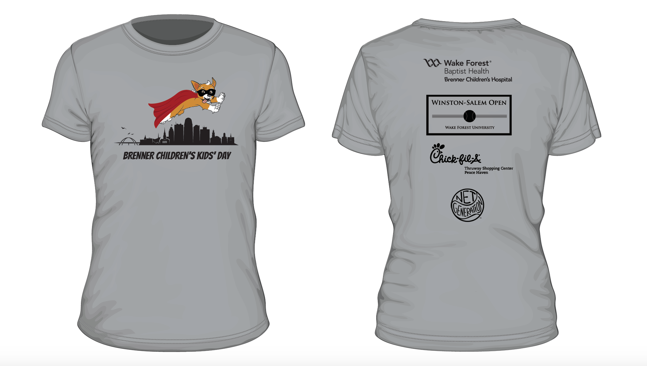
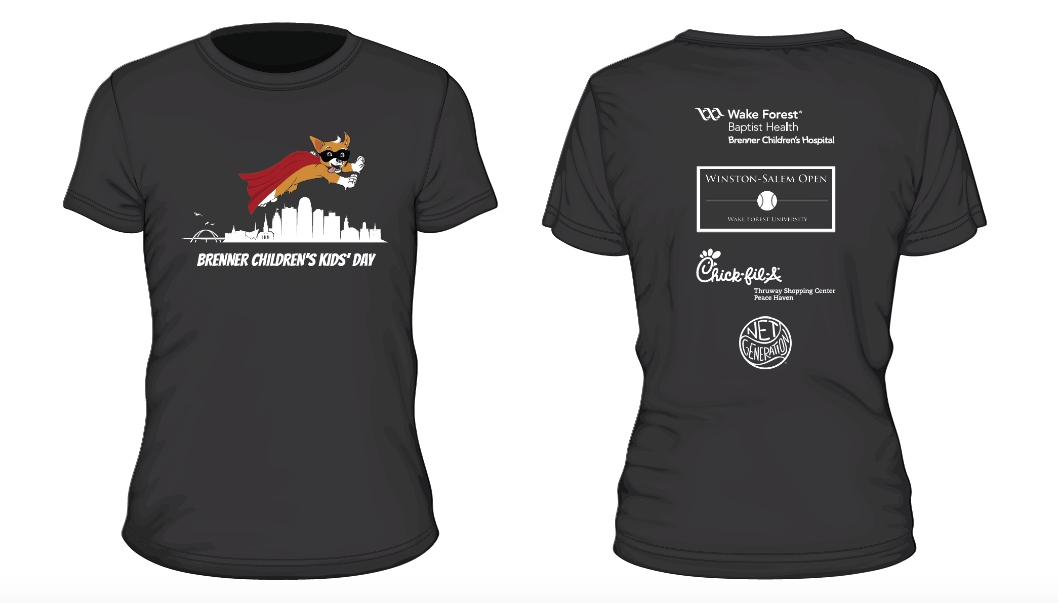
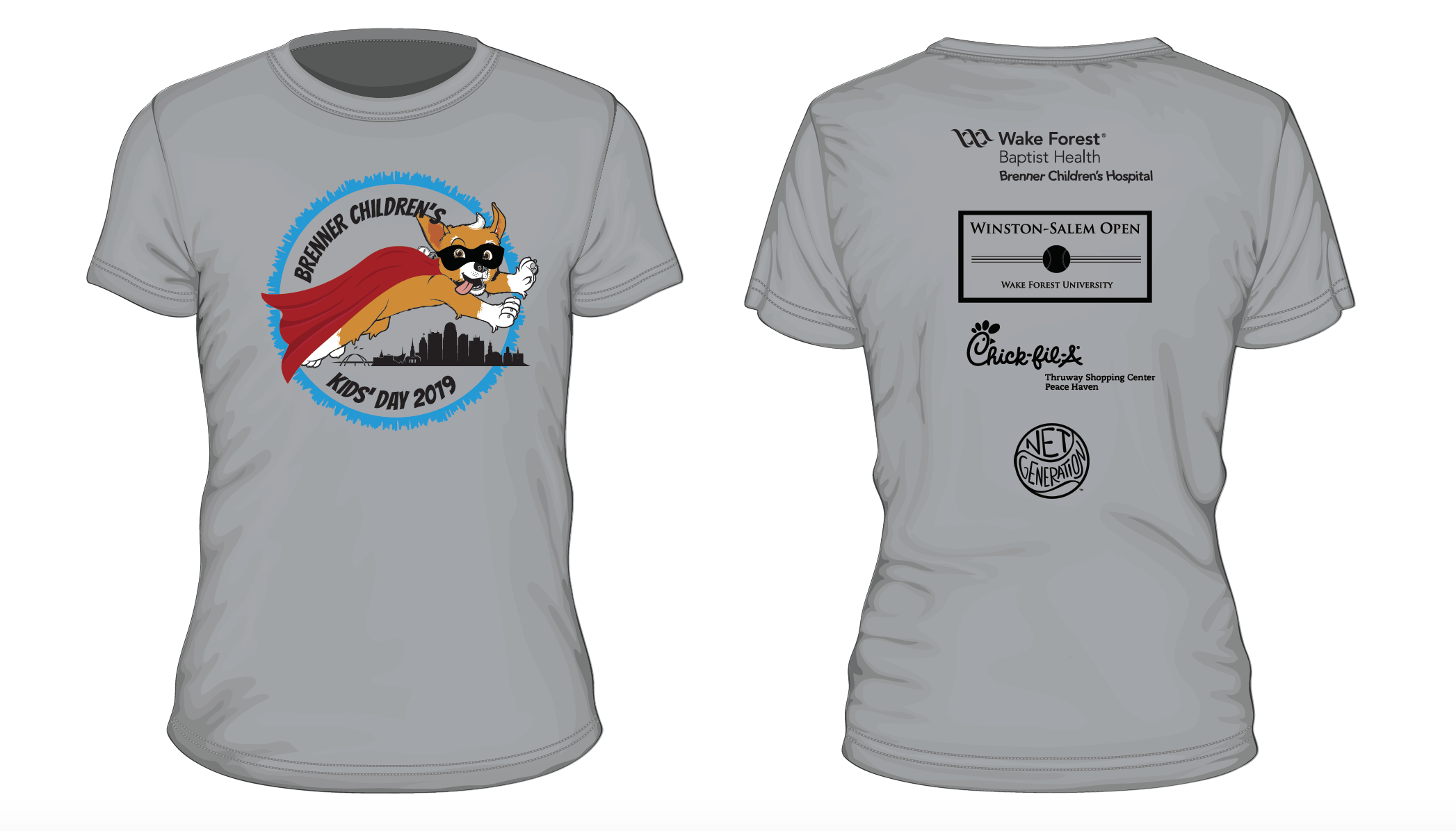
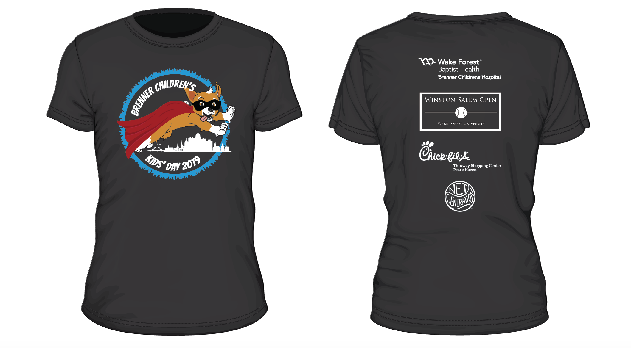
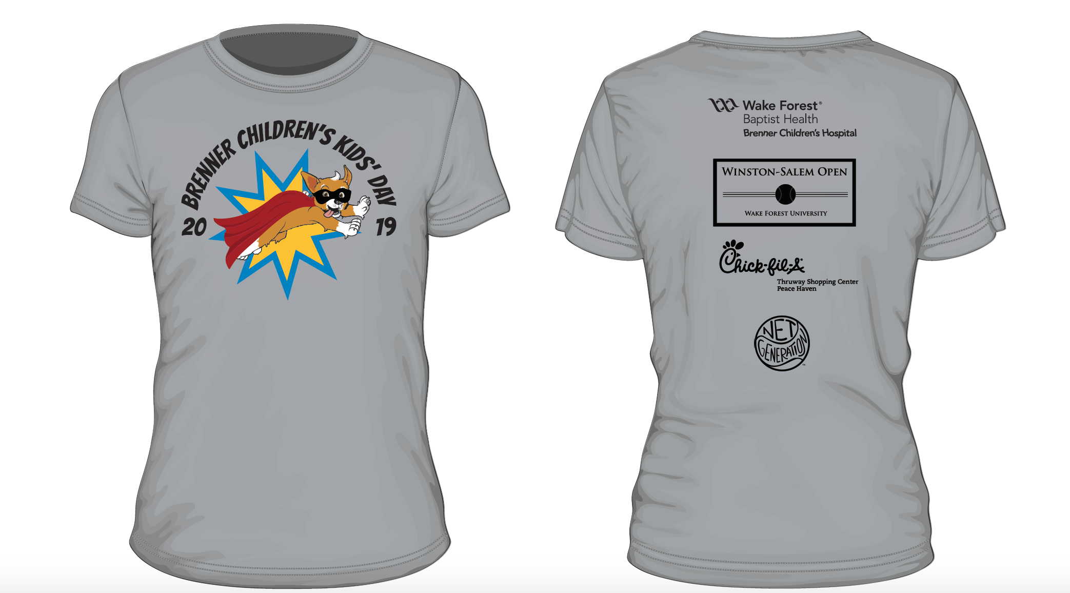
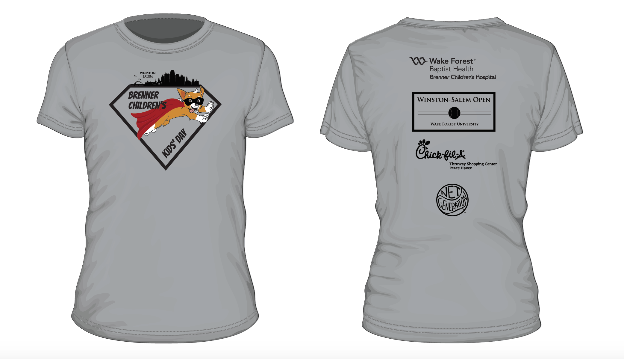
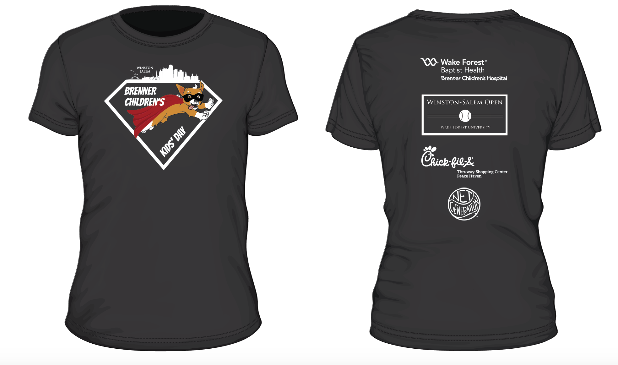
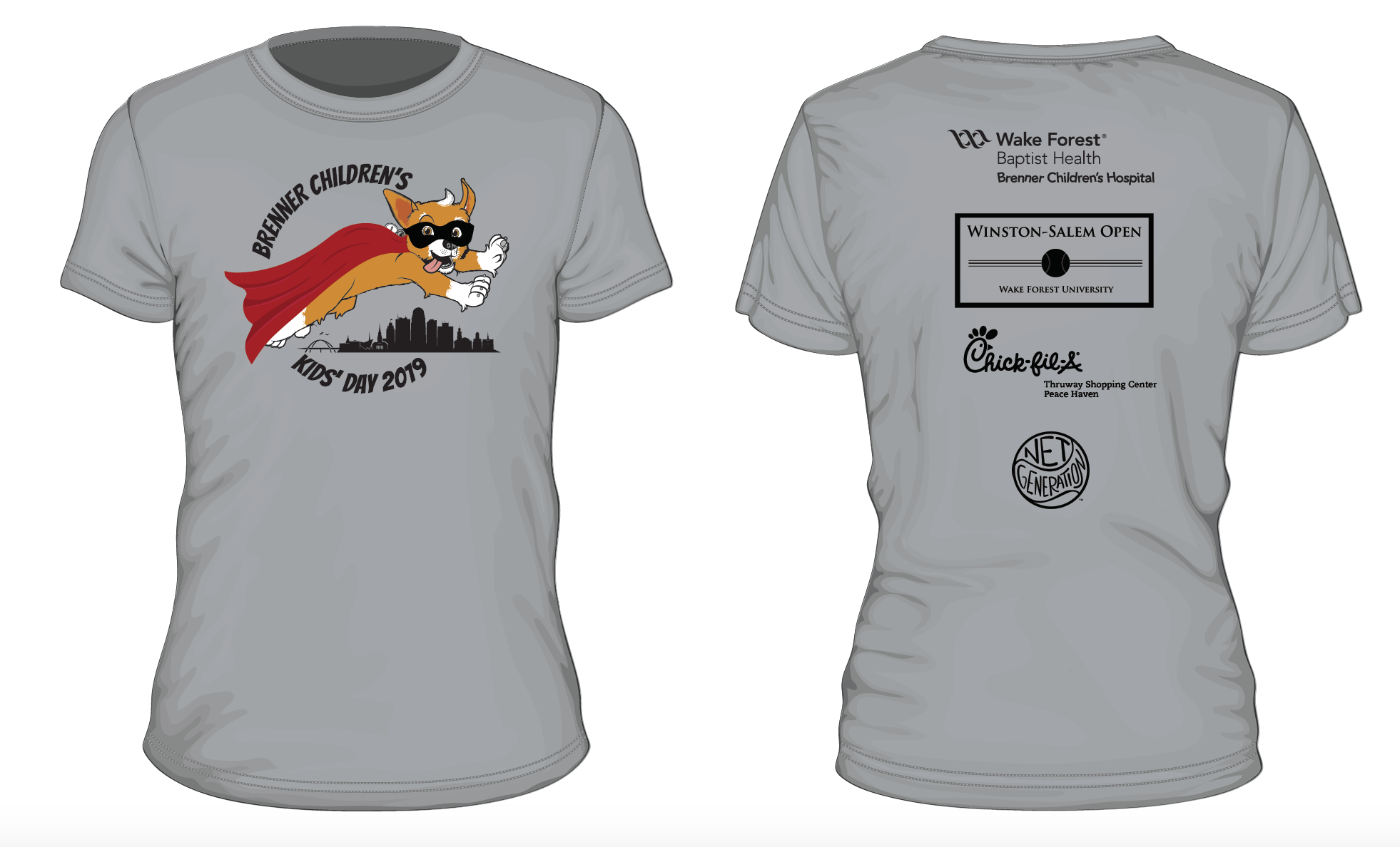
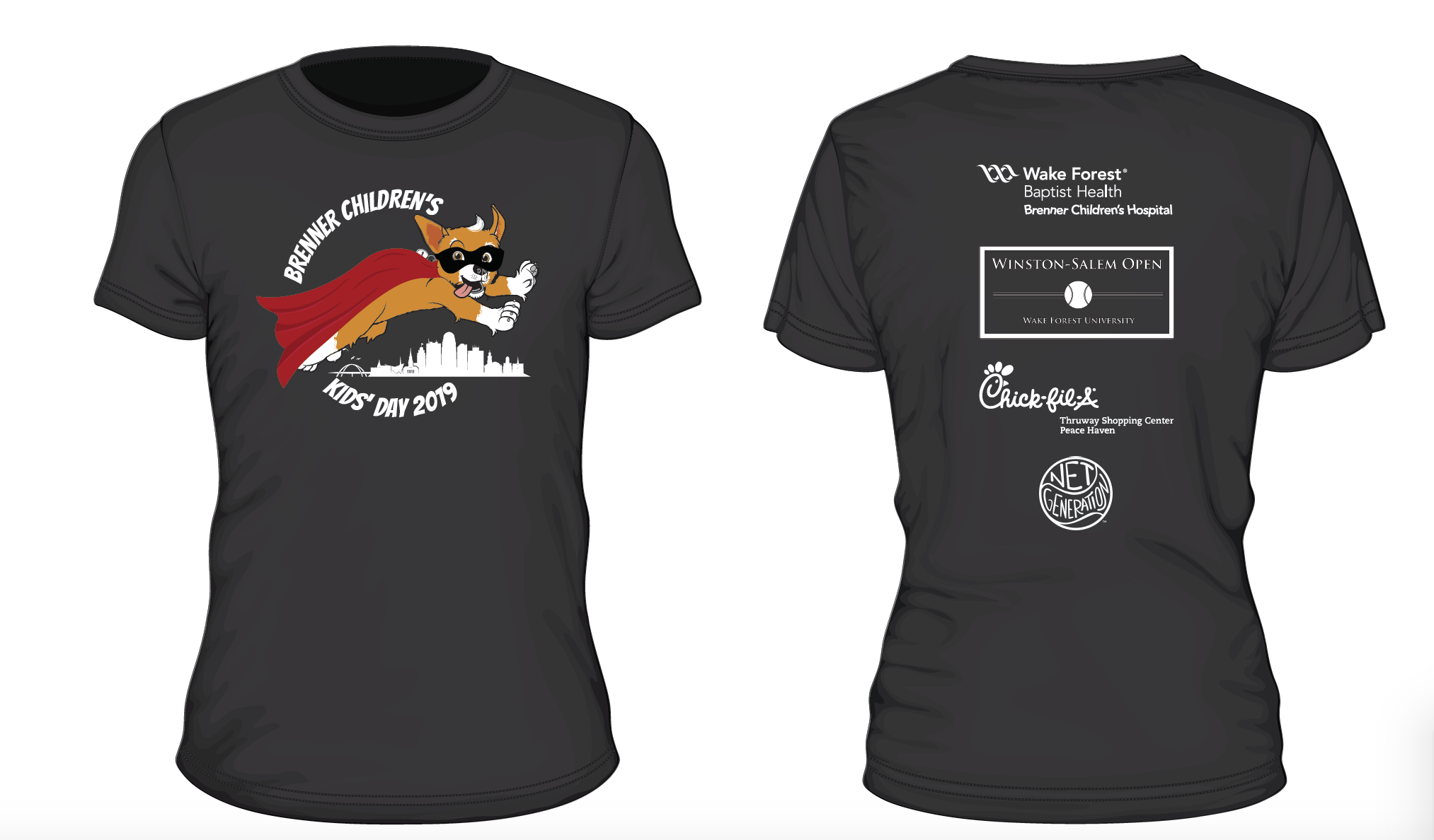
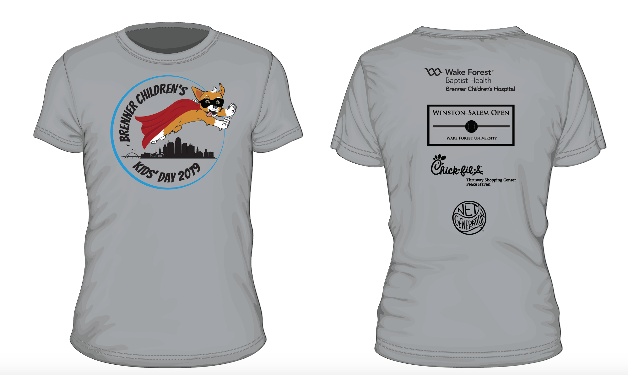
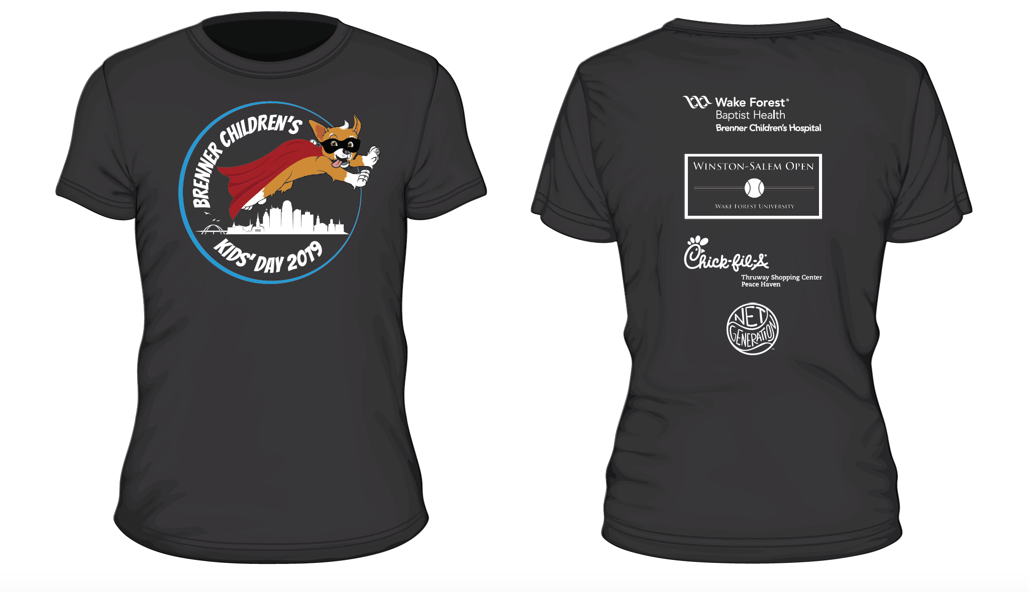
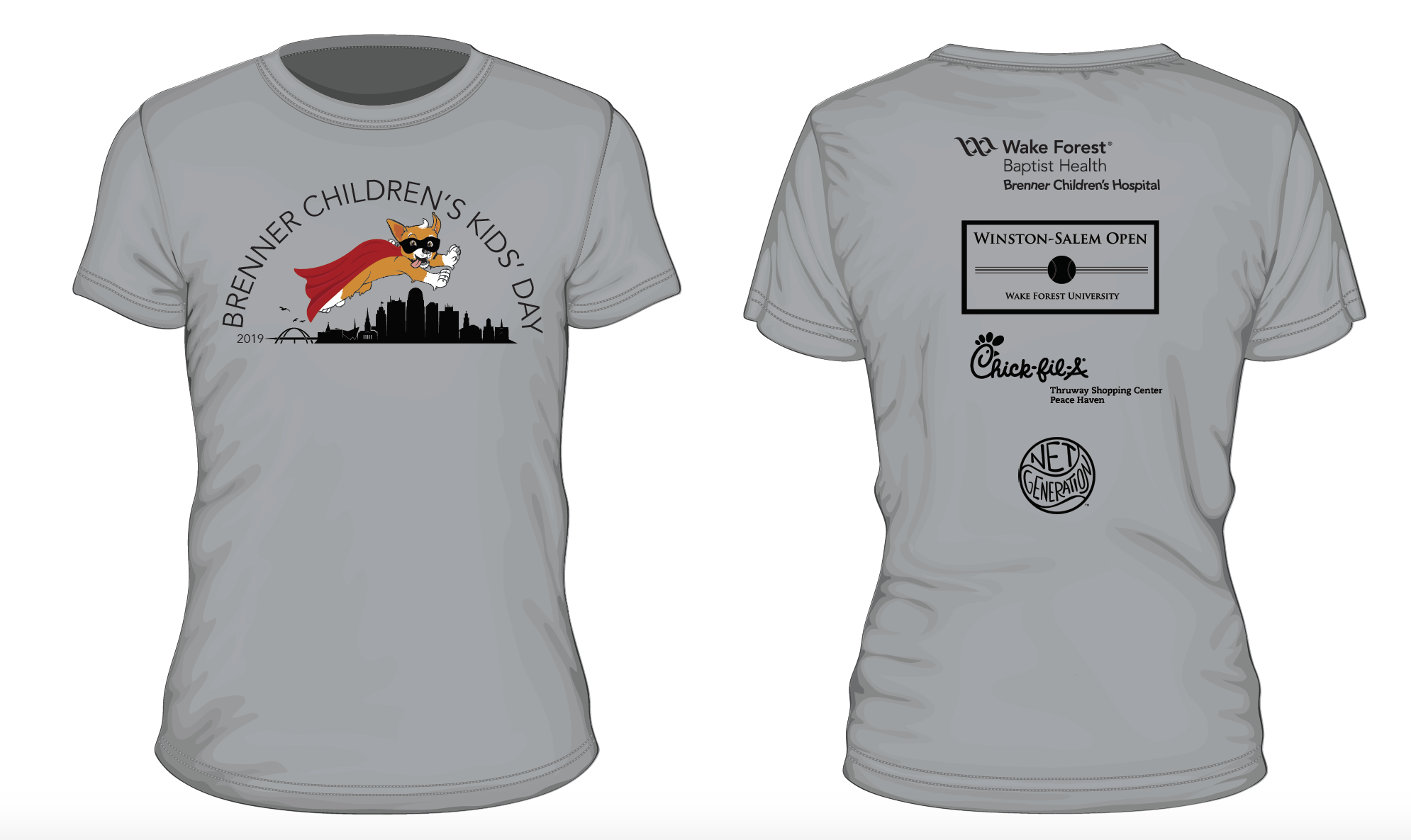
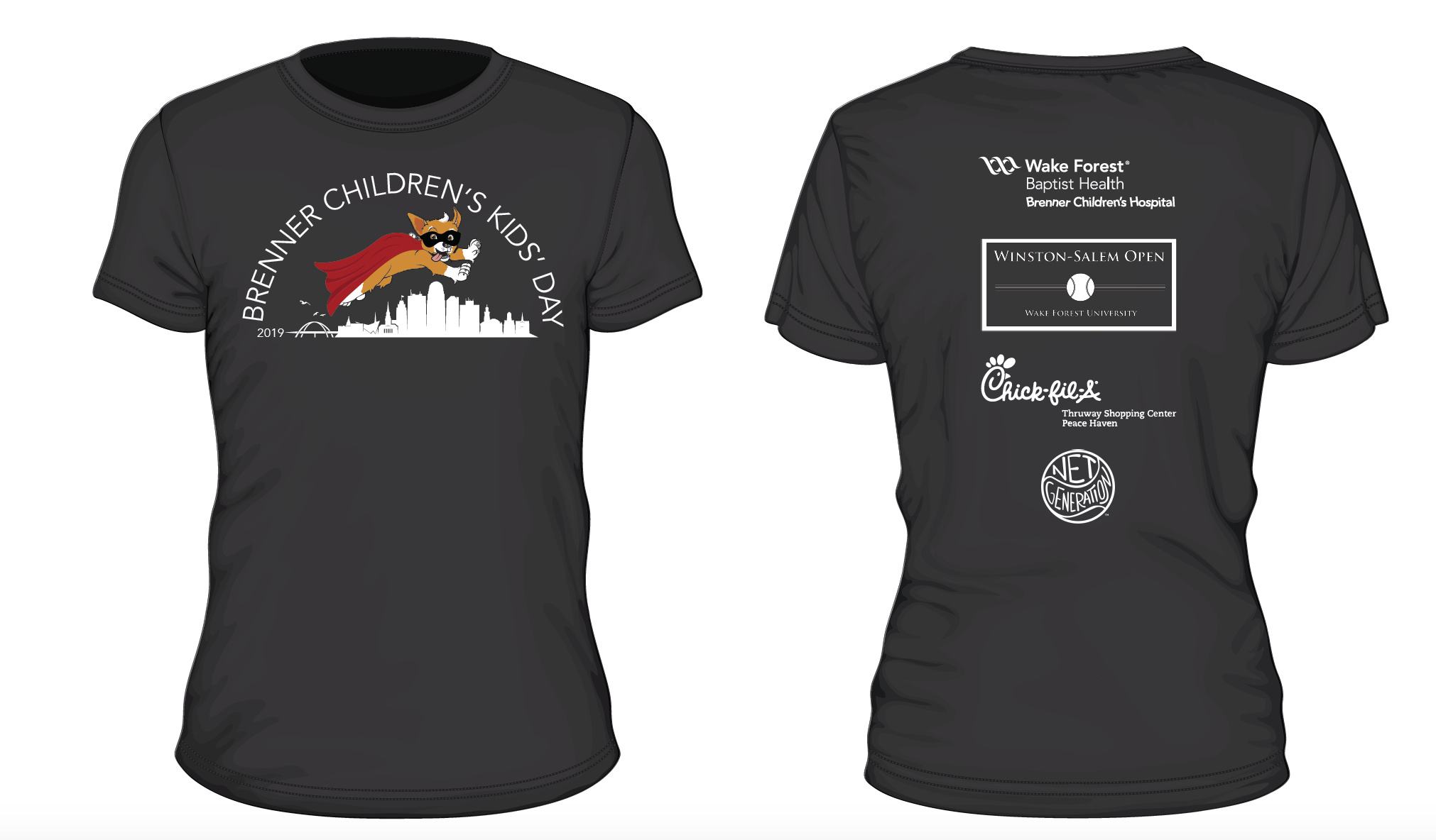
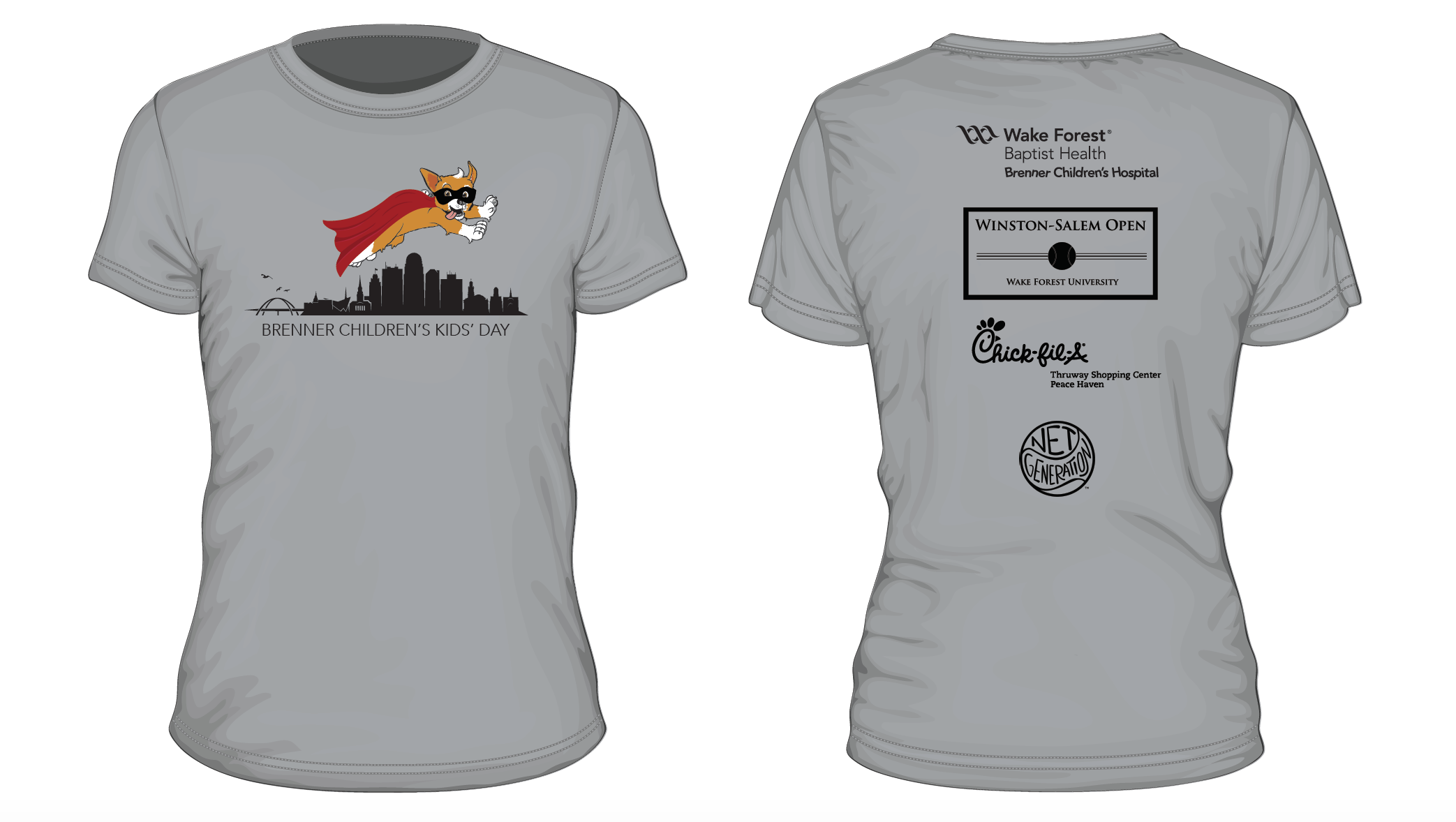
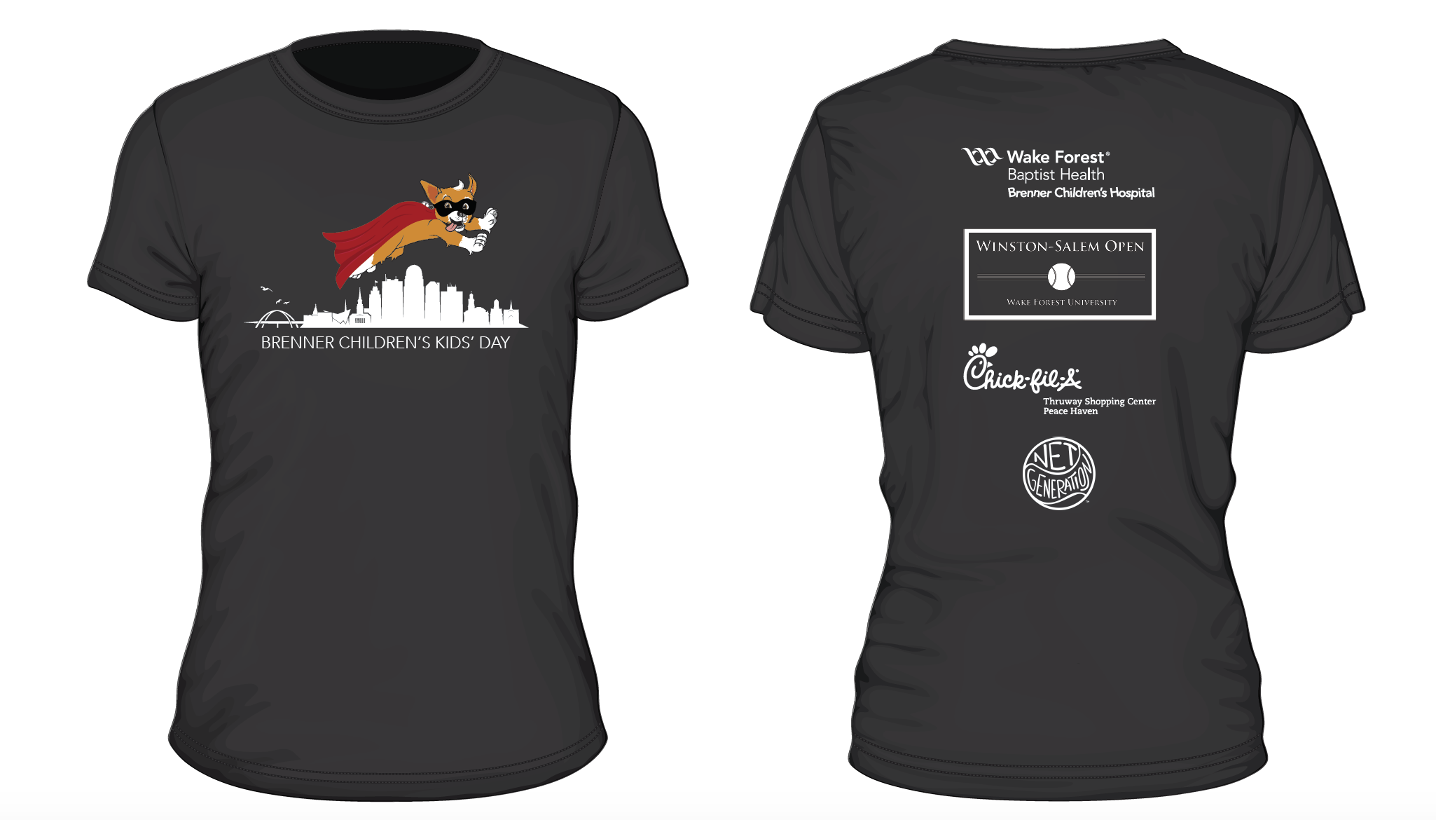
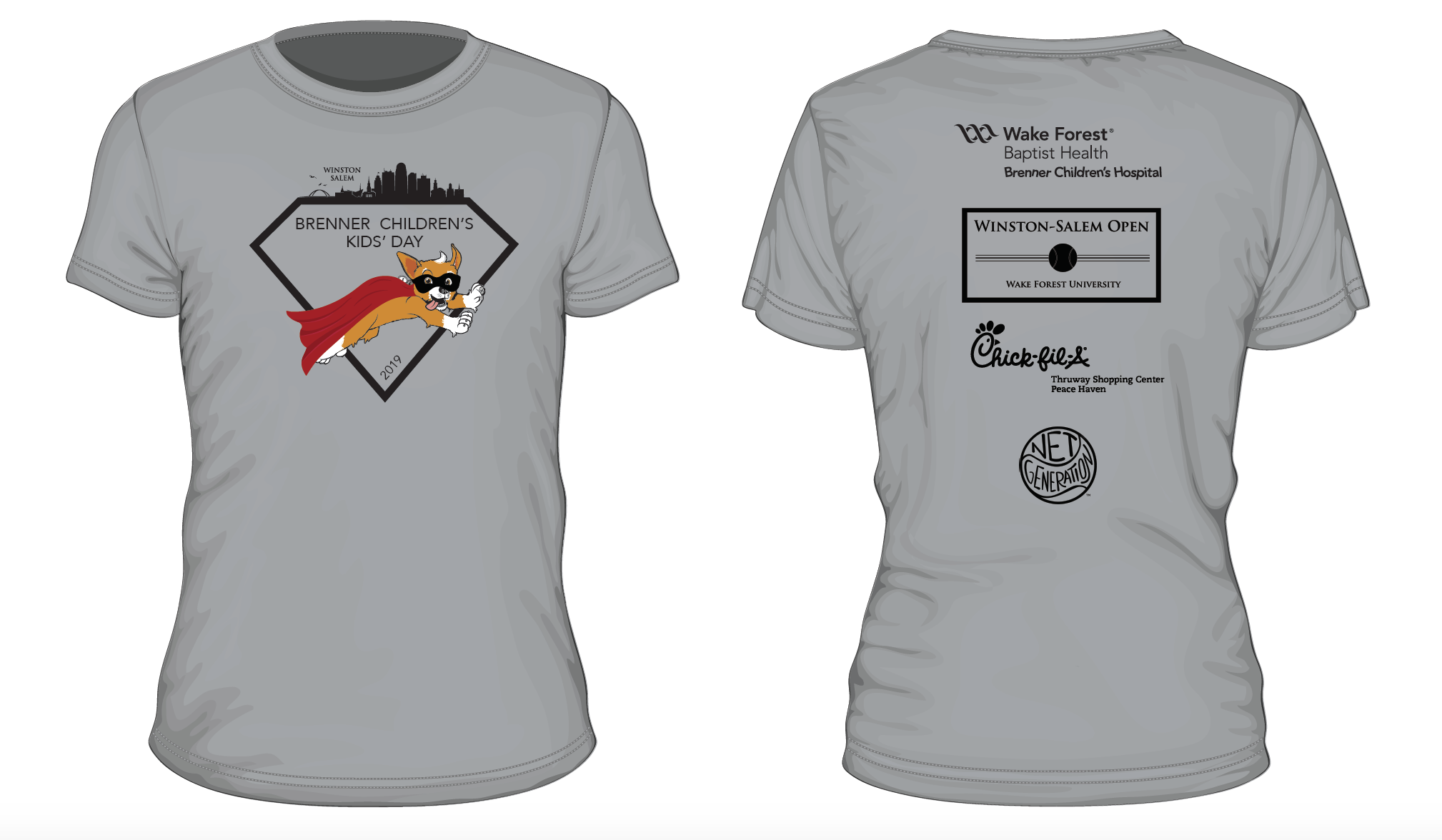
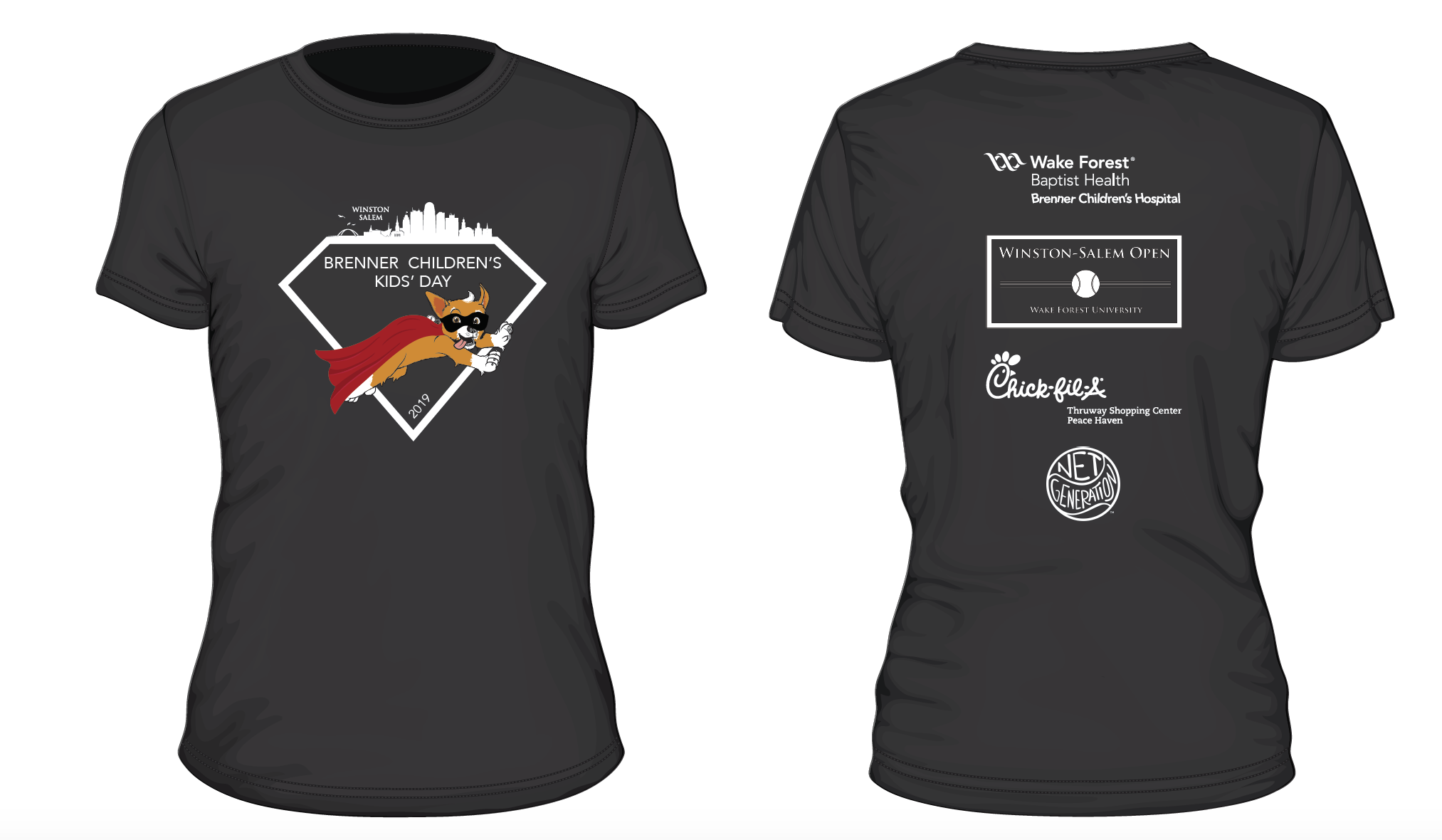
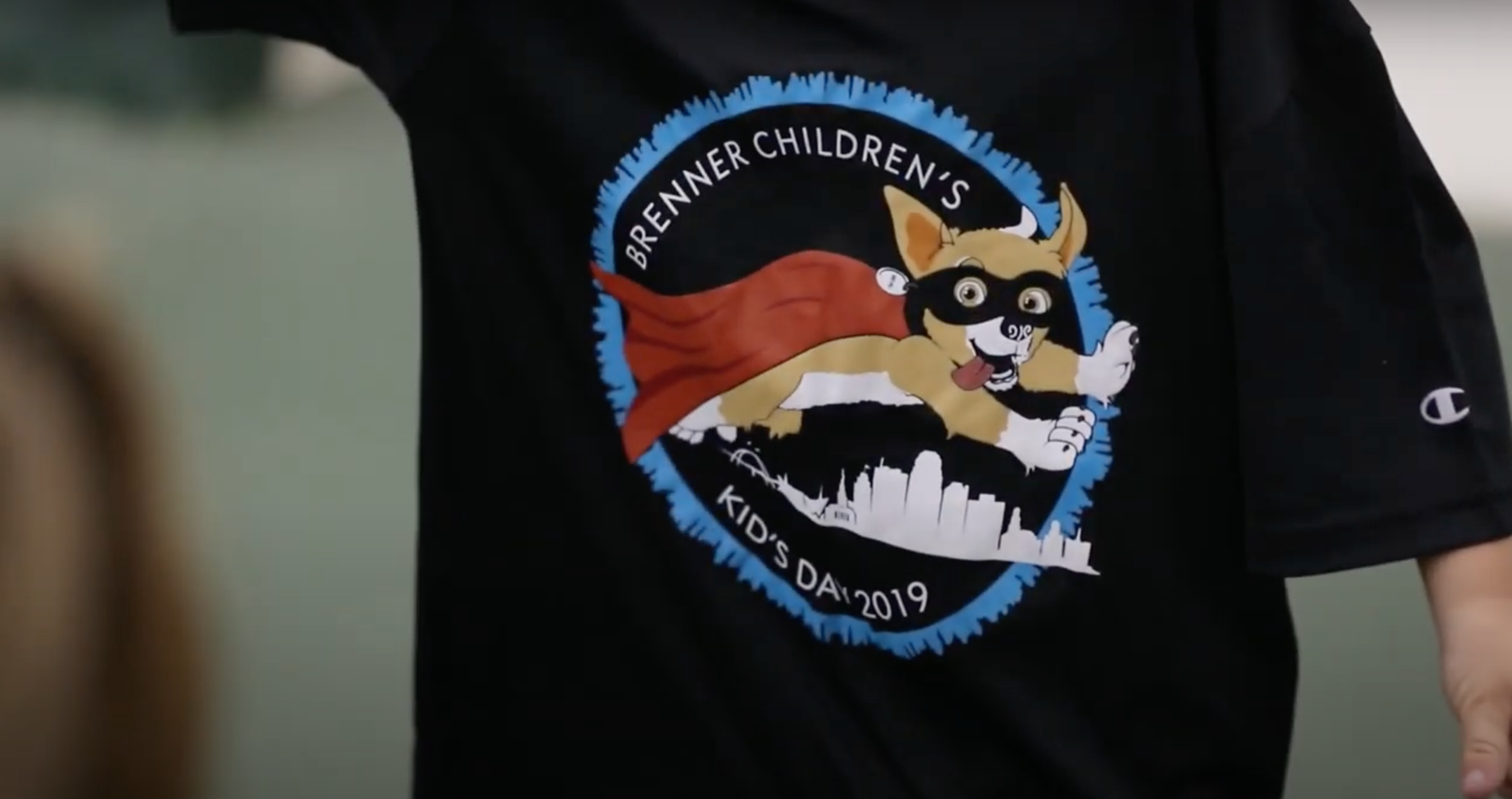
Wake Forest Baptist Medical Center – Brenner's Kids T-shirt
Asked to make iterations on a t-shirt for a tennis kids camp. Given the concept and illustrations. I created more than 20 different iterations. This was the shirt that was chosen.
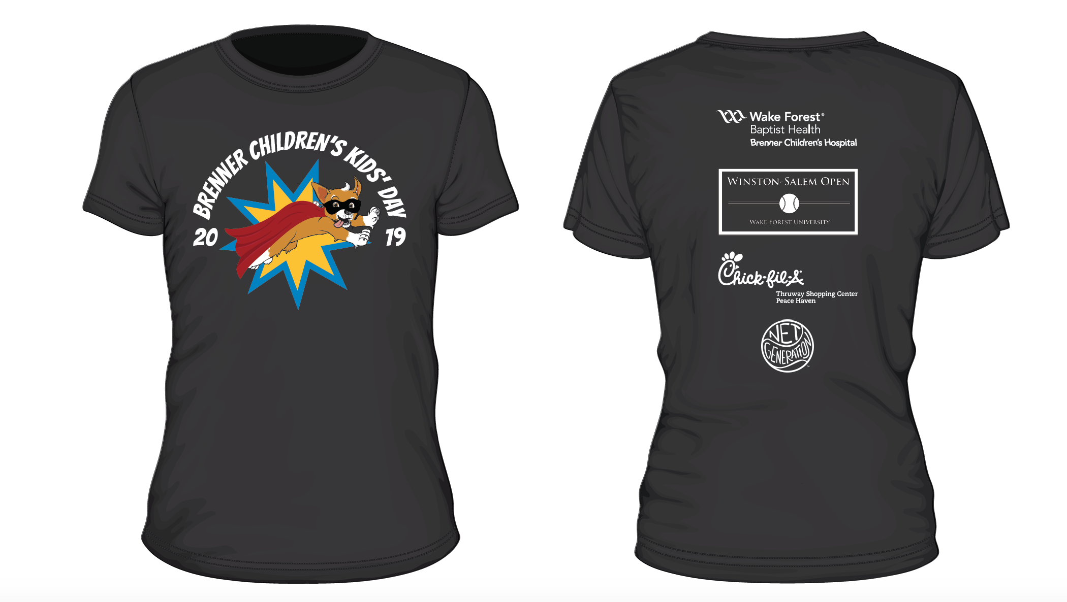
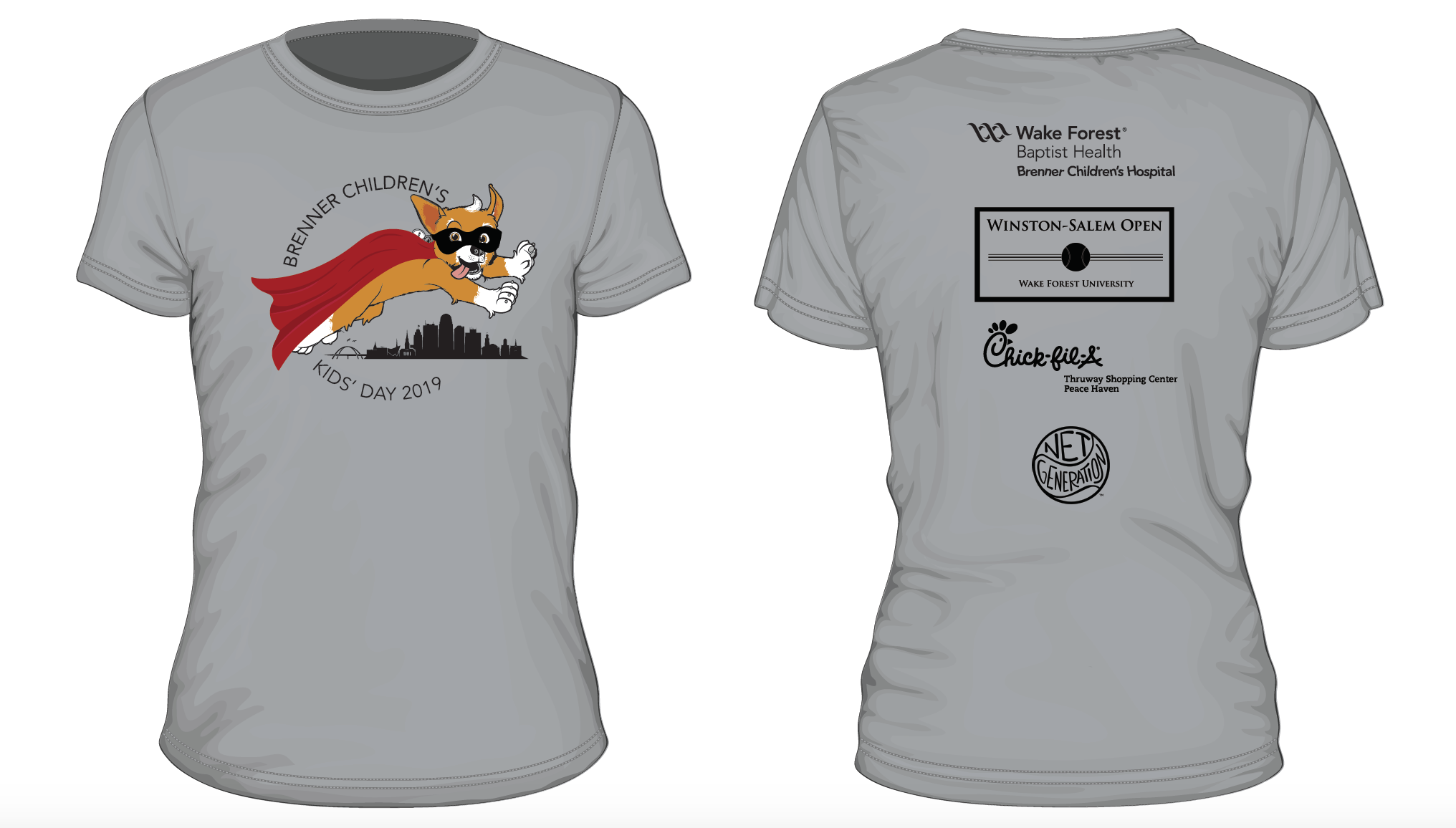
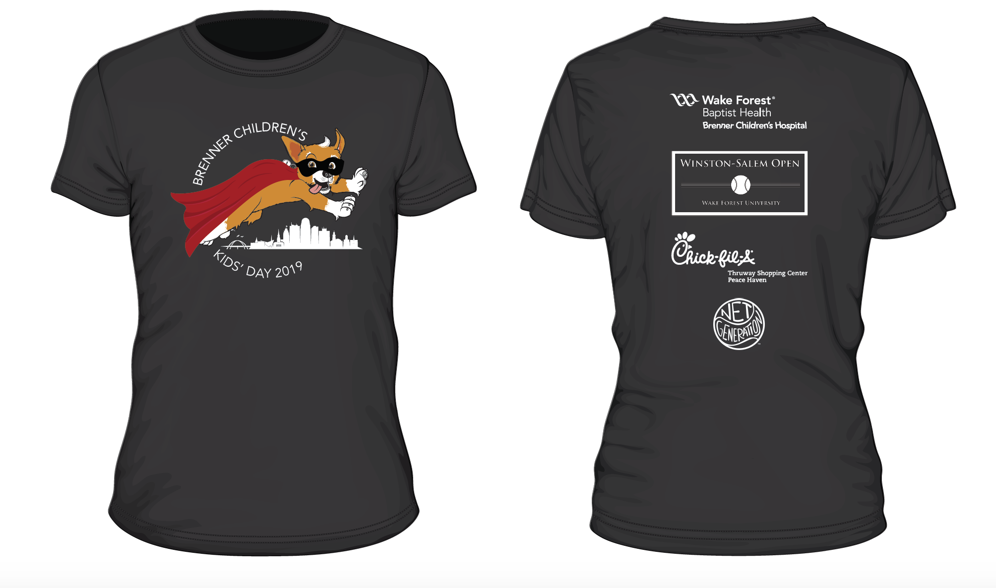
I explored a circular shirt design, horizontal design, half-circle design, and comic themed shirt design. I wanted to make sure my iterations were thorough. The theme was superheros, so I wanted the shirt to feel heroic. I also added a cape and mask to the dog illustration. Here are my 20 different iterations.