
Copenhagen Jazz Festival (2019)
Graphic Design Foundations Studio, taught by Morten Noer at DIS in Copenhagen, Denmark. 7 week course.
Copenhagen Jazz Festival is a foundation that organizes the annual international Copenhagen Jazz Festival. For ten days, jazz envelops the Danish capital offering over a 1000 concerts throught the entire city.
We were asked to create a new visual identity for the Copenhagen Jazz Festival. This included a logo, poster, tote bag, t-shirt, ticket, Instagram account, and one other relevant marketing material.
My identity concept took a different approach by stemming from what I thought and felt about jazz in Copenhagen. My poster concept is what I imagine sound looking like as it comes out of an instrument. From there I created my fun, exciting identity for Copenhagen Jazz Festival.
Full visual identity materials


Process
For the first week, we were asked to experiment by creating a mark that represents Copenhagen Jazz Festival. I interpreted this task as excluding wordmarks or any letters. After a few days, I decided to explore using letters to make sure no opportunity was left untaken. Then I chose four marks to present to my classmates to get some feedback on.
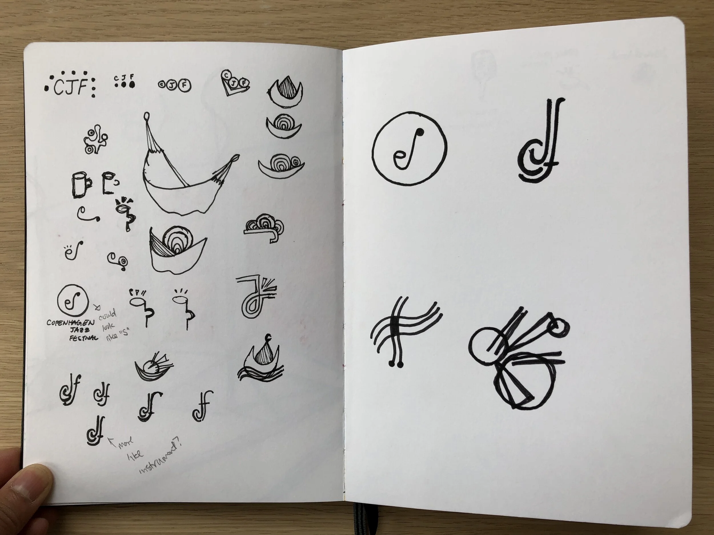
I moved forward with the mark used CJF and looked like a music note and a saxophone. After digitizing it, I realized it didn't flow as well as it could. I decided to trying using brush and ink to get a more flowing mark.
The final logomark
My idea behind this logo was to create a simple monogram of CJF that encapsulated jazz. By having the strokes look like brushstrokes, the logo feels smooth and inviting. The shape the letters make create a musical atmosphere for jazz to flourish.
Next, I did a type study to find the best typeface that would work with the logo. I chose to go with Gill Sans as it was a classic typeface that worked well with the flow of my mark.
Final logo with type
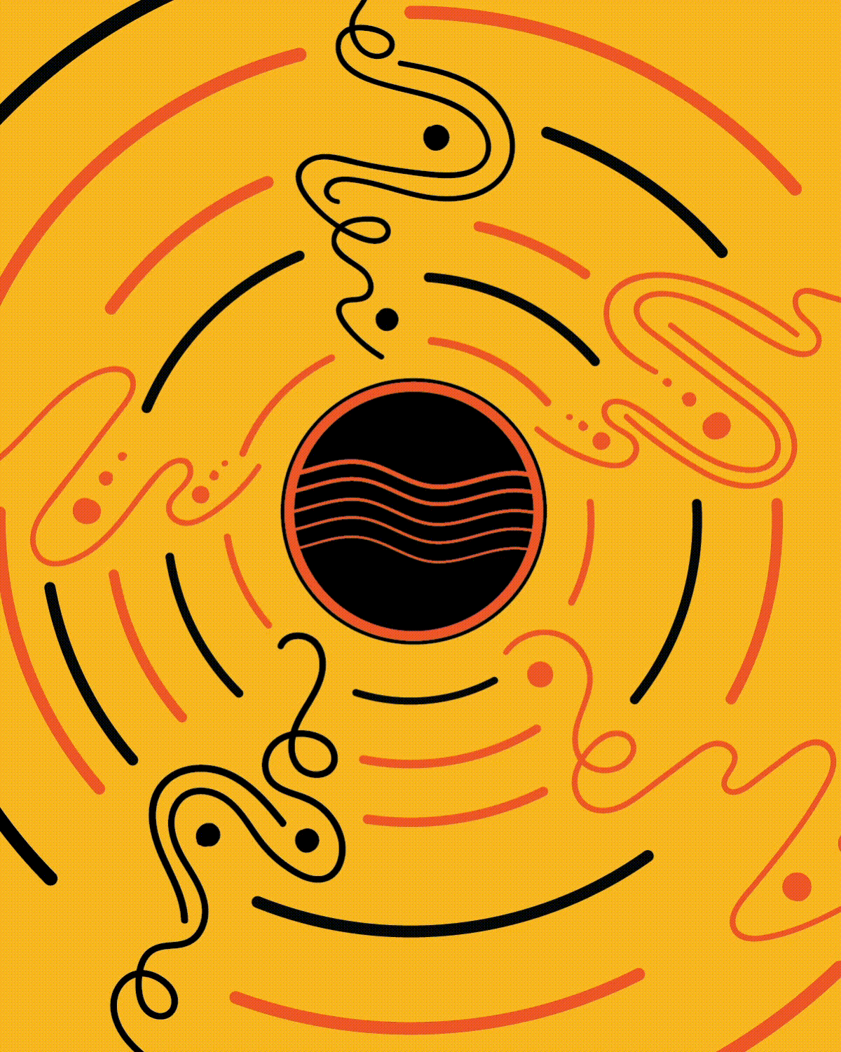
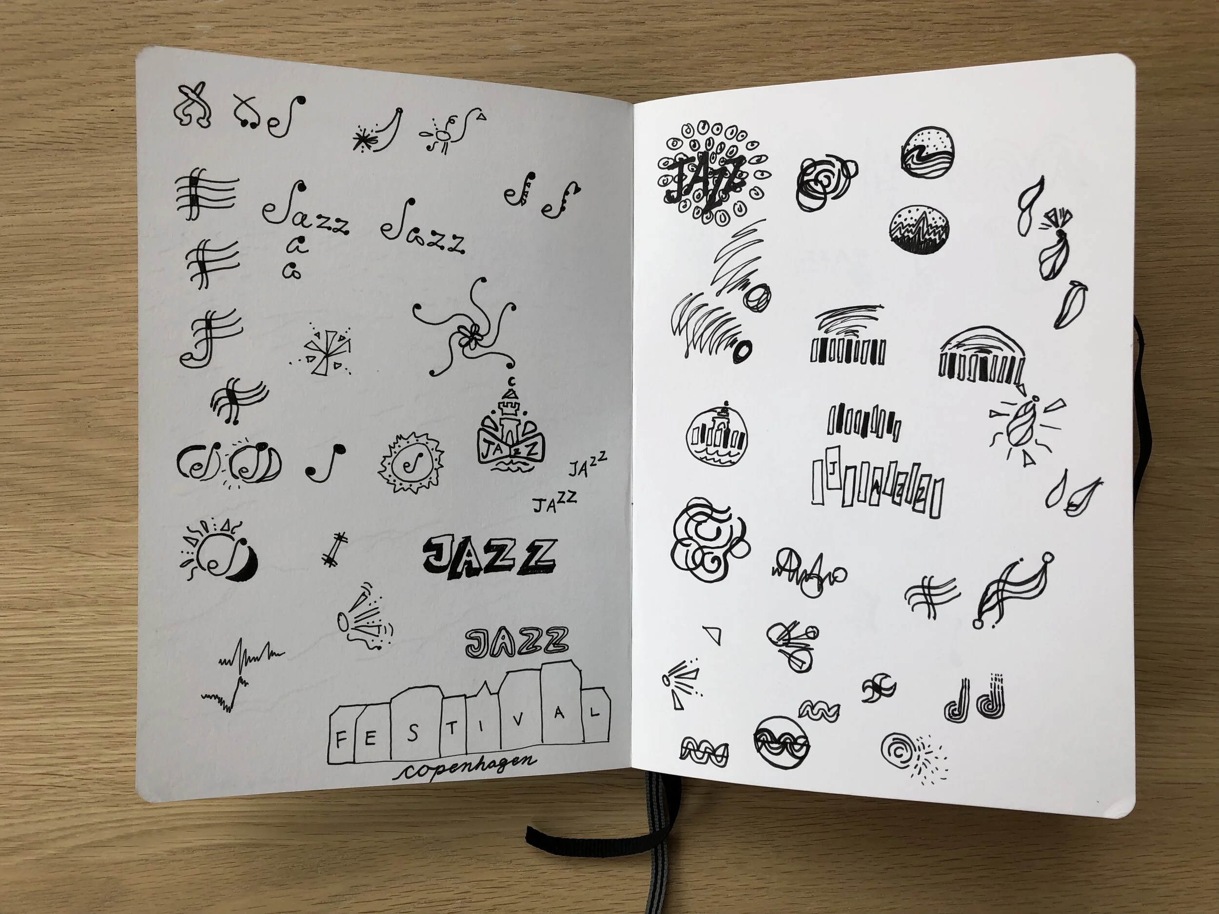
For my poster, I used an activity we did in class to help inspire me. We had a guest designer come lead us as we listened to jazz and drew what we thought the sounds would look like. We started with our eyes closed and then moved to open our eyes and switch tools. My drawings were very abstract looking. This exercised help me create my poster concept of what sound looks like.
At this point, I had three different concepts for the poster. I chose to go with the idea of sound coming out of an instrument because it felt fun, simple, and more calming than the poster on the left. My colors were chosen to be compliments of the instrument in the center, but then I decided the palette didn't work together as a whole, so I changed it to be more cohesive and vibrant.

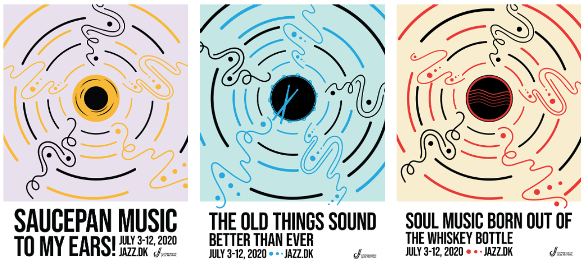

For the poster, I chose to use parts of different instruments that were circular in the center and depict sounds coming out. I also wanted to use funny headlines from jazz slang, phrases, and quotes to grab people’s attention and make them curious about the Copenhagen Jazz Festival.
Some more example phrases are:
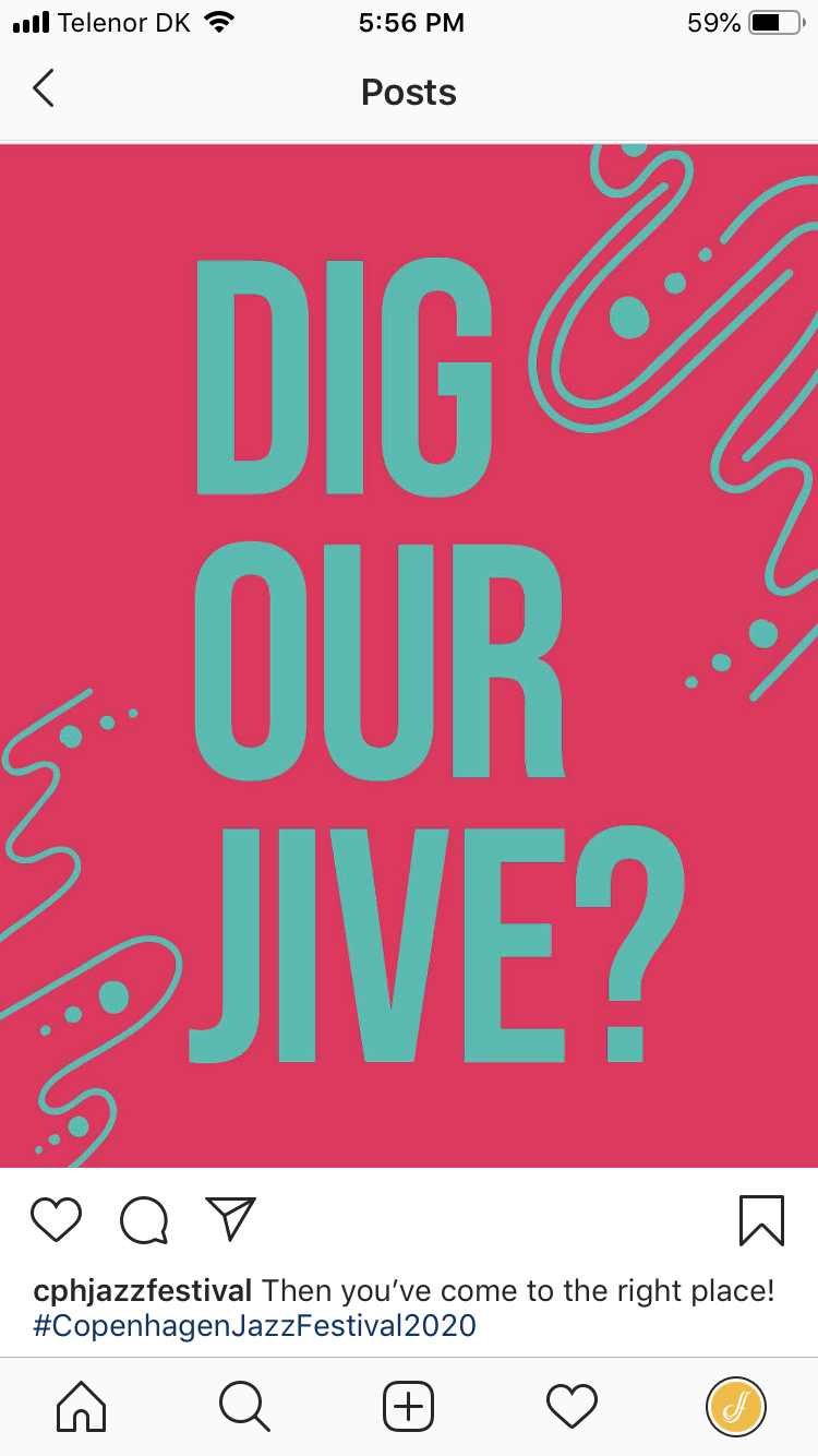
Calling you Helpcats! | Dig Our Jive? | The Right Pocket! | Saucepan Music to My Ears! | The Old Things Sound Better than Ever | Swing Those Hips |
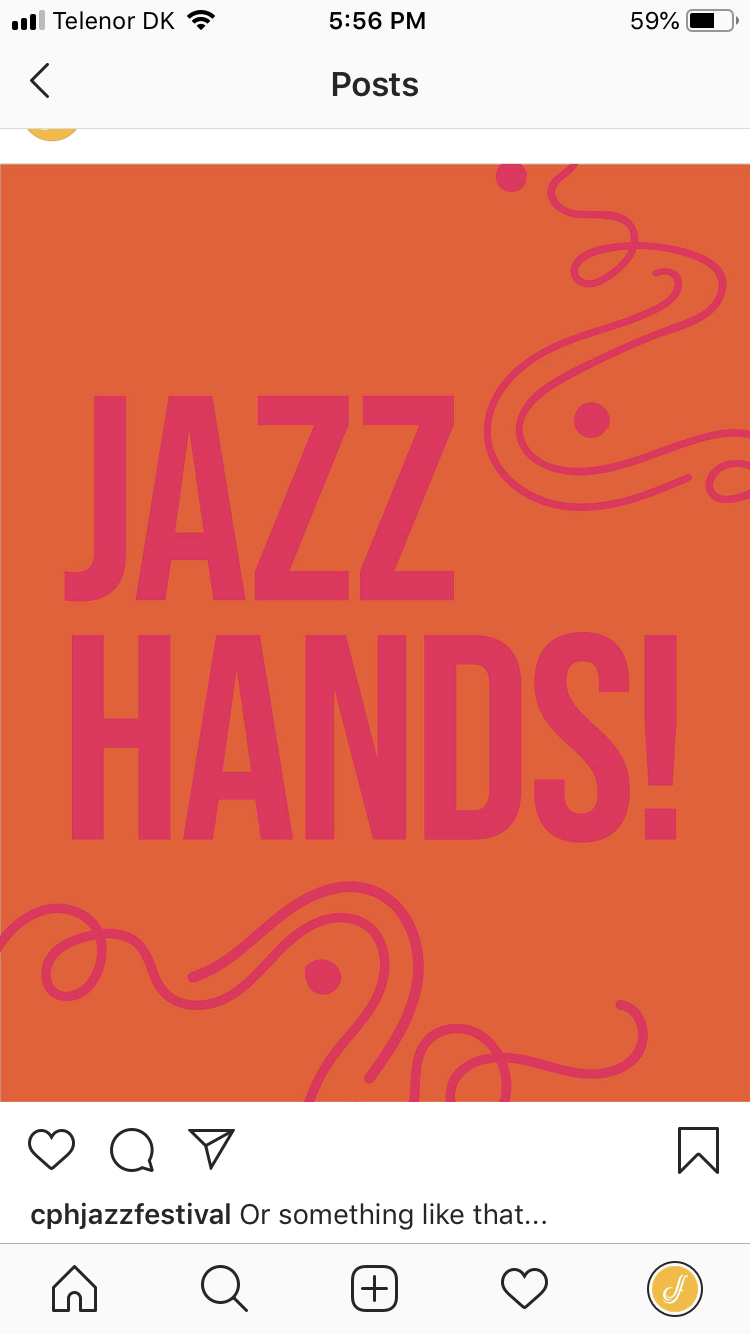
Jazz is Not Dead, it Just Smells Funny | Soul Music Born Out of the Whiskey Bottle | Jazz Hands

From there, merchandise and the banner came more easily in making design decisions. I used the logo, 3 circular instruments, and the sound graphic in the t-shirt and tote bag designs.
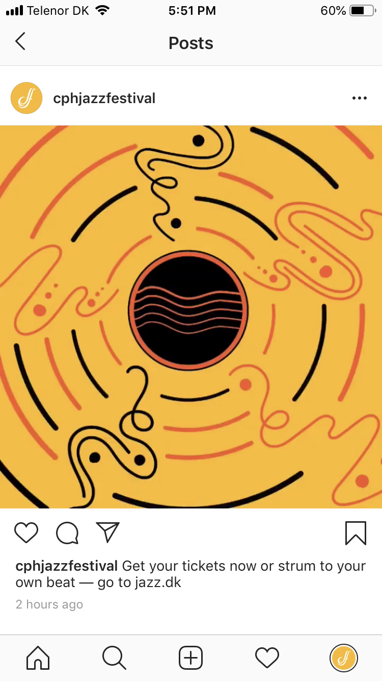
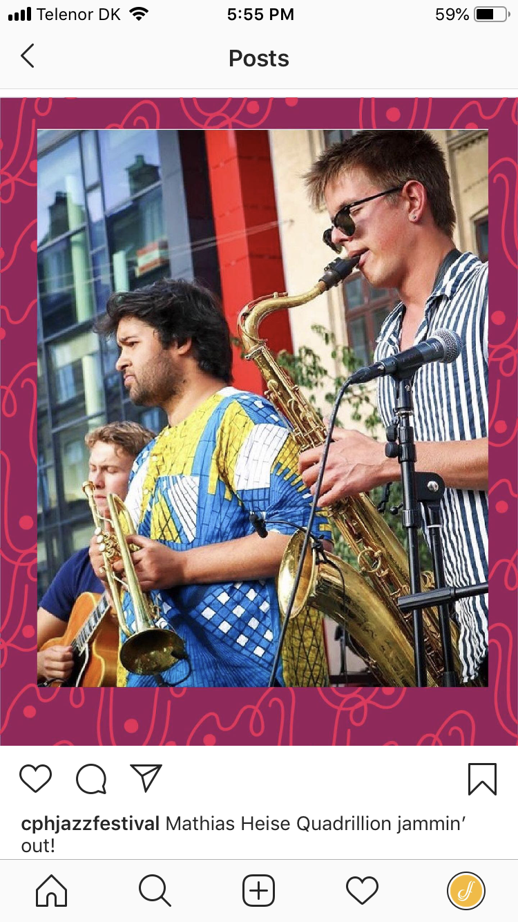
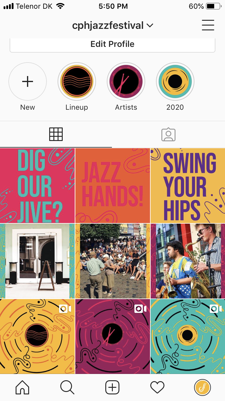
For the social media account, I was inspired by Taco Bell's instagram. They have every three posts (the row) in the same style, so I wanted to use the same idea with my instagram design. The first style is animation of the sound graphics. I had never done animation before, so I used photoshop to create frame by frame gif. The second row is a photo from the festival with a frame relating to the visual identity I created. The third most recent row is highlighting the funny phrases I came up with.
You can check out my instagram for Copenhagen Jazz Festival @cphjazzfestival
This project is more based off of my interpretation of Copenhagen Jazz Festival. I am typically used to approaching a branding project by researching the company and using historical facts or something that relates to the company to create the identity. But this time I ended up taking a different approach. This project is also completely my idea, creation, and decisions. In the past, professors have strongly guide me in a direction, but this time I felt like I was able to make all the design decisions. In the final critique, people were more interested in the funny phrases than the sound graphic. They suggested to have those phrases become the main identity for Copenhagen Jazz Festival.