Architecture Poster (2017)
For this project, we had to create a poster for an architecture series on campus. We first started out with some exercises that limited how we could treat the information. The constraints were only use weight and spacing to show hierarchy, or experiment with just alignment, and so on. Eventually we were able to use color and imagery.
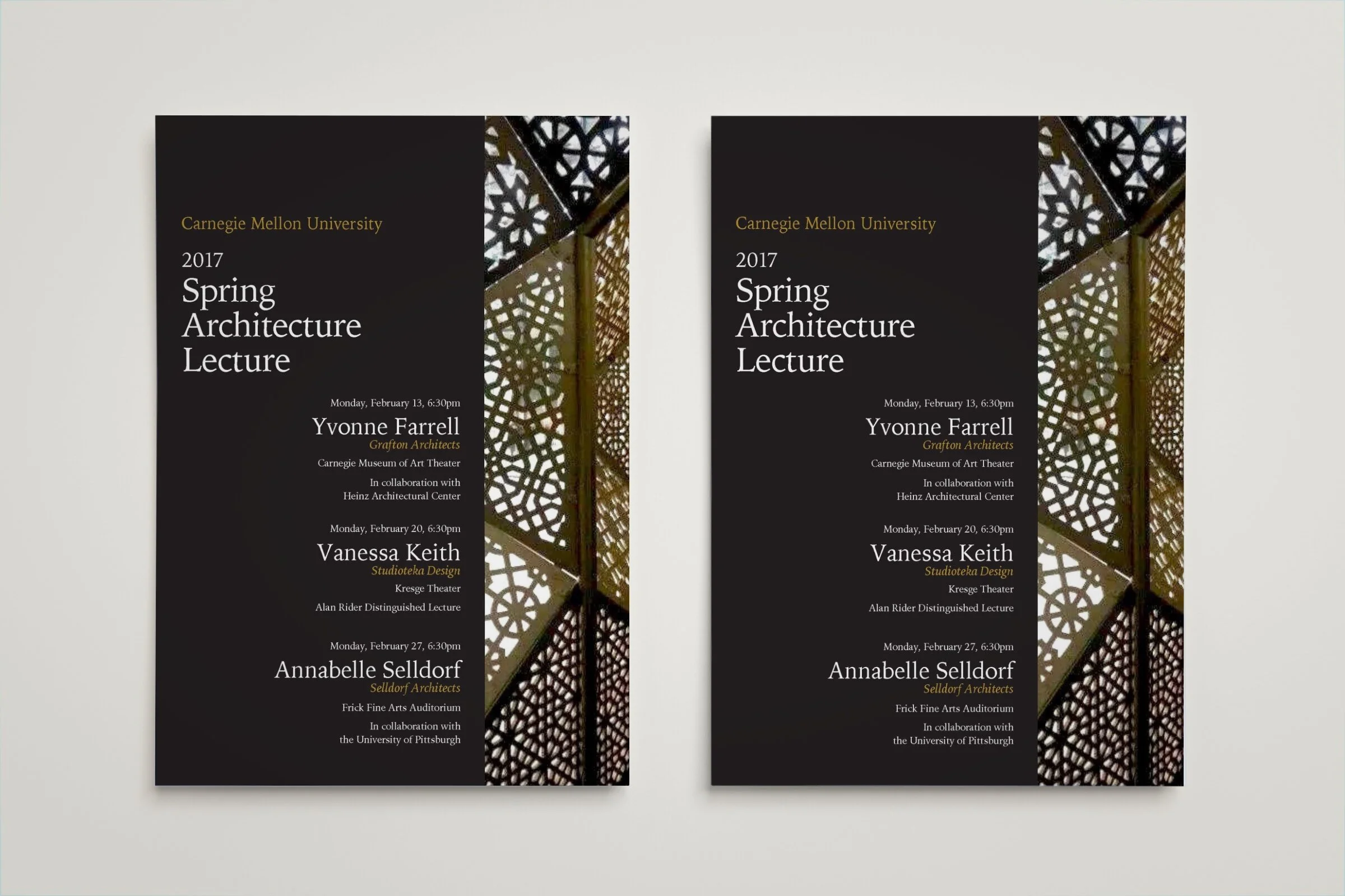
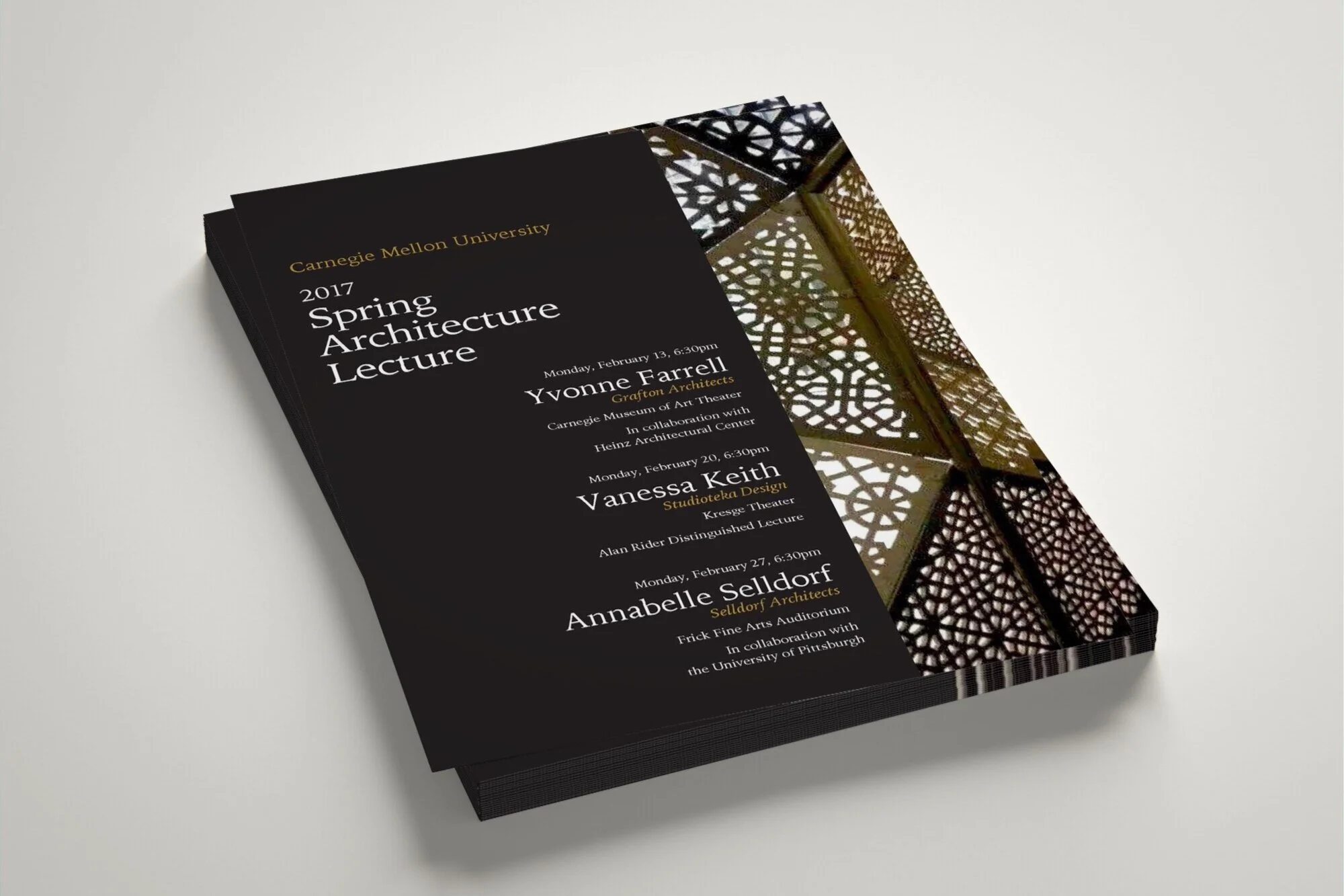
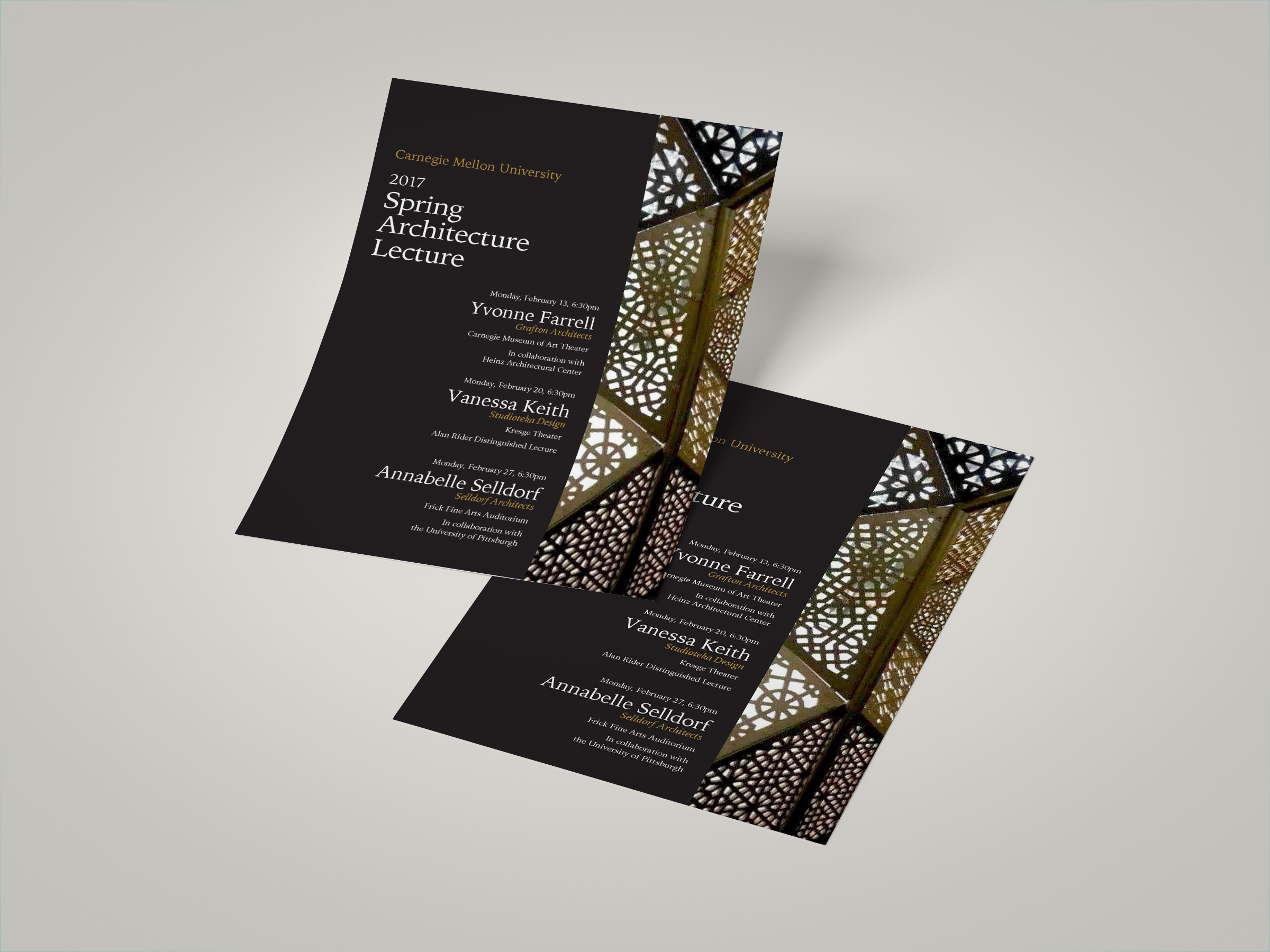
I ended up choosing an image of an interesting shapes and designs on a piece of architecture. I used the diagonals in the image to place my text to lead your eye to the important information. Varied weights, colors and type sizes were used to create hierarchy. My color palette came from the image to keep the poster cohesive.